
In this blog, we are going to understand how to set up a storybook react native in the application. We are also going to understand what exactly a storybook is and why we should use it in a react project. Let’s first understand what a storybook is exactly used for.
While component-based UI libraries like React simplify web development they also introduce new complexities like testing and debugging.
Storybook react native enables developers to build UI components in isolation using independent building blocks. With Storybook you can quickly create User Interface components using your favorite framework while also providing a decluttered interface to work on each component.
Storybook react native is a development environment for UI components that enables you to create and showcase components in an environment outside your main application. This allows you to work on one module at a time and develop entire UIs without the need for a complex dev stack. Storybook also enables you to document, reuse, and test user interface components. In addition to that, it makes building web applications faster and more efficient.
Related read: Storybook React Native Integration: Boosting App Development and Documentation
Yes, we should use storybook react native in React because it provides a better approach to creating a component. It also provides plenty of benefits for developers like,
So let’s see how to set up Storybook React Native in our React application step by step,
🔸 The first step is to create our react application using the command:
npx create-next-app <your-app-name>
🔸 Then we can open our application in an editor or the terminal just type:
cd nextjs-<your-app-name>
🔸 Then we will install the storybook in our application by typing the following command in the terminal:
npx sb init
🔸 After installing the storybook let’s make sure that all the required dependencies are installed by running:
npm install
🔸 Running Storybook locally:
npm run storybook
Once the command has successfully run, a working version of Storybook should start running at http://localhost:6006/.

The folder structure should look somewhat like what we have shown in the above image components can be created in the component folder and in the stories folder which was created while installing the storybook React Native in the application we can create story files for the components with the extension .stories.jsx in which we can create stories in these files.
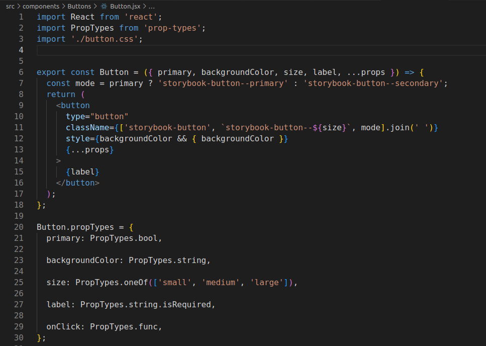
In the components folder let’s create a file named ‘Button.jsx’ and add the following code in the file.
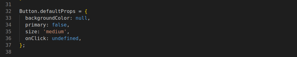
PropTypes are also objects with a key and a value pair where the ‘key’ is the name of the prop while the value represents the type or class by which they are defined.
DefaultProps are default values for our title which will automatically be rendered if the title has not been passed as a prop from our parent component.
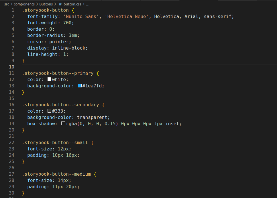
Next, we will add styles in the CSS file in which we will add all the styling that needs to be tested on the component. In the example shown below, we have created a default style and styles for Primary, Secondary, Small, Medium, and Large buttons respectively.

Then we will create a story file in the stories folder with the extension ‘.stories.jsx’ in which we will:
The stories file that we have created will look like this:


Then run the command:
npm run storybook or yarn run storybook
When you run the command ‘yarn storybook’, the Command goes to the main.js file to check the pattern and pick up the appropriate stories. We have such file button.stories.js, then it picks up that file. Here the code reads the default export and adds an entry in the side navigation, and then it picks up named exports and renders actual components.

Storybook react native has quickly gained popularity with developers, and it’s easy to see why. The ability to work on isolated components in a clean interface is a huge time-saver, and the ability to visually test your code is also something too good to pass by.
With its simple interface and wide range of features, you can quickly put together prototypes or entire UIs without having to worry about setting up a complex development environment.
Leave your competitors behind! Become an EPIC integration pro, and boost your team's efficiency.
Register Here

The Mindbowser team's professionalism consistently impressed me. Their commitment to quality shone through in every aspect of the project. They truly went the extra mile, ensuring they understood our needs perfectly and were always willing to invest the time to...

CTO, New Day Therapeutics
I collaborated with Mindbowser for several years on a complex SaaS platform project. They took over a partially completed project and successfully transformed it into a fully functional and robust platform. Throughout the entire process, the quality of their work...

President, E.B. Carlson
Mindbowser and team are professional, talented and very responsive. They got us through a challenging situation with our IOT product successfully. They will be our go to dev team going forward.
Founder, Cascada
Amazing team to work with. Very responsive and very skilled in both front and backend engineering. Looking forward to our next project together.

Co-Founder, Emerge
The team is great to work with. Very professional, on task, and efficient.

Founder, PeriopMD
I can not express enough how pleased we are with the whole team. From the first call and meeting, they took our vision and ran with it. Communication was easy and everyone was flexible to our schedule. I’m excited to...

Founder, Seeke
Mindbowser has truly been foundational in my journey from concept to design and onto that final launch phase.

CEO, KickSnap
We had very close go live timeline and Mindbowser team got us live a month before.

CEO, BuyNow WorldWide
If you want a team of great developers, I recommend them for the next project.

Founder, Teach Reach
Mindbowser built both iOS and Android apps for Mindworks, that have stood the test of time. 5 years later they still function quite beautifully. Their team always met their objectives and I'm very happy with the end result. Thank you!

Founder, Mindworks
Mindbowser has delivered a much better quality product than our previous tech vendors. Our product is stable and passed Well Architected Framework Review from AWS.

CEO, PurpleAnt
I am happy to share that we got USD 10k in cloud credits courtesy of our friends at Mindbowser. Thank you Pravin and Ayush, this means a lot to us.

CTO, Shortlist
Mindbowser is one of the reasons that our app is successful. These guys have been a great team.

Founder & CEO, MangoMirror
Kudos for all your hard work and diligence on the Telehealth platform project. You made it possible.

CEO, ThriveHealth
Mindbowser helped us build an awesome iOS app to bring balance to people’s lives.

CEO, SMILINGMIND
They were a very responsive team! Extremely easy to communicate and work with!

Founder & CEO, TotTech
We’ve had very little-to-no hiccups at all—it’s been a really pleasurable experience.

Co-Founder, TEAM8s
Mindbowser was very helpful with explaining the development process and started quickly on the project.

Executive Director of Product Development, Innovation Lab
The greatest benefit we got from Mindbowser is the expertise. Their team has developed apps in all different industries with all types of social proofs.

Co-Founder, Vesica
Mindbowser is professional, efficient and thorough.

Consultant, XPRIZE
Very committed, they create beautiful apps and are very benevolent. They have brilliant Ideas.

Founder, S.T.A.R.S of Wellness
Mindbowser was great; they listened to us a lot and helped us hone in on the actual idea of the app. They had put together fantastic wireframes for us.

Co-Founder, Flat Earth
Ayush was responsive and paired me with the best team member possible, to complete my complex vision and project. Could not be happier.

Founder, Child Life On Call
The team from Mindbowser stayed on task, asked the right questions, and completed the required tasks in a timely fashion! Strong work team!

CEO, SDOH2Health LLC
Mindbowser was easy to work with and hit the ground running, immediately feeling like part of our team.

CEO, Stealth Startup
Mindbowser was an excellent partner in developing my fitness app. They were patient, attentive, & understood my business needs. The end product exceeded my expectations. Thrilled to share it globally.

Owner, Phalanx
Mindbowser's expertise in tech, process & mobile development made them our choice for our app. The team was dedicated to the process & delivered high-quality features on time. They also gave valuable industry advice. Highly recommend them for app development...

Co-Founder, Fox&Fork