
Recharts is a JavaScript charting library specifically designed for React.js applications. It provides a set of customizable and responsive chart components that allow you to visualize data in various formats, such as line charts, bar charts, pie charts, area charts, scatter charts, and more.
Recharts is built on top of D3.js, a powerful data visualization library, and it simplifies the process of creating interactive charts in React applications. By combining the capabilities of D3.js with the declarative nature of React, Recharts enables developers to easily create dynamic and visually appealing charts with less code.
✔️ Declarative API: Recharts utilizes a declarative API, allowing developers to define charts and their configurations using React components and props.
✔️ Responsive Design: The library includes built-in support for responsive design, ensuring that charts automatically adapt and resize based on the container size or window dimensions.
✔️ SVG-based Rendering: Recharts render charts using Scalable Vector Graphics (SVG), which provides crisp and scalable visuals across different devices and resolutions.
✔️ Customization Options: Recharts offers a wide range of customization options for styling and configuring charts. You can customize colors, axes, labels, tooltips, legends, and more to match your application’s design.
✔️Animation Support: The library provides built-in animation support, allowing you to add smooth and interactive transitions to your charts.
✔️ Composable Components: Recharts offers a set of composable chart components that can be combined to create complex chart layouts and compositions.
Overall, Recharts simplifies the process of building charts in React.js applications, offering a high level of flexibility and interactivity. It’s a popular choice for developers who want to create visually appealing and data-driven visualizations in their React projects.
There are several similar libraries to Recharts that you can consider for charting in React.js applications. Here are a few popular alternatives:
🔸 Chart.js: Chart.js is a versatile and widely-used charting library that supports a variety of chart types, including line charts, bar charts, pie charts, radar charts, and more. It offers a simple and intuitive API with extensive customization options. Chart.js uses HTML5 canvas for rendering charts and provides good documentation and community support.
🔸 Victory: Victory is a collection of modular and interactive React charting components. It offers a wide range of chart types and allows for easy customization and event handling. Victory is built on top of D3.js and leverages React’s component model, making it a powerful and flexible choice for creating charts.
🔸 react-vis: react-vis is a library for creating custom, interactive data visualizations in React.js. It provides a set of flexible and performant components, including line charts, area charts, scatter plots, heat maps, and more. react-vis uses SVG or canvas for rendering and offers easy-to-use customization options.
🔸 ApexCharts: ApexCharts is a feature-rich charting library that supports a wide range of chart types, including line charts, bar charts, scatter charts, and more. It offers a declarative API and is built on top of SVG and JavaScript. ApexCharts provides interactive features like tooltips, zooming, and panning.
🔸 Nivo: Nivo is a powerful and customizable data visualization library for React.js. It offers a rich set of responsive and animated charts, including bar charts, line charts, pie charts, and more. Nivo is built on top of D3.js and provides a declarative API with many configuration options.
Each of these libraries has its own strengths and features, so you can choose the one that best suits your specific requirements, chart types, customization needs, and community support. Consider exploring their documentation and examples to determine which library aligns with your project goals.
To integrate Recharts in a React.js application, you need to follow these steps:
Begin by installing the Recharts library using a package manager like npm or yarn. Open your terminal and run the following command:
npm install recharts
or
yarn add recharts
In your React component file, import the required components from the Recharts library. Typically, you’ll need to import the LineChart, Line, XAxis, and YAxis components, as well as any other components you may require for your specific chart configuration. Here’s an example:
import React from 'react';
import { LineChart, Line, XAxis, YAxis } from 'recharts';Prepare the data you want to visualize in your chart. Recharts expect data in a specific format, an array of objects where each object represents a data point. Each object should have properties that correspond to the data you want to display in your chart. For instance:
const data = [
{ name: 'Jan', uv: 400, pv: 2400, amt: 2400 },
{ name: 'Feb', uv: 300, pv: 1398, amt: 2210 },
// ...
]; In your React component's render method (or functional component equivalent), include the Recharts components you imported earlier and pass in the data and any additional configuration props you require. Here's a basic example:
const MyChart = () => {
return (
<LineChart width={400} height={300} data={data}>
<XAxis dataKey="name" />
<YAxis />
<Line type="monotone" dataKey="uv" stroke="#8884d8" />
</LineChart>
);
}In this example, we create a LineChart component with a specified width and height. We pass the data array to the data prop of the chart. The XAxis and YAxis components define the axes of the chart, and the Line component renders the line graph using the uv data property and applies a stroke color.
Recharts provides a wide range of customization options to style and configure your charts. You can explore the Recharts documentation, for detailed information on different chart types, configuration options, and available props.
Recharts provides a wide range of chart types that you can use to visualize data in your React.js applications. Here are some of the chart types available in Recharts:
A line chart displays data as a series of data points connected by straight line segments. It is suitable for showing trends or changes over time.
import React from "react";
import {LineChart, Line, XAxis, YAxis, CartesianGrid, Tooltip, Legend} from "recharts";

const LineChartComponent = () => {
const data = [
{ name: "Jan", uv: 4000, pv: 2400, amt: 2400 },
{ name: "Feb", uv: 3000, pv: 1398, amt: 2210 },
{ name: "Mar", uv: 2000, pv: 9800, amt: 2290 },
{ name: "Apr", uv: 2780, pv: 3908, amt: 2000 },
{ name: "May", uv: 1890, pv: 4800, amt: 2181 },
{ name: "Jun", uv: 2390, pv: 3800, amt: 2500 },
{ name: "Jul", uv: 3490, pv: 4300, amt: 2100 }
];

return (
<LineChart width={500} height={300} data={data}>
<CartesianGrid strokeDasharray="3 3" />
<XAxis dataKey="name" />
<YAxis />
<Tooltip />
<Legend />
<Line type="monotone" dataKey="pv" stroke="#8884d8" />
<Line type="monotone" dataKey="uv" stroke="#82ca9d" />
</LineChart>
);
};

export default LineChartComponent;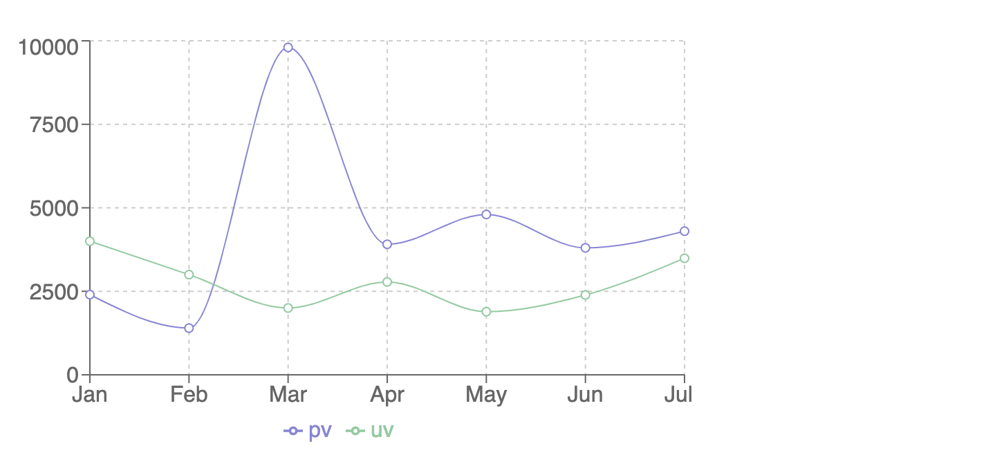
A bar chart represents data using rectangular bars, where the length of each bar corresponds to the data value. It is commonly used to compare different categories or data points.
import React from "react";
import {BarChart, Bar, XAxis, YAxis, CartesianGrid, Tooltip,Legend} from "recharts";

const BarChartComponent = () => {
const data = [
{ name: "Jan", uv: 4000, pv: 2400, amt: 2400 },
{ name: "Feb", uv: 3000, pv: 1398, amt: 2210 },
{ name: "Mar", uv: 2000, pv: 9800, amt: 2290 },
{ name: "Apr", uv: 2780, pv: 3908, amt: 2000 },
{ name: "May", uv: 1890, pv: 4800, amt: 2181 },
{ name: "Jun", uv: 2390, pv: 3800, amt: 2500 },
{ name: "Jul", uv: 3490, pv: 4300, amt: 2100 }
];

return (
<BarChart width={500} height={300} data={data}>
<CartesianGrid strokeDasharray="3 3" />
<XAxis dataKey="name" />
<YAxis />
<Tooltip />
<Legend />
<Bar dataKey="pv" fill="#8884d8" />
<Bar dataKey="uv" fill="#82ca9d" />
</BarChart>
);
};

export default BarChartComponent;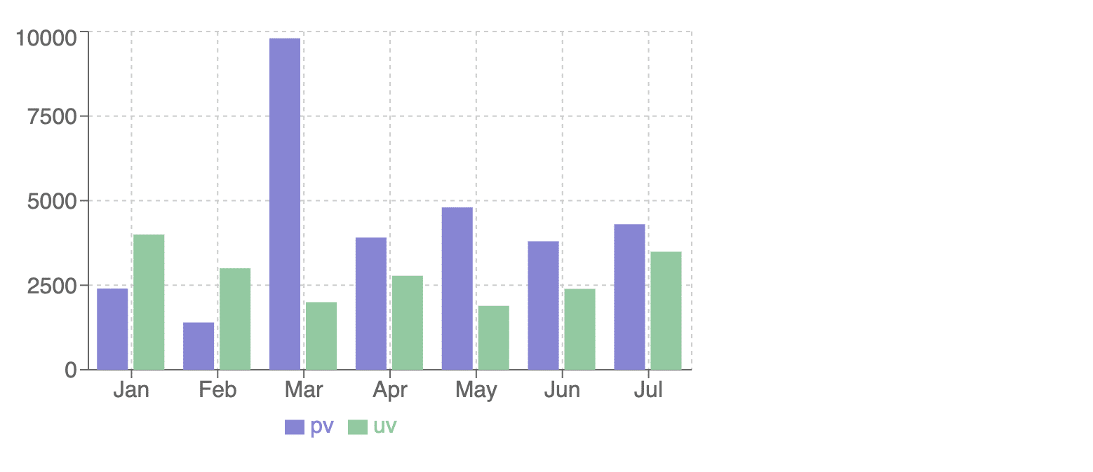
An area chart is similar to a line chart but also fills the area below the line with a solid color. It is useful for visualizing cumulative data or highlighting the magnitude of a variable.
import React from "react";
import { AreaChart, Area, XAxis, YAxis, CartesianGrid, Tooltip, Legend } from "recharts";

const AreaChartExample = () => {
const data = [
{ name: "Jan", uv: 4000, pv: 2400, amt: 2400 },
{ name: "Feb", uv: 3000, pv: 1398, amt: 2210 },
{ name: "Mar", uv: 2000, pv: 9800, amt: 2290 },
{ name: "Apr", uv: 2780, pv: 3908, amt: 2000 },
{ name: "May", uv: 1890, pv: 4800, amt: 2181 },
{ name: "Jun", uv: 2390, pv: 3800, amt: 2500 },
{ name: "Jul", uv: 3490, pv: 4300, amt: 2100 },
];

return (
<AreaChart width={500} height={300} data={data}>
<CartesianGrid strokeDasharray="3 3" />
<XAxis dataKey="name" />
<YAxis />
<Tooltip />
<Legend />
<Area type="monotone" dataKey="pv" fill="#8884d8" stroke="#8884d8" />
<Area type="monotone" dataKey="uv" fill="#82ca9d" stroke="#82ca9d" />
</AreaChart>
);
};

export default AreaChartExample;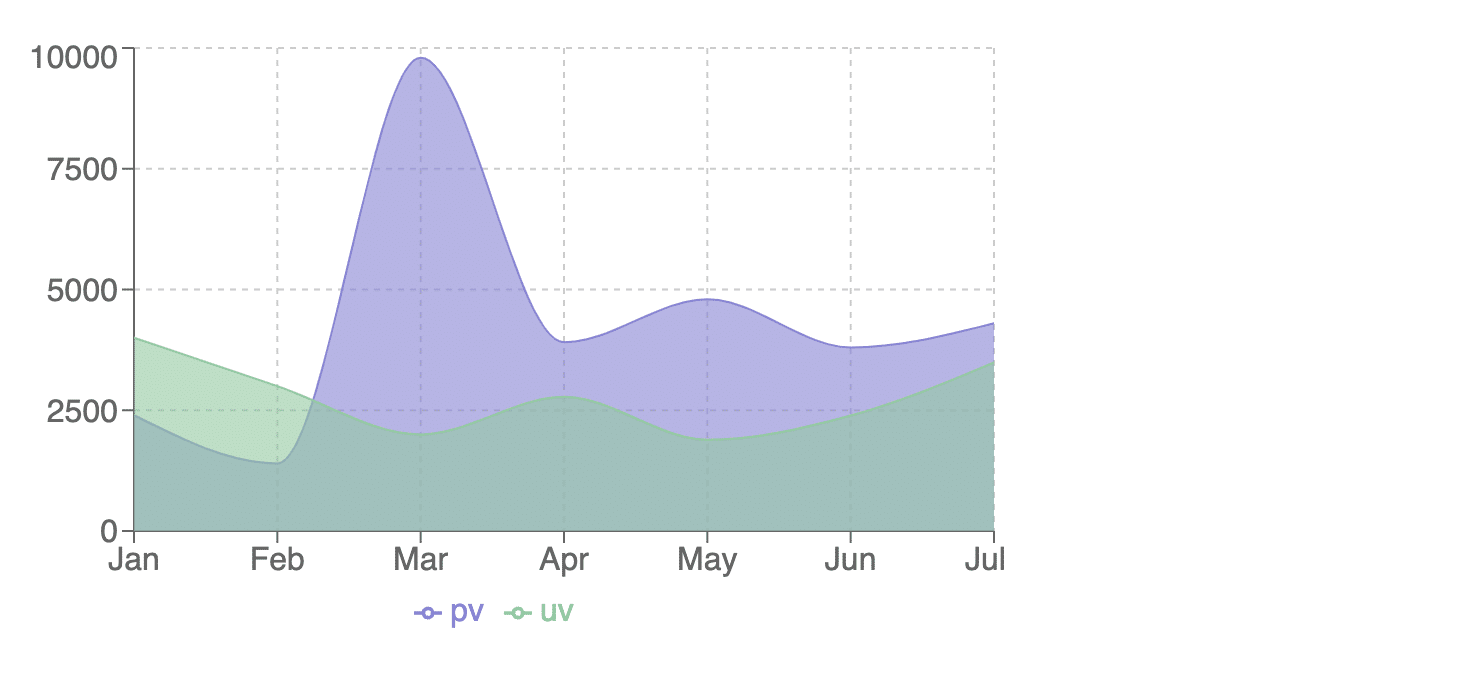
A scatter chart displays individual data points as dots or symbols in a coordinate system. It is suitable for visualizing relationships or correlations between two variables.
import React from "react";
import { ScatterChart, Scatter, XAxis, YAxis, CartesianGrid, Tooltip } from "recharts";

const ScatterChartExample = () => {
const data = [
{ x: 10, y: 30, z: 10 },
{ x: 30, y: 40, z: 20 },
{ x: 45, y: 80, z: 30 },
{ x: 50, y: 50, z: 40 },
{ x: 70, y: 70, z: 50 },
{ x: 80, y: 90, z: 60 },
];

return (
<ScatterChart width={500} height={300}>
<CartesianGrid />
<XAxis type="number" dataKey="x" name="X" />
<YAxis type="number" dataKey="y" name="Y" />
<Tooltip cursor={{ strokeDasharray: "3 3" }} />
<Scatter data={data} fill="#8884d8" />
</ScatterChart>
);
};

export default ScatterChartExample;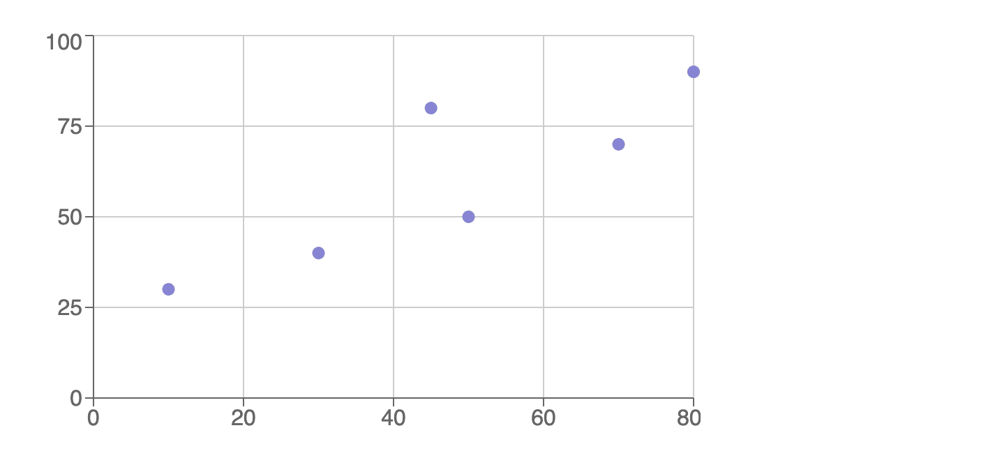
A pie chart represents data as slices of a circular pie, where the size of each slice represents the proportion of the whole. It is commonly used to show percentages or proportions.
import React from "react";
import { PieChart, Pie, Cell, Legend, Tooltip } from "recharts";

const PieChartExample = () => {
const data = [
{ name: "Apple", value: 400 },
{ name: "Orange", value: 300 },
{ name: "Banana", value: 200 },
{ name: "Mango", value: 500 },
{ name: "Pineapple", value: 100 },
];

const COLORS = ["#8884d8", "#82ca9d", "#ffc658", "#ff8042", "#888888"];

return (
<PieChart width={500} height={300}>
<Pie
data={data}
dataKey="value"
nameKey="name"
cx="50%"
cy="50%"
outerRadius={80}
fill="#8884d8"
>
{data.map((entry, index) => (
<Cell key={`cell-${index}`} fill={COLORS[index % COLORS.length]} />
))}
</Pie>
<Tooltip />
<Legend />
</PieChart>
);
};

export default PieChartExample;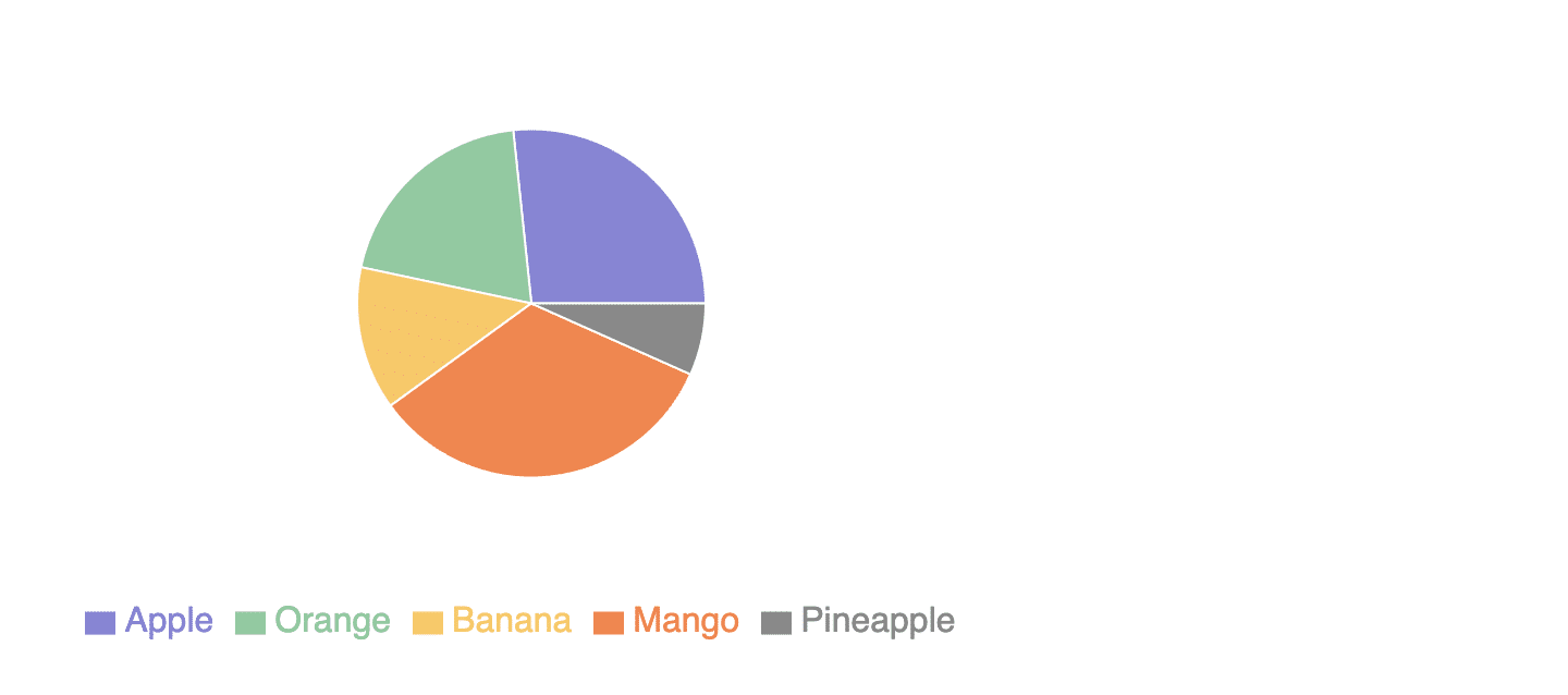
A radar chart displays data on a two-dimensional plane with multiple axes radiating from a central point. It is useful for comparing multiple variables across different categories.
import React from "react";
import { Radar, RadarChart, PolarGrid, Legend, PolarAngleAxis, PolarRadiusAxis } from "recharts";

const RadarChartExample = () => {
const data = [
{ subject: "Math", A: 120, B: 110, fullMark: 150 },
{ subject: "Science", A: 98, B: 130, fullMark: 150 },
{ subject: "English", A: 86, B: 130, fullMark: 150 },
{ subject: "History", A: 99, B: 100, fullMark: 150 },
{ subject: "Geography", A: 85, B: 90, fullMark: 150 },
{ subject: "Art", A: 65, B: 85, fullMark: 150 },
];

return (
<RadarChart width={500} height={300} data={data}>
<PolarGrid />
<PolarAngleAxis dataKey="subject" />
<PolarRadiusAxis angle={30} domain={[0, 150]} />
<Radar name="Student A" dataKey="A" stroke="#8884d8" fill="#8884d8" fillOpacity={0.6} />
<Radar name="Student B" dataKey="B" stroke="#82ca9d" fill="#82ca9d" fillOpacity={0.6} />
<Legend />
</RadarChart>
);
};

export default RadarChartExample;
Recharts allow you to compose multiple chart types together to create complex and customized visualizations. For example, you can combine a line chart with an area chart to show both trends and cumulative data.
import React from "react";
import {
LineChart,
Line,
BarChart,
Bar,
XAxis,
YAxis,
CartesianGrid,
Tooltip,
Legend,
} from "recharts";

const ComposedChartExample = () => {
const data = [
{ name: "Jan", uv: 4000, pv: 2400, amt: 2400 },
{ name: "Feb", uv: 3000, pv: 1398, amt: 2210 },
{ name: "Mar", uv: 2000, pv: 9800, amt: 2290 },
{ name: "Apr", uv: 2780, pv: 3908, amt: 2000 },
{ name: "May", uv: 1890, pv: 4800, amt: 2181 },
{ name: "Jun", uv: 2390, pv: 3800, amt: 2500 },
{ name: "Jul", uv: 3490, pv: 4300, amt: 2100 },
];

return (
<ComposedChart width={500} height={300} data={data}>
<CartesianGrid strokeDasharray="3 3" />
<XAxis dataKey="name" />
<YAxis />
<Tooltip />
<Legend />
<Line type="monotone" dataKey="uv" stroke="#8884d8" />
<Bar dataKey="pv" barSize={20} fill="#82ca9d" />
</ComposedChart>
);
};

export default ComposedChartExample;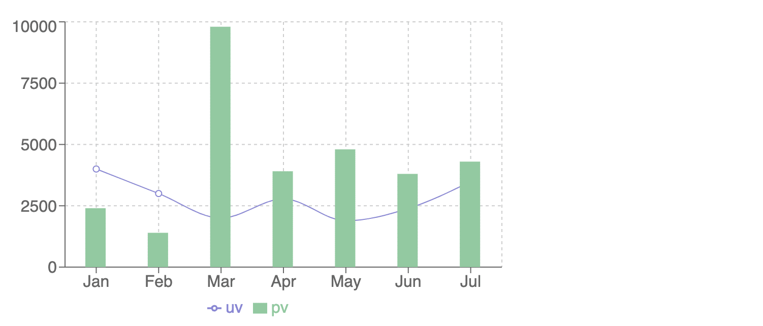
These are some of the commonly used chart types in Recharts, but the library also offers other chart types like scatter line chart, scatter area chart, treemap, radial bar chart, and more.
Additionally, Recharts provides various customization options, including axes, labels, tooltips, legends, and colors, to tailor the appearance and behavior of the charts to your specific needs.

The integration of recharts, along with its diverse range of chart types and similar libraries, offers a powerful solution for data visualization in React applications. With its intuitive design and easy-to-use features, recharts simplifies the process of creating interactive charts.
Whether you need to display complex data sets or communicate insights effectively, Recharts provides a flexible and efficient solution. By leveraging the capabilities of recharts, developers can enhance the visual appeal and functionality of their applications, making data analysis and presentation more accessible and engaging for users.
With its robust capabilities and user-friendly interface, Recharts stand as a valuable tool for developers seeking to elevate their data visualization efforts in React applications.

How to Effectively Hire and Manage a Remote Team of Developers.
Leave your competitors behind! Become an EPIC integration pro, and boost your team's efficiency.
Register Here

The Mindbowser team's professionalism consistently impressed me. Their commitment to quality shone through in every aspect of the project. They truly went the extra mile, ensuring they understood our needs perfectly and were always willing to invest the time to...

CTO, New Day Therapeutics
I collaborated with Mindbowser for several years on a complex SaaS platform project. They took over a partially completed project and successfully transformed it into a fully functional and robust platform. Throughout the entire process, the quality of their work...

President, E.B. Carlson
Mindbowser and team are professional, talented and very responsive. They got us through a challenging situation with our IOT product successfully. They will be our go to dev team going forward.

Founder, Cascada
Amazing team to work with. Very responsive and very skilled in both front and backend engineering. Looking forward to our next project together.

Co-Founder, Emerge
The team is great to work with. Very professional, on task, and efficient.

Founder, PeriopMD
I can not express enough how pleased we are with the whole team. From the first call and meeting, they took our vision and ran with it. Communication was easy and everyone was flexible to our schedule. I’m excited to...

Founder, Seeke
Mindbowser has truly been foundational in my journey from concept to design and onto that final launch phase.

CEO, KickSnap
We had very close go live timeline and Mindbowser team got us live a month before.

CEO, BuyNow WorldWide
If you want a team of great developers, I recommend them for the next project.

Founder, Teach Reach
Mindbowser built both iOS and Android apps for Mindworks, that have stood the test of time. 5 years later they still function quite beautifully. Their team always met their objectives and I'm very happy with the end result. Thank you!

Founder, Mindworks
Mindbowser has delivered a much better quality product than our previous tech vendors. Our product is stable and passed Well Architected Framework Review from AWS.

CEO, PurpleAnt
I am happy to share that we got USD 10k in cloud credits courtesy of our friends at Mindbowser. Thank you Pravin and Ayush, this means a lot to us.

CTO, Shortlist
Mindbowser is one of the reasons that our app is successful. These guys have been a great team.

Founder & CEO, MangoMirror
Kudos for all your hard work and diligence on the Telehealth platform project. You made it possible.

CEO, ThriveHealth
Mindbowser helped us build an awesome iOS app to bring balance to people’s lives.

CEO, SMILINGMIND
They were a very responsive team! Extremely easy to communicate and work with!

Founder & CEO, TotTech
We’ve had very little-to-no hiccups at all—it’s been a really pleasurable experience.

Co-Founder, TEAM8s
Mindbowser was very helpful with explaining the development process and started quickly on the project.

Executive Director of Product Development, Innovation Lab
The greatest benefit we got from Mindbowser is the expertise. Their team has developed apps in all different industries with all types of social proofs.

Co-Founder, Vesica
Mindbowser is professional, efficient and thorough.

Consultant, XPRIZE
Very committed, they create beautiful apps and are very benevolent. They have brilliant Ideas.

Founder, S.T.A.R.S of Wellness
Mindbowser was great; they listened to us a lot and helped us hone in on the actual idea of the app. They had put together fantastic wireframes for us.

Co-Founder, Flat Earth
Ayush was responsive and paired me with the best team member possible, to complete my complex vision and project. Could not be happier.

Founder, Child Life On Call
The team from Mindbowser stayed on task, asked the right questions, and completed the required tasks in a timely fashion! Strong work team!

CEO, SDOH2Health LLC
Mindbowser was easy to work with and hit the ground running, immediately feeling like part of our team.

CEO, Stealth Startup
Mindbowser was an excellent partner in developing my fitness app. They were patient, attentive, & understood my business needs. The end product exceeded my expectations. Thrilled to share it globally.

Owner, Phalanx
Mindbowser's expertise in tech, process & mobile development made them our choice for our app. The team was dedicated to the process & delivered high-quality features on time. They also gave valuable industry advice. Highly recommend them for app development...

Co-Founder, Fox&Fork