


 BLOGS
BLOGS  NEWSROOM
  CASE STUDIES
  WEBINARS
  PODCASTS
  ASSET HUB
  EVENT CALENDAR


Hey there, data enthusiasts (or maybe you’re just curious)!
Picture this: you’re drowning in numbers, spreadsheets overflowing, charts looking like alien hieroglyphics. You know there’s gold in there, valuable insights about your business, but how do you dig it out without getting buried alive in all this data?
In this blog, we’ve covered the benefits of data visualization Services, their uses for businesses, and a step-by-step data visualization process.
What is Data Visualization?
Data visualization is a method that uses static and interactive visuals to help people understand the large amount of data being collected. Data visualization is an important skill in applied statistics and machine learning. With some prior domain knowledge, storytelling with data will be helpful and insightful to you and your audience.
There are many benefits of data visualization that we talk about in this blog so stay tuned!
Why is Data Visualization Important?
Due to complexity and large amounts, simply understanding data in numeric format can be challenging for anyone.
That’s where the importance and benefits of data visualization come in! By transforming numerical data into easy-to-digest visuals, data visualizations (or as we call it, “storytelling with data”) unlock valuable insights.
- With the help of data visualization, decision-makers can easily understand how the data is being interpreted to determine business variations.
- A large amount of data is handled and visualized to establish patterns. Many meaningful insights and the evidence behind the data can be used to establish a business goal.
- Embracing Data Visualization Trends, visualizing data empowers managers to achieve growth and leverage emerging trends in business strategies.
- Data analysts’ job is to make it easy to make new decisions for business development and expansion by using trends from the data with the help of healthcare data visualization.
Benefits of Data Visualization
Data visualization is a potent tool for gleaning profound insights from complex data, informing impactful decisions, and fostering engagement across diverse audiences.
Understanding the benefits of data visualization:
- Pattern Recognition: Data visualization transforms unstructured data into a visual format, unveiling trends and outliers that numerical tables often do not know about.
- Accessibility: It allows complex data to become understandable to a wider audience, fostering collaboration and data-driven decision-making.
- Engaging Communication: Storytelling with data enhances retention and impact, making communication of insights more persuasive and memorable.
- Universal Language: Visualizations break language barriers, fostering universal understanding and effective communication across diverse audiences.
So when you think of the benefits of data visualization, these should come to your mind 😎
Why Python For Data Visualization?
Python has evolved extensively in every field, be it Automation, Machine Learning, Testing, Scraping, etc.
One of the benefits of data visualization with Python is that there are many visualization tools/libraries that provide excellent features and are easy to implement. It includes support for all types of visual, live, customized charts.
Worth mentioning, below are some of the most used Python libraries for data visualization:
- Matplotlib: It is a low-level library that provides much freedom to customize.
- Pandas Visualization: Built on Matplotlib, It has an easy-to-use interface and makes visualization a breeze.
- Seaborn: It has a high-level interface and also has great default styles.
- Bokeh: Supports unique visualizations like Network graphs, Geospatial plots, etc.
- Plotly: It can create interactive plots.
Step-By-Step-Data Visualization Process
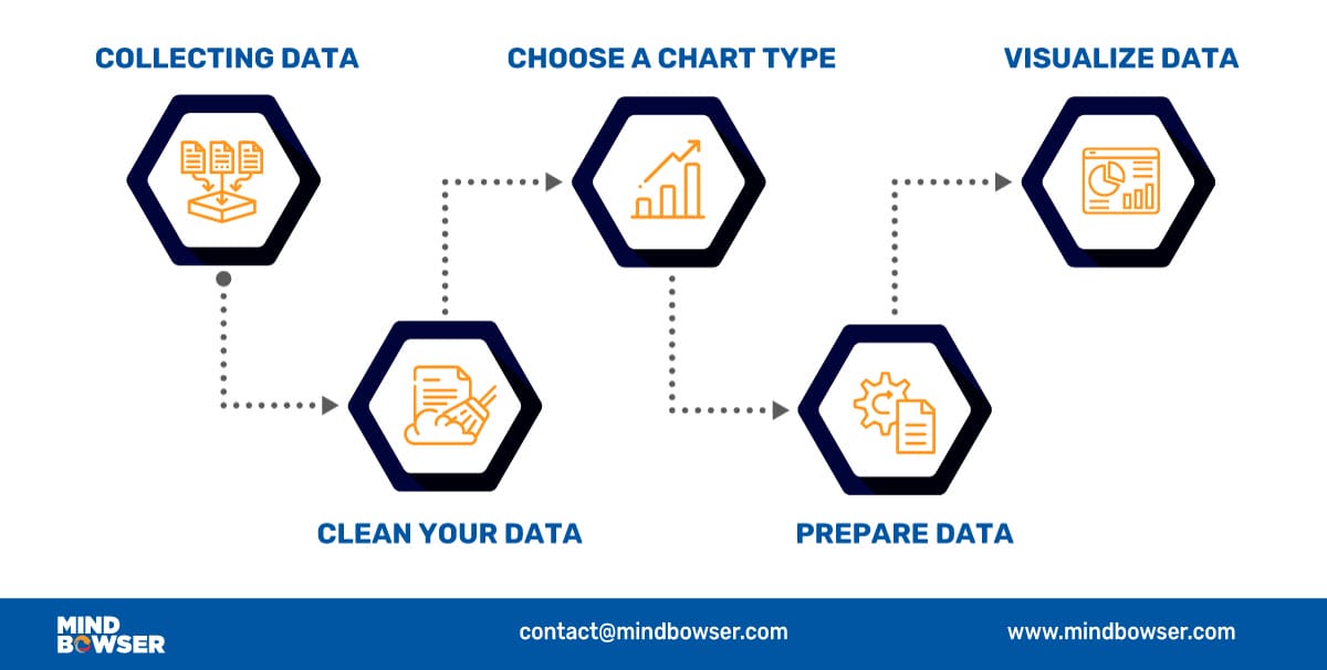
- Collecting Data
The first and most important step of data visualization is gathering data in large amounts. Only after we have substantial data can we apply data visualization techniques to the collected data and get some helpful insights from it.
- Clean Your Data
Data cleaning is an essential step to perform before creating a visualization. A bunch of data out of a large dataset that has inappropriate, empty, or false values may lead to adding erroneous visuals with anomalies in it.
The output received from a data cleaning process is usually a dataset that is free of errors and anomalies etc, which gives much more accuracy when data is processed. Data cleaning is pretty much dependent on the dataset domain that you’re working with.
- Choose A Chart Type
Before choosing a visual chart or graph, it is important to understand your audience and choose a chart or graph that will best communicate the message.
Choosing a chart depends on what findings you need to convey to your audience.
- Do you want to show how merging data columns can give meaningful insights?
- Do you want to show some data patterns from the datasets?
- Do you want to show how data variables are compared to each other?
- Do you want to show the relationships between the data variables?
Choosing a couple of these can help to select the charts that will be best suitable for you. This usually requires some playing around with different charts before choosing the best. These selections lead to showing that the benefits of data visualization are expansive.
- Prepare Data
To prepare the data before sending it further for visualization, determine the type of graph, chart, or any other visualizations you need to create and the supporting library you will be integrating for it. After the chart is finalized, it may be necessary to transform the data as per requirements.
Data preparation tasks include finding data columns that help make some decisions, giving meaningful insights about data, grouping data, creating aggregate values for groups, combining variables to create new columns, etc.
- Visualize Data
In the final step, you’ll have the required data to create visualizations. Now we apply visualization skills to the prepared data and represent the data in charts or graphs with meaningful insights. After we’re finished, we’ll present it to you so you can see what we’ve discovered!
This way, storytelling with data helps to put forth your understanding of the data in a simple & visual format.
Types Of Data Visualization Charts
Now that we understand how the data visualization process works, we can apply different data visualization types to their uses. As mentioned in the earlier section, by using those visualization libraries, we can create some visualizations as follows:
- Line Chart
Line charts are used to display trends over time. The X-axis usually represents a period, and the Y-axis represents the quantity associated with the period on the X-axis. For example, an A-line chart can illustrate a shopping mall’s peak visit time for the day broken down by weekdays and hours.
- Area Chart
An area chart is a line chart with the areas below the lines filled with colors. Use a stacked area chart to display each value’s contribution to a total over some time.
- Bar Chart
A bar chart also displays trends over time. In the case of multiple variables, a bar chart can make it easier to compare the data for each variable at every moment. E.g., a bar chart can compare the company’s growth year-wise.
- Histogram
A histogram represents data using bars of different heights. Usually, each bar groups numbers into ranges in a histogram. The taller the bars, the more data falls in that range.
It displays the shape and spread of continuous data set samples. E.g., we can use a histogram to measure each answer’s frequency in a survey question. The bars would be the answer: “bad,” “good,” and “best.”
- Scatter Plot
Scatter plots are used when there is a need to find correlations. If a data XY exists, then a Scatter plot is used to find the relationship between variables X and Y.
- Bubble Chart
The bubble chart evolved from a scatter plot. Unlike scatter plots, each data point is assigned a label or category and shown as a bubble. It is used to show and compare the relationship between the labeled circles. A bubble chart makes it hard to read with multiple bubbles, so it has a limited data set size capacity.
- Pie Chart
A pie chart is a circular graph representing the data set in which the pie slices are divided to represent a numeric proportion. Pie charts are used when there is a need to show the contribution of a data point inside a whole data set.
- Gauge
A gauge chart is evolved from a pie chart and doughnut chart. It is used to visualize the distance between intervals. Multiple gauge charts can be shown linearly to visualize the difference between multiple intervals.
- Map
Most of the data collected have a location variable, which makes it easy to plot on a map. , e.g., a map visualization is mapping the number of customers worldwide, country-wise, where each country would represent several customers. Location information can help businesses grow in a region where the business has not scattered compared to other regions.
- Heat Map
A heat map is a visualization tool that uses color, like a bar chart’s height and width. Two dimensions are shown as the magnitude of a phenomenon. The heat map can identify whether the phenomenon is clustered or varies over space.
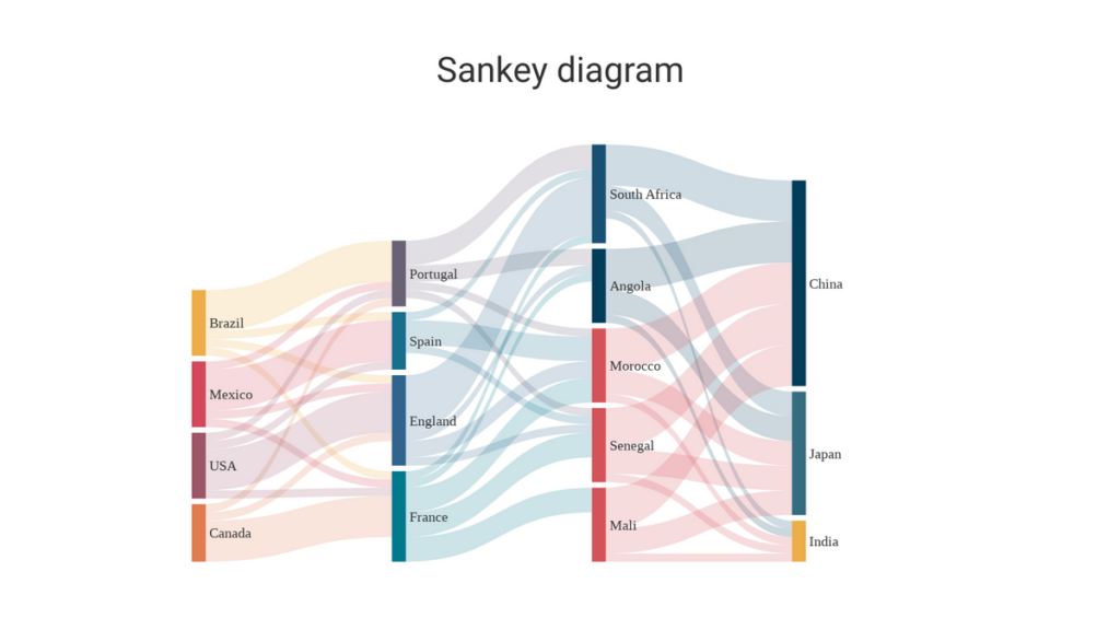
- Sankey Diagrams
These show the flow of data between different categories. For example, this Sankey diagram shows the flow of migrants between different countries
Data Visualization Examples
Here are some real-world benefits of data visualization:
Tracking COVID-19 Cases: Interactive maps showing the spread of COVID-19 cases by location, often color-coded based on severity, help people understand the pandemic’s geographical impact and guide public health decisions. (Example: Johns Hopkins Coronavirus Resource Center)
Financial Market Performance: Line charts and heatmaps display stock prices, market fluctuations, and investment opportunities, aiding financial analysts and investors in making informed decisions.
Streaming Service Recommendations: Streaming services like Netflix and Spotify use data visualizations to personalize recommendations. Scatter plots analyze your viewing history to identify preferred genres and actors. Bar charts highlight trending movies and shows, while heat maps suggest similar content based on your watchlist.
Why Mindbowser?
Our experience and agile team of full-stack engineers, data scientists, and mobile app developers accelerate innovation and implementation of customization ML and AI products.
Our experts bring vast cross-industry expertise supported by scientific rigor and in-depth knowledge of advanced techniques to design, develop, and deploy bespoke Artificial Intelligence solutions.
Interested in harnessing the power of specialized tools for data visualization? Learn more about how you can leverage data visualization and the benefits of data visualization with tools like Power BI in our article on Data Visualization with Power BI.

Meet Our Tech expert
Sandeep Natoo
Sandeep is a highly experienced Python Developer with 15+ years of work experience developing heterogeneous systems in the IT sector. He is an expert in building integrated web applications using Java and Python. With a background in data analytics. Sandeep has a knack for translating complex datasets into meaningful insights, and his passion lies in interpreting the data and providing valuable predictions with a good eye for detail.
Conclusion
Data visualization is the formal practice of translating complex data into readily interpretable visual representations.
Charts, graphs, and maps transform complex information into an accessible format, facilitating analysis, communication, and data-driven decision-making across various domains. This leads to storytelling with data which helps decision-makers make tough decisions more easily.
Data visualization is a potent tool for gleaning profound insights from complex data, informing impactful decisions, and fostering engagement across diverse audiences.
Why is it crucial in data visualization services?
- Pattern Recognition: Data visualization transforms raw data into a visual narrative, unveiling hidden trends and outliers that numerical tables often obscure.
- Accessibility: It democratizes data by making complex information understandable to a wider audience, fostering collaboration and data-driven decision-making.
- Engaging Communication: By leveraging the human brain’s affinity for visuals, data visualization enhances retention and impact, making communication of insights more persuasive and memorable.
- Universal Language: Visualizations transcend language barriers, fostering global understanding and effective communication across diverse audiences.
The benefits of data visualization are:
- Enhanced Decision-Making: Transform complex data into clear visuals, revealing hidden patterns and trends to inform strategic choices.
- Improved Communication: Foster collaboration and understanding by presenting information in an accessible and engaging format for all stakeholders.
- Increased Efficiency: Simplify data analysis and interpretation, enabling faster and more informed decision-making across all levels.
- Boosted Performance: Identify areas for improvement and track progress towards goals through intuitive dashboards and performance indicators.
- Greater Transparency: Build trust and accountability by sharing data insights clearly and effectively with stakeholders.
The different types of data visualization charts are:
- Line Chart
- Area Chart
- Bar Chart
- Histogram
- Scatter Plot
- Bubble Chart
- Pie Chart
- Gauge
- Map
- Heatmap
- Sankey Diagram
- Enhanced understanding
- Simplifies complex data
- Reveals hidden patterns and trends
- Improved communication
- Engages the audience and helps with comprehension
- Power of Storytelling with data
- Informed decision-making
- Data-driven approach
- Performance measurement and identification of opportunities
- Accessibility and efficiency
- Increased information access
- Improved productivity and resource management


