Flutter layout system is powerful and flexible, and with the right tools, it can be easy to use as well. In this article, we’ll provide you with a variety of code snippets and examples to help you get started with Flutter layouts.
Whether you’re a beginner just learning the ropes or an experienced developer looking for inspiration, this flutter layout cheat sheet has something for everyone. We’ll focus on using Flutter widgets to create simple and complex layouts, and we’ll be constantly expanding our sample catalog to include more and more examples.
Row And Columns
MainaxisAlignment
Row /*or Column*/(

  mainAxisAlignment: MainAxisAlignment.start,

  children: <Widget>[

    Icon(Icons.back, size: 40),

    Icon(Icons.back, size: 40),

    Icon(Icons.back, size: 40),

  ],

),

Row /*or Column*/(

  mainAxisAlignment: MainAxisAlignment.center,

  children: <Widget>[

    Icon(Icons.back, size: 40),

    Icon(Icons.back, size: 40),

    Icon(Icons.back, size: 40),

  ],

),
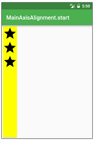
Row /*or Column*/(

  mainAxisAlignment: MainAxisAlignment.end,

  children: <Widget>[

    Icon(Icons.back, size: 40),

    Icon(Icons.back, size: 40),

    Icon(Icons.back, size: 40),

  ],

),
Row /*or Column*/(

  mainAxisAlignment: MainAxisAlignment.spaceBetween,

  children: <Widget>[

    Icon(Icons.back, size: 40),

    Icon(Icons.back, size: 40),

    Icon(Icons.back, size: 40),

  ],

),
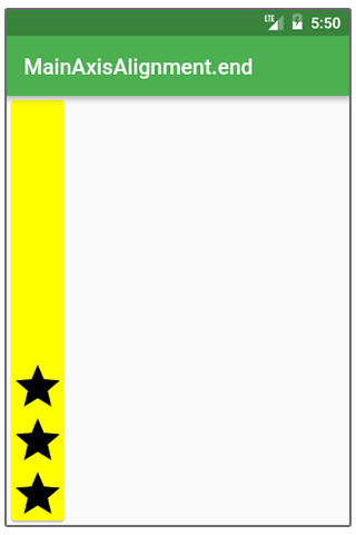
Row /*or Column*/(

  mainAxisAlignment: MainAxisAlignment.spaceEvenly,

  children: <Widget>[

    Icon(Icons.back, size: 40),

    Icon(Icons.back, size: 40),

    Icon(Icons.back, size: 40),

  ],

),
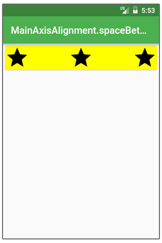
Row /*or Column*/(

  mainAxisAlignment: MainAxisAlignment.spaceAround,

  children: <Widget>[

    Icon(Icons.back, size: 40),

    Icon(Icons.back, size: 40),

    Icon(Icons.back, size: 40),

  ],

),
LinearGradient, RadialGradient, and SweepGradient are the three different forms of gradients.
Row(

  crossAxisAlignment: CrossAxisAlignment.baseline,

  textBaseline: TextBaseline.alphabetic,

  children: <Widget>[

    Text(

      “Mindbowser”,

      style: Theme.of(context).textTheme.colortheme(),

    ),

    Text(

       “Mindbowser”,

      style: Theme.of(context).textTheme.redshade(),

    ),

  ],

),
CrossAxisAlignment
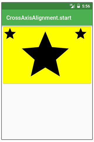
Row /*or Column*/(

  crossAxisAlignment: CrossAxisAlignment.start,

  children: <Widget>[

    Icon(Icons.star, size: 40),

    Icon(Icons.star, size: 150),

    Icon(Icons.star, size: 40),

  ],

),
Row /*or Column*/(

  crossAxisAlignment: CrossAxisAlignment.center,

  children: <Widget>[

    Icon(Icons.star, size: 40),

    Icon(Icons.star, size: 150),

    Icon(Icons.star, size: 40),

  ],

),
Row /*or Column*/(

  crossAxisAlignment: CrossAxisAlignment.end,

  children: <Widget>[

    Icon(Icons.star, size: 40),

    Icon(Icons.star, size: 150),

    Icon(Icons.star, size: 40),

  ],

),
Row /*or Column*/(

  crossAxisAlignment: CrossAxisAlignment.stretch,

  children: <Widget>[

    Icon(Icons.star, size: 40),

    Icon(Icons.star, size: 150),

    Icon(Icons.star, size: 40),

  ],

),
MainAxisSize
Row /*or Column*/(

  mainAxisSize: MainAxisSize.max,

  children: <Widget>[

    Icon(Icons.star, size: 40),

    Icon(Icons.star, size: 40),

    Icon(Icons.star, size: 40),

  ],

),
Row /*or Column*/(

  mainAxisSize: MainAxisSize.min,

  children: <Widget>[

    Icon(Icons.star, size: 40),

    Icon(Icons.star, size: 40),

    Icon(Icons.star, size: 40),

  ],

),
IntrinsicWidth And IntrinsicHeight
Do you want every widget in a row or column to match the biggest widget’s height or width? Look no further!
If your layout is of this type:
Widget build(BuildContext context) {

  return Scaffold(

    appBar: AppBar(title: Text(‘Mindbowser’)),

    body: Center(

      child: Column(

        children: <Widget>[

          RaisedButton(

            onPressed: () {},

            child: Text(“Small”),

          ),

          RaisedButton(

            onPressed: () {},

            child: Text('Larger’'),

          ),

          RaisedButton(

            onPressed: () {},

            child: Text('The raised button'),

          ),

        ],

      ),

    ),

  );

}
However, if you want every button to be the widest possible, use intrinsicwidth:
Widget build(BuildContext context) {

  return Scaffold(

    appBar: AppBar(title: Text(‘Mindbowser’)),

    body: Center(

      child: IntrinsicWidth(

        child: Column(

          crossAxisAlignment: CrossAxisAlignment.stretch,

          children: <Widget>[

            RaisedButton(

              onPressed: () {},

              child: Text(‘Small Text’),

            ),

            RaisedButton(

              onPressed: () {},

              child: Text('Longer Text'),

            ),

            RaisedButton(

              onPressed: () {},

              child: Text('Raised Button'),

            ),

          ],

        ),

      ),

    ),

  );

}
Use a combination of IntrinsicHeight and Row widgets if you have a similar issue but prefer to have all the widgets the same height as the tallest.
Stack
Ideal for layering Widgets on top of one another.
@override

Widget build(BuildContext context) {

  Widget main = Scaffold(

    appBar: AppBar(title: Text(‘Mindbowser’)),

  );


  return Stack(

    fit: StackFit.expand,

    children: <Widget>[

      main,

      Banner(

        message: "Banner Top ",

        location: BannerLocation.topStart,

      ),

      Banner(

        message: "Banner End",

        location: BannerLocation.topEnd,

      ),

      Banner(

        message: "Bottom Start",

        location: BannerLocation.bottomStart,

      ),

      Banner(

        message: "Bottom End",

        location: BannerLocation.bottomEnd,

      ),

    ],

  );

}
It will help if you put your widgets in a positioned widget.
Widget build(BuildContext context) {

  return Scaffold(

    appBar: AppBar(title: Text(‘Mindbowser’)),

    body: Stack(

      fit: StackFit.expand,

      children: <Widget>[

        Material(color: Colors.redAccent),

        Positioned(

         top: 0,

          left: 0,

          child: Icon(Icons.star, size: 40),

        ),

        Positioned(

          top: 259,

          left: 150,

          child: Icon(Icons.call, size: 40),

        ),

      ],

    ),

  );

}
You can use LayoutBuilder to get the top/bottom numbers if you want to avoid hazarding a guess.
Widget build(BuildContext context) {

  const iconSize = 40;

  return Scaffold(

    appBar: AppBar(title: Text('Mindbowser Layout Text')),

    body: LayoutBuilder(

      builder: (context, constraints) =>

        Stack(

          fit: StackFit.expand,

          children: <Widget>[

            Material(color: Colors.redAccent),

            Positioned(

              top: 0,

              child: Icon(Icons.back, size: iconSize),

            ),

            Positioned(

              top: constraints.maxHeight - iconSize,

              left: constraints.maxWidth - iconSize,

              child: Icon(Icons.phone, size: iconSize),

            ),

          ],

        ),

    ),

  );

}
Expanded
Expanded works well for dividing space between numerous things and is compatible with Flex-Flexbox architecture.
Row(

  children: <Widget>[

    Expanded(

      child: Container(

        decoration: const BoxDecoration(color: Colors.yellow),

      ),

      flex: 4,

    ),

    Expanded(

      child: Container(

        decoration: const BoxDecoration(color: Colors.gray),

      ),

      flex: 3,

    ),

    Expanded(

      child: Container(

        decoration: const BoxDecoration(color: Colors.orange),

      ),

      flex: 2,

    ),

  ],

),
ConstrainedBox
Most widgets will utilize the least amount of space feasible by default:
Card(child: const Text('Hey There!!!!'), color: Colors.red)A widget can use the remaining space however they like with ConstrainedBox.
ConstrainedBox(

  constraints: BoxConstraints.expand(),

  child: const Card(

    child: const Text('Hey There!'),

    color: Colors.orange,

  ),

),
When using BoxConstraints, you can limit the minimum and maximum height and width that a widget can have.
BoxConstraints. If not supplied, expand uses limitless (all available) space:
ConstrainedBox(

  constraints: BoxConstraints.expand(height: 500),

  child: const Card(

    child: const Text('Hey There!'),

    color: Colors.red,

  ),

),
And it’s the same as:
ConstrainedBox(

  constraints: BoxConstraints(

    minWidth: double.infinity,

    maxWidth: double.infinity,

    minHeight: 400,

    maxHeight: 400,

  ),

  child: const Card(

    child: const Text('Hey There!'),

    color: Colors.red,

  ),

),
Align
Sometimes it’s not easy to adjust our widget to the right size; for instance, it keeps stretching when you don’t want it to:
As an illustration, the following occurs when you only want the button not to be extended and you have a Column with CrossAxisAlignment.stretch:
Widget build(BuildContext context) {

  return Scaffold(

    appBar: AppBar(title: Text('Align is here’')),

    body: Column(

      crossAxisAlignment: CrossAxisAlignment.stretch,

      children: <Widget>[

        Align(

          child: RaisedButton(

            onPressed: () {},

            child: const Text(‘Raised button’),

          ),

        ),

      ],

    ),

  );

}
Always try wrapping your widget with align first when it refuses to obey the constraints you try to set up.
Container
One of the most popular Widgets, and for a good reason:
The container as a tool for layout
When you don’t provide the container’s height and width, it will be the same size as its child.
Widget build(BuildContext context) {

  return Scaffold(

    appBar: AppBar(title: Text('Mindbowser’')),

    body: Container(

      color: Colors.redAccent,

      child: Text("Hey"),

    ),

  );

}
Use double to expand the Container such that it matches its parent. For the qualities of height and width, infinite.
Widget build(BuildContext context) {

  return Scaffold(

    appBar: AppBar(title: Text('Mindbowser')),

    body: Container(

      height: double.infinity,

      width: double.infinity,

      color: Colors.redAccent,

      child: Text("Hey"),

    ),

  );

}
Hire Flutter Developers at your Ease
Container As Decoration
The color attribute can affect the container’s background, as well as decoration and foregroundDecoration. (With those two parameters, you can completely alter how the container appears, but I’ll cover alternative decorations in more detail later.)
Foreground decoration is usually on top of the child, while the decoration is always behind the child.
Decoration
Widget build(BuildContext context) {

  return Scaffold(

    appBar: AppBar(title: Text('Mindbowser text')),

    body: Container(

      height: double.infinity,

      width: double.infinity,

      decoration: BoxDecoration(color: Colors.redAccent),

      child: Text("Hi"),

    ),

  );

}


decoration and foregroundDecoration

Widget build(BuildContext context) {

  return Scaffold(

    appBar: AppBar(title: Text('Container.foregroundDecoration')),

    body: Container(

    height: double.infinity,

      width: double.infinity,

      decoration: BoxDecoration(color: Colors.redAccent),

      foregroundDecoration: BoxDecoration(

        color: Colors.yellow.withOpacity(0.5),

      ),

      child: Text("Hi"),

    ),

  );

}
Container as Transform
You can use the transform property directly from the Container if you want to update your layout with something other than the Transform widget.
Widget build(BuildContext context) {

  return Scaffold(

    appBar: AppBar(title: Text(‘Mindbowser’)),

    body: Container(

      height: 200,

      width: 200,

      transform: Matrix4.rotationZ(pi / 3),

      decoration: BoxDecoration(color: Colors.redAccent),

      child: Text(

        "Hey",

        textAlign: TextAlign.center,

      ),

    ),

  );

}
BoxDecoration
The decoration is typically applied to a Container widget to alter the appearance of the container.
image: DecorationImage
Puts an image as a background:
Scaffold(

  appBar: AppBar(title: Text('Mindbowser’)),

  body: Center(

    child: Container(

      height: 200,

      width: 200,

      decoration: BoxDecoration(

        color: Colors.red,

        image: DecorationImage(

          fit: BoxFit.fitWidth,

          image: NetworkImage(

            'https://flutter.io/images/background.png',

          ),

        ),

      ),

    ),

  ),

);
border: Border
Specifies what should the border of the Container looks like.
Scaffold(

  appBar: AppBar(title: Text(‘Mindbowser’)),

  body: Center(

    child: Container(

      height: 400,

      width: 400,

      decoration: BoxDecoration(

        color: Colors.red,

        border: Border.all(color: Colors.black, width: 4),

      ),

    ),

  ),

);
borderRadius: BorderRadius
Enables border corners to be rounded.
If the decoration is in the form of a BoxShape.circle, borderRadius will not function.
Scaffold(

  appBar: AppBar(title: Text(Mindbowser’')),

  body: Center(

    child: Container(

      Height: 300,

      width: 300,

      decoration: BoxDecoration(

        color: Colors.red,

        border: Border.all(color: Colors.black, width: 2),

        borderRadius: BorderRadius.all(Radius.circular(20));

      ),

    ),

  ),

);
shape: BoxShape
Box decoration can be either a rectangle/square or an ellipse/circle.
For any other shape, you can use ShapeDecoration instead of BoxDecoration.
Scaffold(

  appBar: AppBar(title: Text('MINDBOWSER’)),

  body: Center(

    child: Container(

      height: 300,

      width: 300,

      decoration: BoxDecoration(

        color: Colors.red,

        shape: BoxShape.circle,

      ),

    ),

  ),

);
boxShadow: List<BoxShadow>
Adds shadow to the Container.
This parameter is a list because you can specify multiple different shadows and merge them together.
Scaffold(

  appBar: AppBar(title: Text(‘Mindbowser')),

  body: Center(

    child: Container(

      height: 300,

      width: 300,

      decoration: BoxDecoration(

        color: Colors.red,

        boxShadow: const [

          BoxShadow(blurRadius: 25),

        ],

      ),

    ),

  ),

);
gradient
LinearGradient, RadialGradient, and SweepGradient are the three different forms of gradients.
LinearGradient
Scaffold(

  appBar: AppBar(title: Text('gradient: LinearGradient')),

  body: Center(

    child: Container(

      height: 200,

      width: 200,

      decoration: BoxDecoration(

        gradient: LinearGradient(

          colors: const [

            Colors.red,

            Colors.blue,

          ],

        ),

      ),

    ),

  ),

);
RadialGradient
Scaffold(

  appBar: AppBar(title: Text('Mindbowser’')),

  body: Center(

    child: Container(

      height: 300,

      width: 300,

      decoration: BoxDecoration(

        gradient: RadialGradient(

          colors: const [Colors.green, Colors.orange],

          stops: const [0.5, 1.5],

        ),

      ),

    ),

  ),

);
SweepGradient
Scaffold(

  appBar: AppBar(title: Text('Mindbowser’')),

  body: Center(

    child: Container(

      height: 300,

      width: 300,

      decoration: BoxDecoration(

        gradient: SweepGradient(

          colors: const [

            Colors.red,

            Colors.grey,

            Colors.skyblue,

            Colors.lightgreen,

            Colors.yellow,

        ],

          stops: const [0.0, 0.5, 0.3, 0.9, 1.5],

        ),

      ),

    ),

  ),

);
backgroundBlendMode
BoxDecoration’s backgroundBlendMode is its most intricately detailed attribute. It is in charge of blending the BoxDecoration’s color/gradient scheme with the surface it is placed on.
You can utilize a sizable number of the algorithms listed in the BlendMode enum with backgroundBlendMode.
Set BoxDecoration to foregroundDecoration, which will be drawn on top of the Container’s child first (whereas decoration is pulled behind the child).
Scaffold(

  appBar: AppBar(title: Text(‘Mindbowser’)),

  body: Center(

    child: Container(

      height: 300,

      width: 300,

      foregroundDecoration: BoxDecoration(

        backgroundBlendMode: BlendMode.exclusion,

        gradient: LinearGradient(

          colors: const [

            Colors.orange,

            Colors.green,

          ],

        ),

      ),

      child: Image.network(

        'https://flutter.io/images/background.png',

      ),

    ),

  ),

);
The effect of backgroundBlendMode extends beyond the Container it is contained in.
Anything above the Container in the widget tree has its color changed by the backgroundBlendMode setting.
A parent Container draws an image, and a child Container employs backgroundBlendMode in the code below. You would nevertheless have the same result as before.
Scaffold(

  appBar: AppBar(title: Text(‘Mindbowser’)),

  body: Center(

    child: Container(

      decoration: BoxDecoration(

        image: DecorationImage(

          image: NetworkImage(

            'https://flutter.io/images/background.png',

          ),

        ),

      ),

      child: Container(

        height: 300,

        width: 300,

        foregroundDecoration: BoxDecoration(

      backgroundBlendMode: BlendMode.exclusion,

          gradient: LinearGradient(

            colors: const [

              Colors.orange,

              Colors.green,

            ],

          ),

        ),

      ),

    ),

  ),

);
Material
Border with cut corners
Scaffold(

  appBar: AppBar(title: Text('shape: BeveledRectangleBorder')),

  body: Center(

    child: Material(

      shape: const BeveledRectangleBorder(

        borderRadius: BorderRadius.all(Radius.circular(30)),

        side: BorderSide(color: Colors.grey, width: 6),

      ),

      color: Colors.blue,

      child: Container(

        height: 300,

        width: 300,

      ),

    ),

  ),

);
Slivers
SliverFillRemaining
When you want to centre your content even when there isn’t enough room for it, this widget is indispensable. Interactive illustration.
Scaffold(

  appBar: AppBar(title: Text(‘Mindbowser’)),

  body: CustomScrollView(

    slivers: [

      SliverFillRemaining(

        hasScrollBody: false,

        child: Column(

          mainAxisAlignment: MainAxisAlignment.center,

          children: const [

            FlutterLogo(size: 300),

            Text(

              'Center word’

              'logo',

              textAlign: TextAlign.center,

            ),

          ],

        ),

      ),

    ],

  ),

);
If there is not enough room for the content to be in the center, SliverFillRemaining will scroll:
Without SliverFillRemaining, the content would have overflowed as follows:
An insufficient space without SliverFillRemaining
completing the empty spot
In addition to helping you center your content, SliverFillRemaining will fill the empty viewport space. This widget must be positioned in CustomScrollView as the last sliver to accomplish that.
If there is insufficient room, the widget becomes scrollable:
Scaffold(

  appBar: AppBar(title: Text('SliverFillRemaining')),

  body: CustomScrollView(

    slivers: [

      SliverList(

        delegate: SliverChildListDelegate(const [

          ListTile(title: Text(‘List text 1')),

          ListTile(title: Text('‘List text 2')),

          ListTile(title: Text(‘List text 3')),

          ListTile(title: Text(‘List text 4’)),

        ]),

      ),

      SliverFillRemaining(

        hasScrollBody: false,

        child: Container(

          color: Colors.redAccent,

          child: Column(

            mainAxisAlignment: MainAxisAlignment.center,

            children: const [

              FlutterLogo(size: 300),

              Text(

                'Centered Text’'

                'logo',

                textAlign: TextAlign.center,

              ),

            ],

          ),

        ),

      ),

    ],

  ),

);
SizedBox
One of the easiest yet most practical Widgets is this one.
ConstrainedBox as SizedBox
ConstrainedBox and SizedBox can both function in a similar ways.
SizedBox as padding
You can use the Padding or Container widgets to add margin or padding as necessary. However, they might need to be more understandable and verbose than introducing a Sizedbox.
Column(

  children: <Widget>[

    Icon(Icons.star, size: 70),

    const SizedBox(height: 200),

    Icon(Icons.star, size: 70),

    Icon(Icons.star, size: 70),

  ],

),
Because SizedBox has a const constructor, using const SizedBox() is cheap**
SafeArea
We should avoid drawing in some regions on various platforms, such as the Notch on the iPhone X or the Status Bar on Android.
SafeArea widget answers this issue (see examples with and without SafeArea).
Widget build(BuildContext context) {

  return Material(

    color: Colors.green,

    child: SafeArea(

      child: SizedBox.expand(

        child: Card(color: Colors.redAccent),

      ),

    ),

  );

}

Conclusion
In summary, using the Opacity widget with an opacity value of 0.0 is a less expensive option for hiding a widget in Flutter. However, it is important to note that this method does not completely remove the widget from the layout, as it will still occupy space even though it is invisible.
If you need to completely remove the widget from the layout and free up the occupied space, you may need to consider using a different approach, such as removing the widget from the tree entirely or using a different layout widget.


