













 BLOGS
BLOGS  NEWSROOM
  CASE STUDIES
  WEBINARS
  PODCASTS
  ASSET HUB
  EVENT CALENDAR
























TL;DR
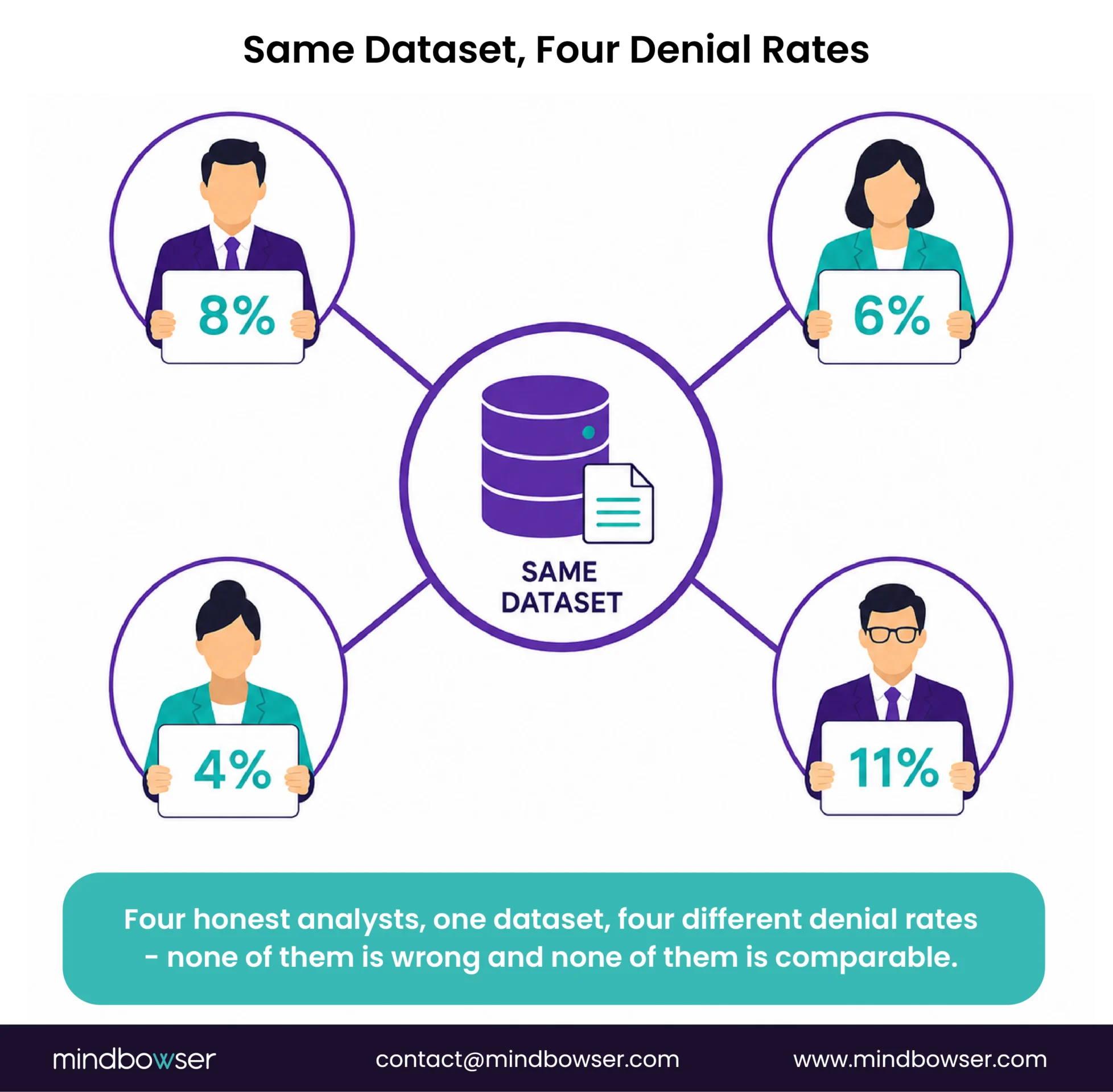
Improvement programs stall because nobody agreed what they were measuring before they started. Two organizations can both report a 6% denial rate and mean materially different things, which is why HFMA had to convene a task force to standardize the definition. Pick standard definitions first, instrument against them, then improve, and use the 29 HFMA MAP Keys rather than inventing your own.
I have watched a lot of revenue cycle improvement programs, and the ones that fail rarely fail at the improving. They fail about nine months in, in a meeting where two people discover they have been measuring different things the whole time.
The pattern is consistent enough that I now ask about it first. Someone presents a chart showing denial rate falling from 8% to 6%. Someone else says their number was 4% and has not moved. Both are looking at the same organization. Both are right, because they are not calculating the same thing, and nobody wrote down which one counted.
At that point the program is finished, whatever anyone decides in the room. You cannot defend a result you cannot define, and you cannot get a second year of budget for a result you cannot defend.
This piece is about fixing that first, before any of the tactics. If you want the general shape of the cycle before the measurement argument, our revenue cycle management services covers it and the 13 steps of the revenue cycle is the plainer starting point.
Why “improve the revenue cycle” Is Not An Instruction
Read the advice that dominates this topic and you will find the same list on every page. Verify insurance up front. Automate what you can. Train your staff. Manage denials proactively rather than reactively. Track your key performance indicators. Collect at the point of service.
None of that is wrong. I would give most of it myself.
The problem is that every item on the list is unfalsifiable as written. “Manage denials proactively” describes a posture, not a target. “Track your KPIs” does not say which ones, calculated how, compared against what. An instruction you cannot fail is an instruction you cannot pass either, and a program built on six of them will produce activity, effort, genuine work, and no defensible answer to the question of whether it worked.
That is not a motivation problem. The teams I have seen run these programs work hard and know their business. It is a specification problem, and it happens upstream of everything the listicles are talking about.
The Tell: Somebody Had To Convene A Task Force
If the definitional problem were imaginary, I would not lean on it this hard. Here is why I do.
The Healthcare Financial Management Association convened a Claim Integrity Task Force whose published purpose includes standardizing denial metrics for revenue cycle benchmarking and process improvement.
Read that again. A national association assembled a task force because the industry could not agree on how to count a denial.
Standards bodies are expensive and slow. Nobody convenes one to solve a problem that a careful analyst could fix in an afternoon. They get convened when definitions have genuinely diverged across an industry, when the divergence is costing people money, and when no single organization can fix it alone.
So when I say your denial rate is probably not comparable to anyone else’s, that is not a rhetorical device. It is the reason a task force exists.
What HFMA MAP Keys Actually Are
MAP Keys are industry-standard revenue cycle key performance indicators published by HFMA under its MAP Initiative. There are 29 of them, organized into 5 major groups, and each carries a precise definition of what goes in the numerator and the denominator.
Two worth knowing by name, because they are the ones the denial argument turns on:
- MAP Key AR-5, remittance denial rate
- MAP Key AR-6, denial write-offs as a percentage of net patient service revenue
Those are two different measurements of what a casual conversation would call “our denial rate,” and an organization can move one without moving the other.
HFMA publishes the MAP Keys as a standard precisely so that a number produced in one organization means the same thing as a number produced in another. That is the entire value proposition, and it is the thing missing from every page currently ranking for this topic.
I want to be careful not to oversell this. Adopting MAP Keys will not by itself improve anything. It is instrumentation, not intervention. What it does is make the intervention measurable, and that turns out to be the constraint most programs actually hit.
The Four Numbers Everyone Tracks, And What Each One Hides
Most organizations track some version of four metrics. Each is genuinely useful and each has a blind spot that the number itself will not show you.
- On the target figures that circulate for these: You will see specific benchmarks quoted for all four, usually attributed upstream to MGMA or HFMA. We are not restating them as settled, because the definitions behind them vary in exactly the way this article is about, and a benchmark without its definition is a number without a meaning. Where a figure appears below it is described as commonly cited, not as a standard.
- Days in accounts receivable: How long money takes to arrive. The blind spot: days in A/R improves when you write off aggressively. A falling number can mean faster collection or faster surrender, and the metric cannot tell you which.
- Clean claim rate: The share of claims accepted on first submission without edits or rejections. Commonly cited at 95% and above, with 98% treated as strong. The blind spot: it counts acceptance, not payment. A claim can be clean, accepted, and paid at less than it should have been, which is exactly the failure the orthopedic revenue cycle turns on.
- Denial rate: Discussed above, and the one with the definitional problem. Benchmark figures circulate for this one, and quoting a denial-rate benchmark without its definition is the exact problem this article is about, so we are not repeating them.
- Cost to collect: What you spend to bring in a dollar. The blind spot: it falls when you cut staff, and it falls when you get more efficient, and the number looks identical either way for about two quarters.
Notice the pattern. Every one of the four can be moved in the right direction by doing something harmful. That is not an argument against measuring them. It is an argument for measuring more than one, defining each precisely, and refusing to run a program on a single headline number.
How To Calculate Denial Rate, And The Six Forks That Come First
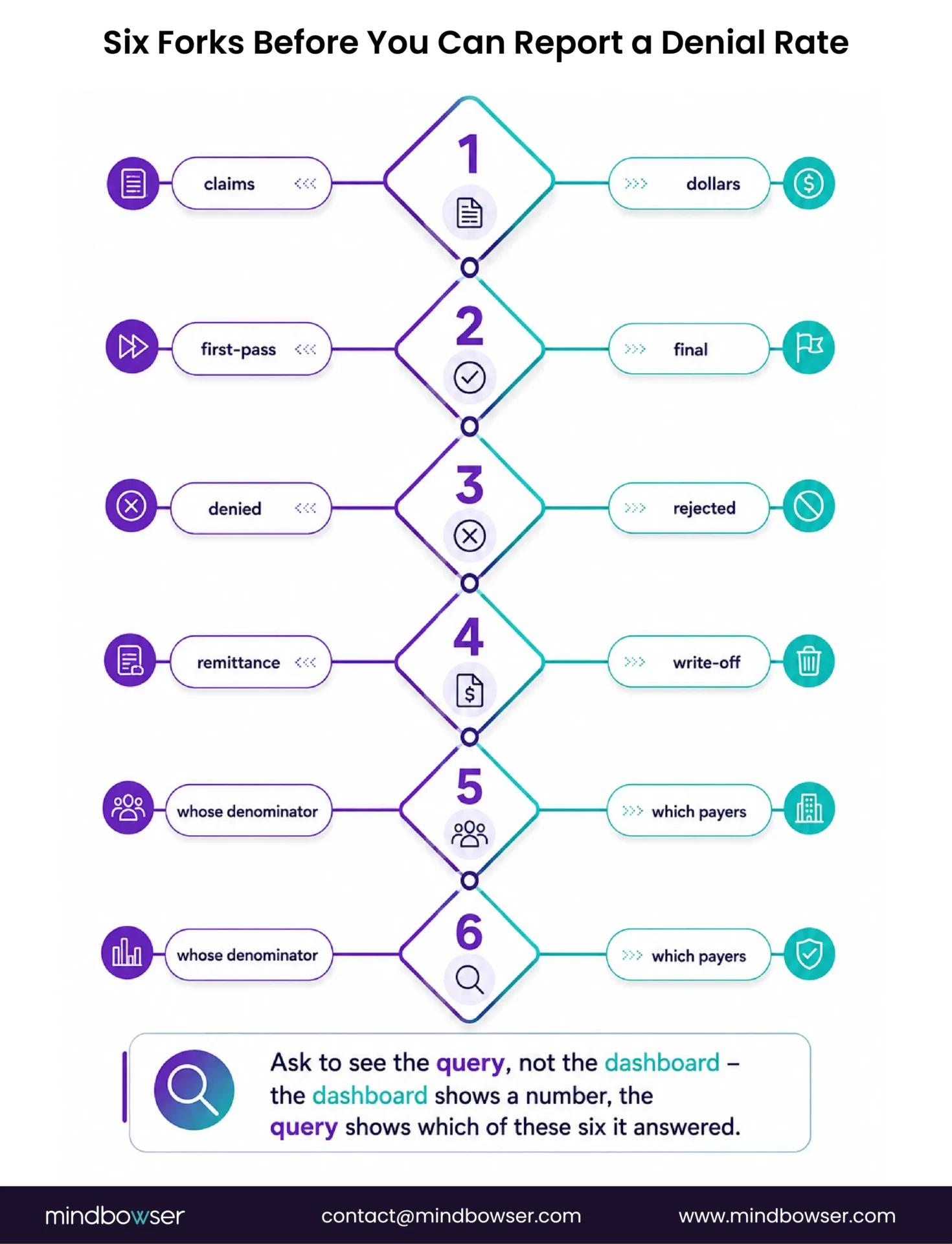
Take one metric and follow the forks, because seeing it done once is more convincing than the general argument.
You want to report a denial rate. Before you can calculate anything you have to answer six questions, and each answer changes the number:
- Claims or dollars? A denied high-value surgical claim and a denied office visit count the same by volume and very differently by value.
- First pass or final? Do claims that denied and were successfully appealed count as denials, or as eventual payments?
- Denied or rejected? A front-end rejection from a clearinghouse never reached the payer. Many organizations exclude these. Many include them without realizing.
- At remittance or at write-off? A claim denied and still under appeal is in a different state from one abandoned. HFMA’s AR-5 and AR-6 sit on opposite sides of this line.
- Whose denominator? Claims submitted in the period, or claims adjudicated in the period? These differ whenever volume is changing.
- Which payers? Including or excluding self-pay, and including or excluding payers you have a special arrangement with.
Six binary-ish choices. Even conservatively that is dozens of defensible denial rates from one dataset, and the gap between the highest and lowest is routinely larger than the improvement any program is trying to demonstrate.
This is why I open engagements by asking to see the query, not the dashboard. The dashboard shows a number. The query shows which of these six it answered, and that is the only way to know whether last quarter and this quarter are comparable. Denial management work that starts anywhere else is building on sand.
Not Sure Where Your Revenue Cycle Is Breaking Down?
Instrument Before You Improve
The sequence that works is not complicated. It is just routinely run out of order.
- Define. Pick your metrics and write down the exact calculation for each. Where a published standard exists, adopt it rather than inventing one. This is a document, and it should be short enough that everyone involved has actually read it.
- Instrument. Build the reporting so the definitions are enforced by the query rather than by whoever runs it. If two people can produce different numbers for the same metric, you have not finished this step.
- Baseline. Measure for long enough to know what normal looks like, including seasonality. A baseline taken over one month is not a baseline.
- Intervene. Now do the work the listicles describe. It is good advice. It just needed the three steps above to be legible.
- Re-measure against the same definitions. Including when the definitions turn out to be inconvenient.
Step two is the one that gets skipped, because it is unglamorous and it produces no visible improvement. Skipping it does not slow the program down at first. It makes step five impossible, and that only becomes apparent at the end, which is why the failure surfaces nine months in rather than in week three.
A revenue cycle analytics view that enforces definitions at the query level is what step two actually looks like in practice.
Where Improvement Actually Comes From

Once you can measure, the question is where to push. The answer is consistently earlier in the process than where the problem is recorded.
Across the specialty work in this cluster the same finding kept appearing: denials are recorded at submission and created at registration. Coordination of benefits errors, wrong plan selection, unverified benefit tier. By the time a claim denies, the mistake is 30 days old and was made by someone who never saw the claim.
That has an uncomfortable implication for how improvement programs get staffed. Back-end recovery work is visible. You can count appeals filed and dollars recovered and put it in a deck. Front-end prevention is invisible by construction, because its output is a denial that never happened, and nobody gets to count those.
So the work that produces the most durable improvement is also the work that is hardest to take credit for. I do not have a clever fix for that beyond naming it, but naming it helps, because the alternative is a program that keeps working the visible half and wondering why the total does not move.
Concretely, the highest-yield front-end items are eligibility verification quality, benefit tier confirmation before service, and prior authorization ownership. Prior authorization services is the deeper treatment of the third, and claims processing configuration is where the edit rules that catch the rest actually live.
Your Benchmark Is Not Your Benchmark
Even with clean definitions, cross-organization comparison stays harder than the benchmark tables suggest, because specialty mix changes what “normal” is.
This is not a theoretical caveat. Working through five specialties in this cluster produced five genuinely different failure modes, not five versions of one:
- Cardiology How the revenue actually leaks: A code-set migration left claim edit rules referencing retired codes, failing silently
- Gastroenterology How the revenue actually leaks: A payer-dependent modifier decided mid-procedure, wrong choice auto-denies
- Oncology How the revenue actually leaks: A mandatory attestation on the drug line, absent means automatic denial
- Dermatology How the revenue actually leaks: Unit counting on a code family with an open federal audit topic
- Orthopedics How the revenue actually leaks: The wrong modifier still pays, at a reduced rate, invisibly
- Behavioral health How the revenue actually leaks: Session-based billing against carve-out payers
A multi-specialty organization comparing its blended denial rate against a benchmark is comparing a weighted average of six different problems against someone else’s weighted average of a different six. The comparison is not meaningless, but it is much weaker than it looks, and it will not tell you where to act.
Segment before you benchmark. By specialty, by payer, by setting. The segmented numbers are smaller and noisier and considerably more useful, because they point at something you can actually go and fix.
What Actually Moves The Numbers, Ranked Honestly
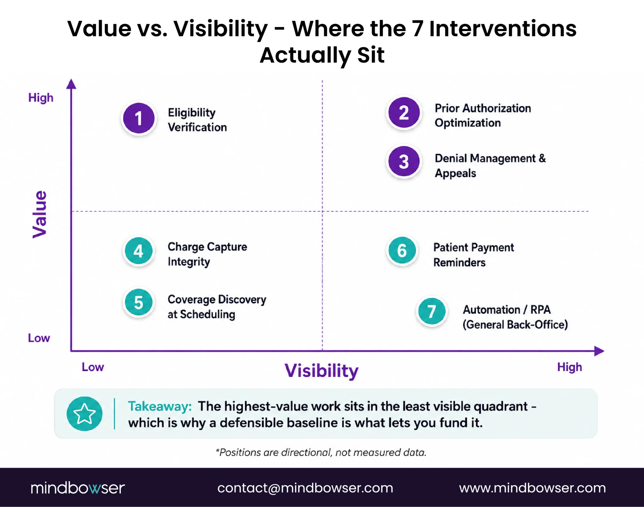
Everything above is about being able to tell. This section is about what to do once you can, and I want to be upfront about the epistemic status of it: this ordering comes from what I have observed across engagements, not from controlled trial data. Nobody has that data. Anyone who hands you a ranked list of revenue cycle interventions with percentage improvements attached to each is giving you their marketing, and you should ask what population it was measured on.
With that said, the ordering is fairly stable, and the top of it surprises people.
- Eligibility verification quality: First, and by a distance. Every specialty analysis in this cluster independently traced the largest denial contributor back to eligibility: coordination of benefits errors, wrong plan selection, benefit tier unconfirmed. It is unglamorous, it happens at the front desk, and it is upstream of everything else on this list. Fixing coding accuracy while eligibility is broken is treating a symptom with real effort.
- Pre-submission edit rules for the deterministic failures: The specialty work found that most mechanisms are rule-checkable before submission rather than judgment calls: bundling edits, frequency limits, component matching, mandatory attestations, unit arithmetic. Each is a rule that can be enforced once instead of remembered daily.
- Expected versus allowed reconciliation: Ranked high with a caveat: it is detection, not prevention. It does not stop anything. What it does is make an entire class of loss visible for the first time, and in organizations that have never had it, the first run is usually the most informative report they have seen in years.
- Prior authorization ownership: Partly a timing call. The workflow is being restructured by CMS-0057-F, which requires affected payers to run a Prior Authorization application programming interface by January 1, 2027. Investing heavily in the current manual process shortly before the mechanics change is worth thinking about carefully.
- Denial worklist prioritization by recoverable value: Genuinely useful, and it is back-end. Most worklists are ordered by age or by whatever the system defaults to, not by expected recovery, which means staff time is allocated by accident.
- Coder training. Real, and slower and less durable than the five above. Training decays with turnover; an encoded rule does not. The place training clearly wins is documentation quality, because that genuinely cannot be encoded, as the dermatology analysis sets out.
- Automation and robotic process automation: Last, deliberately, and this is the one that generates argument. Automation and robotic process automation are frequently proposed first because they are the most visible investment. Applied to an uninstrumented process they scale whatever you were already doing, including the errors, and they make the resulting numbers harder to interpret rather than easier. Automate after steps 1 to 3, not before.
The honest summary of that list: the highest-value work is the least visible, and the most visible work is the lowest-value. That is an awkward thing to take to a budget meeting, which is why the instrumentation matters. A defensible baseline is what lets you argue for the boring intervention.
What Your Systems Have To Know
- Metric definitions as versioned configuration, not as logic buried in a report: When the definition changes, and it will, you need to know which historical numbers were calculated under which version. Otherwise your trend line silently mixes two metrics.
- Expected versus allowed reconciliation at line level: Clean claim rate tells you a claim was accepted. Only this tells you it was paid correctly.
- Segmentation by specialty, payer and setting built in from the start: Retrofitting segmentation onto an aggregate reporting layer is substantially harder than designing for it, and every useful question turns out to need it.
- Re-baselining as a supported operation: When a definition changes or a payer contract changes or CMS changes the payment basis, the baseline has to move, and the system should make that an explicit, recorded event rather than a quiet edit.
The engineering caution I would offer, having watched several of these builds: connecting to the practice management system or the electronic health record is the well-understood part. The hard part is that every organization’s definition of an episode, a visit and a claim differ slightly from the standard, and reconciling those differences is where the schedule goes. Anyone quoting this work without asking how you define a visit has not thought about it.
The Baseline Moves Underneath You
The CY2027 outpatient proposed rule, CMS-1850-P, would change the payment basis for 340B-acquired drugs, extend site-neutral payment to off-campus imaging without contrast, and remove 637 services from the Inpatient Only list. Our explainer on what CMS-1850-P costs your revenue cycle covers the detail. The comment period closes August 31, 2026.
Separately, CMS-0057-F requires affected payers to run a Prior Authorization application programming interface by January 1, 2027, which changes the mechanics of a workflow most improvement programs have a workstream for.
Either of those can move a metric more than a year of improvement work, in either direction. If your program cannot distinguish “we got better” from “the payment basis changed,” it will claim credit for one and get blamed for the other. For the longer view on how regulation keeps reshaping this, the future of healthcare revenue cycle management is the wider frame, and rural and critical access organizations carry a different exposure profile covered in critical access hospital reimbursement.
Outsource, Buy, or Build
Outsourcing is the right answer for a lot of organizations, and the case is strongest where the work is specialized and the volume does not justify hiring for it. Outsourcing revenue cycle management covers where the line usually falls, our list of revenue cycle management companies is a starting point for a shortlist, and medical billing versus revenue cycle management sets out the scope difference if that is still fuzzy.
Here is the caveat that belongs in this particular article. A partner reporting performance against their own metric definitions is not independently verifiable. That is not an accusation, it is a structural observation, and it applies equally to an internal team reporting against definitions it wrote itself. If you outsource, the definitions should be yours, written into the agreement, and the underlying claim-level data should come back to you in a form you can recalculate from.
Building earns its keep when you have the volume to fund maintenance, when segmentation matters because your mix is complex, and when the measurement layer needs to be independent of whoever is being measured. That last condition is the one people underweight.
Two adjacent notes. Automation in the revenue cycle and robotic process automation are frequently the first thing proposed and rarely the first thing needed, because automating a process you have not instrumented just produces wrong answers faster. And if you are earlier in the journey than this article assumes, revenue cycle management in medical billing and healthcare claims management software are the more foundational reads.
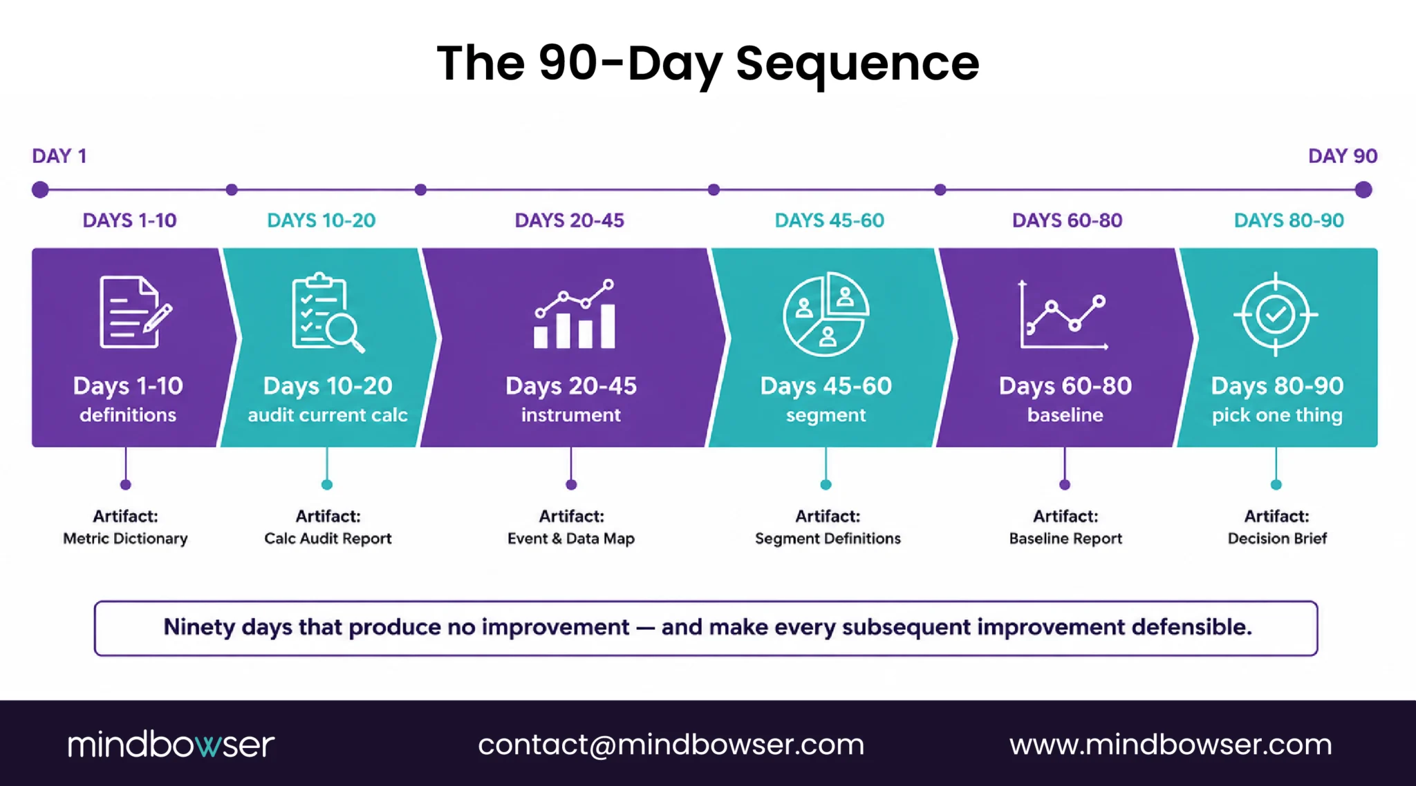
A 90-day Sequence That Produces Something Defensible
Not an improvement plan. A plan to get to the point where improvement can be measured.
- Days 1 to 10, write the definitions: Pick your metrics, adopt published standards where they exist, and write the exact calculation for each. Artifact: a document short enough that people read it.
- Days 10 to 20, find out what you are actually calculating today: Pull the query behind each dashboard number. Compare it to the definition you just wrote. The gaps are your real starting position.
- Days 20 to 45, instrument: Make the definitions enforced by the reporting rather than by convention. Two people should not be able to produce two numbers.
- Days 45 to 60, segment: By specialty, payer and setting. Expect the blended number you have been reporting to become several less flattering ones.
- Days 60 to 80, baseline: Long enough to see the shape, honest about seasonality.
- Days 80 to 90, pick one thing: One segment, one mechanism, one intervention, with a pre-registered definition of what success looks like and a date to check it.
Step 6 is deliberately small. A program that can prove one improvement is worth more than one that claims six, because the first one gets a second year.
One question this sequence raises and I should answer, because it decides whether any of it survives contact with an organization: who owns it.
Not the improvement work. The definitions. Somebody has to be able to say no when a well-meaning analyst changes a calculation mid-year because the new version is more flattering, or more accurate, or just easier to pull. Both of those changes are sometimes right, and both destroy the comparison unless the change is versioned and the baseline is restated.
In practice this works best when the definitions sit with someone who is not accountable for the numbers improving. Finance owning definitions while revenue cycle operations owns performance is a workable split. Revenue cycle operations owning both is the arrangement that quietly erodes, not through dishonesty but because the person under pressure to move a number is the wrong person to also adjudicate what the number means.
If your organization is too small for that separation, the substitute is writing the definitions down and dating them, so that changes are at least visible in the record.
Start by defining what you are measuring, before choosing tactics. Adopt published metric standards where they exist, build reporting that enforces those definitions, establish a baseline, then intervene and re-measure against the same definitions. Most programs skip the instrumentation step, which costs nothing at the time and makes the final result impossible to defend.
MAP Keys are industry-standard revenue cycle key performance indicators published by the Healthcare Financial Management Association under its MAP Initiative. There are 29 of them across 5 major groups, each with a precise definition. Two commonly referenced examples are AR-5, remittance denial rate, and AR-6, denial write-offs as a percentage of net patient service revenue.
There is no single calculation, which is the difficulty. You have to decide whether to count claims or dollars, first-pass or final, whether to include front-end rejections, whether to measure at remittance or at write-off, which denominator period to use, and which payers to include. Each choice produces a different defensible number, which is why adopting a published standard definition matters more than the specific choice.
Commonly cited targets put days in accounts receivable in the 30 to 40 range, with receivables over 90 days held under 10%. Treat these as directional rather than authoritative, and note that the metric improves when an organization writes off aggressively, so it should never be read alone.
Budget roughly 90 days before you can measure anything defensibly, and expect the first provable improvement after that. Programs that report gains sooner are usually reporting against definitions that were not fixed at the start.
Cautiously. Specialty mix, payer mix and setting all change what normal looks like, so a blended organizational metric compared against a blended external benchmark tells you very little about where to act. Segment first, then compare like with like.