Hey there, data enthusiasts (or maybe you’re just curious)!
Picture this: you’re drowning in numbers, spreadsheets overflowing, charts looking like alien hieroglyphics. You know there’s gold in there, valuable insights about your business, but how do you dig it out without getting buried alive in all this data?
In this blog, we’ve covered the benefits of data visualization Services, their uses for businesses, and a step-by-step data visualization process.
Data visualization is a method that uses static and interactive visuals to help people understand the large amount of data being collected. Data visualization is an important skill in applied statistics and machine learning. With some prior domain knowledge, storytelling with data will be helpful and insightful to you and your audience.
There are many benefits of data visualization that we talk about in this blog so stay tuned!
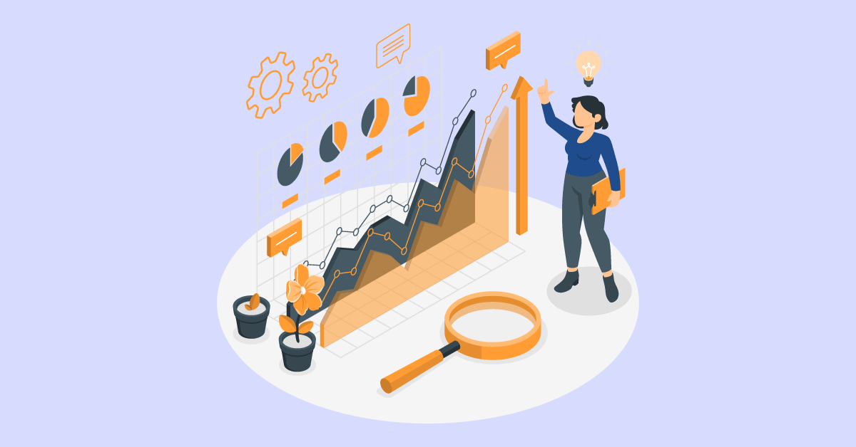
Due to complexity and large amounts, simply understanding data in numeric format can be challenging for anyone.
That’s where the importance and benefits of data visualization come in! By transforming numerical data into easy-to-digest visuals, data visualizations (or as we call it, “storytelling with data”) unlock valuable insights.
Data visualization is a potent tool for gleaning profound insights from complex data, informing impactful decisions, and fostering engagement across diverse audiences.
Understanding the benefits of data visualization:
So when you think of the benefits of data visualization, these should come to your mind 😎
Python has evolved extensively in every field, be it Automation, Machine Learning, Testing, Scraping, etc.
One of the benefits of data visualization with Python is that there are many visualization tools/libraries that provide excellent features and are easy to implement. It includes support for all types of visual, live, customized charts.
Worth mentioning, below are some of the most used Python libraries for data visualization:
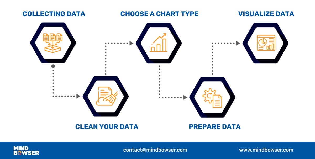
The first and most important step of data visualization is gathering data in large amounts. Only after we have substantial data can we apply data visualization techniques to the collected data and get some helpful insights from it.
Data cleaning is an essential step to perform before creating a visualization. A bunch of data out of a large dataset that has inappropriate, empty, or false values may lead to adding erroneous visuals with anomalies in it.
The output received from a data cleaning process is usually a dataset that is free of errors and anomalies etc, which gives much more accuracy when data is processed. Data cleaning is pretty much dependent on the dataset domain that you’re working with.
Before choosing a visual chart or graph, it is important to understand your audience and choose a chart or graph that will best communicate the message.
Choosing a chart depends on what findings you need to convey to your audience.
Choosing a couple of these can help to select the charts that will be best suitable for you. This usually requires some playing around with different charts before choosing the best. These selections lead to showing that the benefits of data visualization are expansive.
To prepare the data before sending it further for visualization, determine the type of graph, chart, or any other visualizations you need to create and the supporting library you will be integrating for it. After the chart is finalized, it may be necessary to transform the data as per requirements.
Data preparation tasks include finding data columns that help make some decisions, giving meaningful insights about data, grouping data, creating aggregate values for groups, combining variables to create new columns, etc.
In the final step, you’ll have the required data to create visualizations. Now we apply visualization skills to the prepared data and represent the data in charts or graphs with meaningful insights. After we’re finished, we’ll present it to you so you can see what we’ve discovered!
This way, storytelling with data helps to put forth your understanding of the data in a simple & visual format.
Now that we understand how the data visualization process works, we can apply different data visualization types to their uses. As mentioned in the earlier section, by using those visualization libraries, we can create some visualizations as follows:
Line charts are used to display trends over time. The X-axis usually represents a period, and the Y-axis represents the quantity associated with the period on the X-axis. For example, an A-line chart can illustrate a shopping mall’s peak visit time for the day broken down by weekdays and hours.
An area chart is a line chart with the areas below the lines filled with colors. Use a stacked area chart to display each value’s contribution to a total over some time.
A bar chart also displays trends over time. In the case of multiple variables, a bar chart can make it easier to compare the data for each variable at every moment. E.g., a bar chart can compare the company’s growth year-wise.
A histogram represents data using bars of different heights. Usually, each bar groups numbers into ranges in a histogram. The taller the bars, the more data falls in that range.
It displays the shape and spread of continuous data set samples. E.g., we can use a histogram to measure each answer’s frequency in a survey question. The bars would be the answer: “bad,” “good,” and “best.”
Scatter plots are used when there is a need to find correlations. If a data XY exists, then a Scatter plot is used to find the relationship between variables X and Y.
The bubble chart evolved from a scatter plot. Unlike scatter plots, each data point is assigned a label or category and shown as a bubble. It is used to show and compare the relationship between the labeled circles. A bubble chart makes it hard to read with multiple bubbles, so it has a limited data set size capacity.
A pie chart is a circular graph representing the data set in which the pie slices are divided to represent a numeric proportion. Pie charts are used when there is a need to show the contribution of a data point inside a whole data set.
A gauge chart is evolved from a pie chart and doughnut chart. It is used to visualize the distance between intervals. Multiple gauge charts can be shown linearly to visualize the difference between multiple intervals.
Most of the data collected have a location variable, which makes it easy to plot on a map. , e.g., a map visualization is mapping the number of customers worldwide, country-wise, where each country would represent several customers. Location information can help businesses grow in a region where the business has not scattered compared to other regions.
A heat map is a visualization tool that uses color, like a bar chart’s height and width. Two dimensions are shown as the magnitude of a phenomenon. The heat map can identify whether the phenomenon is clustered or varies over space.
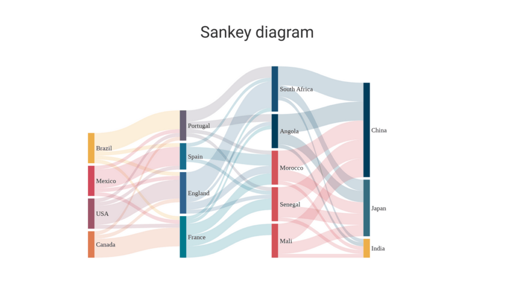
These show the flow of data between different categories. For example, this Sankey diagram shows the flow of migrants between different countries
Tracking COVID-19 Cases: Interactive maps showing the spread of COVID-19 cases by location, often color-coded based on severity, help people understand the pandemic’s geographical impact and guide public health decisions. (Example: Johns Hopkins Coronavirus Resource Center)
Financial Market Performance: Line charts and heatmaps display stock prices, market fluctuations, and investment opportunities, aiding financial analysts and investors in making informed decisions.
Streaming Service Recommendations: Streaming services like Netflix and Spotify use data visualizations to personalize recommendations. Scatter plots analyze your viewing history to identify preferred genres and actors. Bar charts highlight trending movies and shows, while heat maps suggest similar content based on your watchlist.
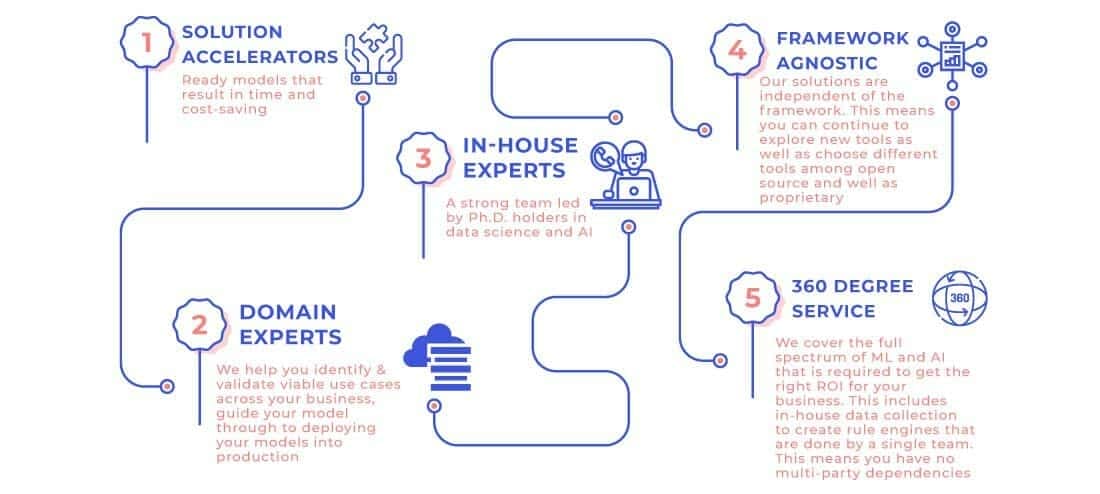
Our experience and agile team of full-stack engineers, data scientists, and mobile app developers accelerate innovation and implementation of customization ML and AI products.
Our experts bring vast cross-industry expertise supported by scientific rigor and in-depth knowledge of advanced techniques to design, develop, and deploy bespoke Artificial Intelligence solutions.
Interested in harnessing the power of specialized tools for data visualization? Learn more about how you can leverage data visualization and the benefits of data visualization with tools like Power BI in our article on Data Visualization with Power BI.
Sandeep is a highly experienced Python Developer with 15+ years of work experience developing heterogeneous systems in the IT sector. He is an expert in building integrated web applications using Java and Python. With a background in data analytics. Sandeep has a knack for translating complex datasets into meaningful insights, and his passion lies in interpreting the data and providing valuable predictions with a good eye for detail.

Data visualization is the formal practice of translating complex data into readily interpretable visual representations.
Charts, graphs, and maps transform complex information into an accessible format, facilitating analysis, communication, and data-driven decision-making across various domains. This leads to storytelling with data which helps decision-makers make tough decisions more easily.
Data visualization is a potent tool for gleaning profound insights from complex data, informing impactful decisions, and fostering engagement across diverse audiences.
Why is it crucial in data visualization services?
The benefits of data visualization are:
The different types of data visualization charts are:
Join us for “Your 24/7 Clinical Knowledge Partner – The AI Companion” Webinar on Wednesday, 30th July 2025 at 11:00 AM EDT
Register Now

We worked with Mindbowser on a design sprint, and their team did an awesome job. They really helped us shape the look and feel of our web app and gave us a clean, thoughtful design that our build team could...

The team at Mindbowser was highly professional, patient, and collaborative throughout our engagement. They struck the right balance between offering guidance and taking direction, which made the development process smooth. Although our project wasn’t related to healthcare, we clearly benefited...

Founder, Texas Ranch Security
Mindbowser played a crucial role in helping us bring everything together into a unified, cohesive product. Their commitment to industry-standard coding practices made an enormous difference, allowing developers to seamlessly transition in and out of the project without any confusion....

CEO, MarketsAI
I'm thrilled to be partnering with Mindbowser on our journey with TravelRite. The collaboration has been exceptional, and I’m truly grateful for the dedication and expertise the team has brought to the development process. Their commitment to our mission is...

Founder & CEO, TravelRite
The Mindbowser team's professionalism consistently impressed me. Their commitment to quality shone through in every aspect of the project. They truly went the extra mile, ensuring they understood our needs perfectly and were always willing to invest the time to...

CTO, New Day Therapeutics
I collaborated with Mindbowser for several years on a complex SaaS platform project. They took over a partially completed project and successfully transformed it into a fully functional and robust platform. Throughout the entire process, the quality of their work...

President, E.B. Carlson
Mindbowser and team are professional, talented and very responsive. They got us through a challenging situation with our IOT product successfully. They will be our go to dev team going forward.

Founder, Cascada
Amazing team to work with. Very responsive and very skilled in both front and backend engineering. Looking forward to our next project together.

Co-Founder, Emerge
The team is great to work with. Very professional, on task, and efficient.

Founder, PeriopMD
I can not express enough how pleased we are with the whole team. From the first call and meeting, they took our vision and ran with it. Communication was easy and everyone was flexible to our schedule. I’m excited to...

Founder, Seeke
We had very close go live timeline and Mindbowser team got us live a month before.

CEO, BuyNow WorldWide
Mindbowser brought in a team of skilled developers who were easy to work with and deeply committed to the project. If you're looking for reliable, high-quality development support, I’d absolutely recommend them.

Founder, Teach Reach
Mindbowser built both iOS and Android apps for Mindworks, that have stood the test of time. 5 years later they still function quite beautifully. Their team always met their objectives and I'm very happy with the end result. Thank you!

Founder, Mindworks
Mindbowser has delivered a much better quality product than our previous tech vendors. Our product is stable and passed Well Architected Framework Review from AWS.

CEO, PurpleAnt
I am happy to share that we got USD 10k in cloud credits courtesy of our friends at Mindbowser. Thank you Pravin and Ayush, this means a lot to us.

CTO, Shortlist
Mindbowser is one of the reasons that our app is successful. These guys have been a great team.

Founder & CEO, MangoMirror
Kudos for all your hard work and diligence on the Telehealth platform project. You made it possible.

CEO, ThriveHealth
Mindbowser helped us build an awesome iOS app to bring balance to people’s lives.

CEO, SMILINGMIND
They were a very responsive team! Extremely easy to communicate and work with!

Founder & CEO, TotTech
We’ve had very little-to-no hiccups at all—it’s been a really pleasurable experience.

Co-Founder, TEAM8s
Mindbowser was very helpful with explaining the development process and started quickly on the project.

Executive Director of Product Development, Innovation Lab
The greatest benefit we got from Mindbowser is the expertise. Their team has developed apps in all different industries with all types of social proofs.

Co-Founder, Vesica
Mindbowser is professional, efficient and thorough.

Consultant, XPRIZE
Very committed, they create beautiful apps and are very benevolent. They have brilliant Ideas.

Founder, S.T.A.R.S of Wellness
Mindbowser was great; they listened to us a lot and helped us hone in on the actual idea of the app. They had put together fantastic wireframes for us.

Co-Founder, Flat Earth
Mindbowser was incredibly responsive and understood exactly what I needed. They matched me with the perfect team member who not only grasped my vision but executed it flawlessly. The entire experience felt collaborative, efficient, and truly aligned with my goals.

Founder, Child Life On Call
The team from Mindbowser stayed on task, asked the right questions, and completed the required tasks in a timely fashion! Strong work team!

CEO, SDOH2Health LLC
Mindbowser was easy to work with and hit the ground running, immediately feeling like part of our team.

CEO, Stealth Startup
Mindbowser was an excellent partner in developing my fitness app. They were patient, attentive, & understood my business needs. The end product exceeded my expectations. Thrilled to share it globally.

Owner, Phalanx
Mindbowser's expertise in tech, process & mobile development made them our choice for our app. The team was dedicated to the process & delivered high-quality features on time. They also gave valuable industry advice. Highly recommend them for app development...

Co-Founder, Fox&Fork