


Data visualization is the art of impressive storytelling in data science that provides fruitful insights from complex data sets. It offers various benefits including helping organizations extract meaningful and actionable insights from complex data that are easy to understand and guide for making impactful data-driven decisions.
Although numerous types of data visualization techniques are available, selecting a particular technique depends upon the data of the type to be analyzed. Each data visualization method has its own distinct characteristics and uses, strengths, and limitations, and choosing the right technique for visualization is crucial for effective data analysis.
In this article, we will explore different types of data visualization techniques, their distinct characteristics, use cases, and principles that are used for creating compelling visualizations that enhance the overall effectiveness of the insights derived from data. Choosing the appropriate visualization approach is crucial for effective analysis and directly impacts the quality of decision-making that stems from the insights gathered.
35 Types of Data Visualization
Data visualization serves as a powerful tool for presenting complex data in an engaging and informative manner, enriching the storytelling process. Various visualization techniques are employed to convey data effectively, with specific formats chosen based on the nature of the data being presented. This approach not only simplifies data comprehension but also enhances the impact of the narrative being shared.
1. Bar Charts
One of the original types of data visualization is bar charts. They are used for comparing data along two axes. One axis represents categorical or discrete data level with rectangular bars while the second axis represents data value.

Characteristics of Bar Charts:
- Every categorical value or discrete data is represented as a rectangular bar.
- The length or height of the bar is proportional to the value or frequency of the data associated with that category.
- Offer a visually simple and intuitive way to interpret data.
- Facilitate easy comparison between different categories and are helpful in identifying patterns and trends present in the data.
TradingView is a financial platform that uses bar charts to represent price movements and trading activity over a specific time period. The height of each bar reflects the price range between the opening and closing prices, while the width of the bar signifies the time interval. Bullish (up) and bearish (down) bars indicate price increases and decreases, respectively. Traders and investors use bar charts in TradingView to assess trends, volatility, and potential entry or exit points in various financial instruments, enhancing their decision-making process in the dynamic world of trading and investing.
Use Cases and Strengths:
- Compare data across a large set of categories or groups and effectively display rankings or ordered data.
- When plotting data over time, analyze trends and patterns in data, making them useful for tracking changes and developments.
- Due to their simplicity and ease of understanding, bar charts are used for engaging audiences across diverse backgrounds and disciplines.
- The ability to convey information clearly and efficiently makes them a staple in data analysis and reporting.
2. Line Charts
Line charts, also commonly known as line plots or line graphs, display information as a series of data points or markers that are connected through straight line segments. These charts display quantitative values over a continuous interval or time period.

Characteristics of Line Charts:
- Every data point corresponds to a distinct value at a specific time or position.
- The x-axis of the chart represents a timescale, sequence of intervals, or a continuous variable and the y-axis represents quantitative value.
- Line charts use lines to connect data points, emphasizing the continuity and progression of the variable over time or a continuous axis.
- They can accommodate multiple data series or variables on a single chart, making comparing trends and relationships between different entities easy.
MetaTrader is a trading platform that uses line charts to represent price movements in financial markets. These charts connect individual data points, representing the closing prices of an asset over a specific time period, using a continuous line. Line charts provide a simplified view of price trends and patterns, allowing traders to identify key support and resistance levels and overall market direction.
Use Cases and Strengths:
- Useful for tracking and analyzing trends over time, such as tracking the performance of a stock in the market over a time period.
- Compare multiple data variables on a single chart easily and identify correlations, divergences, or patterns between different entities.
- Help in forecasting future trends based on historical data patterns. By visually examining the trajectory of a line, analysts can make predictions about potential future outcomes.
- Recurring patterns and seasonality of a data variable can be easily visualized in line charts.
3. Pie Charts
The pie chart is a visual representation of data in a circular form that displays categorical data as a percentage of the whole. This type of data visualization will spruce up your pie chart game.

Characteristics of Pie Charts:
- Each slice in the pie chart depicts a specific category and the size of each slice represents a proportion or percentage of that category. When combined together, the sum of all the slices represents 100% of the data set.
- Labels and legends included in the pie chart make it more informative.
- Pie charts provide an easy visual comparison of relative sizes.
Pie charts in Google Analytics are used to display the distribution of data, such as traffic sources, user demographics, or device categories, in a circular format. These charts help website owners and marketers understand the relative importance of different segments, analyze key metrics, and make data-driven decisions.
Use Cases and Strengths:
- Used to analyze and compare the composition or distribution of data.
- Comparing proportions or percentages of relative sizes between the categories is easy as the dominant or significant data set value can be quickly identified.
- Visually appealing and engaging, making them useful for presentations, reports, and data communication.
4. Scatter Plots
Scatter plots display the relationship between two continuous variables in the form of scattered dots. These data points are plotted on a two-dimensional plane between the x-axis and y-axis.

Characteristics of Scatter Plots:
- Each data point on the graph represents a unique observation and helps in determining if there is any relationship between the variables.
- Scatter plots can reveal patterns, trends, and relationships between the variables and, depending on the distribution of points, identify positive, negative, or no correlation, as well as nonlinear associations.
Tableau is a popular data visualization tool; analysts use scatter plots to visualize and identify correlations, patterns, and trends between variables to uncover insights about their relationships. An intuitive drag-and-drop feature in Tableau helps define the continuous variables and customization options to create scatter plots.
Use Cases and Strengths:
- Analyze the correlation between two variables. If the points cluster around a straight line (positively or negatively sloped), it indicates a correlation between the variables.
- Identifying data points that deviate significantly from the overall pattern helps to detect outliers that provide valuable insights or indicate anomalies in the data.
- Helps to view the visual distribution of the data to identify clusters or groups indicating that there might be subpopulations or segments within the data.
- Showcase trends over time, especially when time is one of the continuous variables. This helps in visualizing how the variables change in correlation to each other over a period of time.
5. Maps
Maps use various visual elements, such as points, lines, polygons, or shaded regions to represent data geographically. These elements can be customized to convey specific information about the data. These types of data visualization tools help to locate a certain place or location.

Characteristics of Maps:
- Maps provide a spatial understanding of the data, allowing viewers to explore relationships, patterns, and distributions in a real-world context.
- Allow for interactive exploration where users can zoom in or out, pan across the map, and interact with data points to view additional information.
Uber and Ola cabs use maps to facilitate their ride-sharing services. These maps provide real-time geolocation data, enabling users to request rides and drivers to navigate efficiently. They display available vehicles, estimated arrival times, and optimal routes, enhancing the user experience and ensuring efficient and accurate service delivery. Additionally, these maps assist drivers in locating passengers, navigating through traffic, and reaching their destinations, contributing to ride-sharing platforms’ overall effectiveness and reliability.
Use Cases and Strengths:
- Used to analyze demographics, disease spread, or customer locations.
- Highlight spatial relationships and proximity in the context of how data is distributed in a geographical region or area.
- Data insights can be communicated through maps in an engaging manner to create visual impact and effective storytelling.
6. Heatmaps
Heatmaps are used to represent numerical data graphically by using colors on a two-dimensional grid. The value of each data point is indicated as color, where a warm color indicates high-density data points and cool colors represent low-density data points. For example, these types of data visualization tools help identify the most viewed point of a website.

Characteristics of Heatmaps:
- Areas with a higher concentration of data points are depicted with a more intense color, making it easy to identify areas of high or low activity.
- The key characteristic of heatmaps is their ability to visually display variations in data intensity, allowing viewers to identify patterns, trends, and areas of interest. They visualize the density and intensity of values.
- Heatmaps are visually impactful reveal patterns and are valuable when working with extensive datasets, preventing the visual overload that would occur from displaying each individual data point.
Hotjar is a Conversion Rate Optimization (CRO) tool that uses heatmaps to monitor and analyze user engagements on a website. They provide valuable insights into user behavior, showing where users click, move their mouse, or scroll, helping marketers and UX designers understand how visitors interact with the site, and identify opportunities for improving conversion rates by optimizing page elements and layout.
Use Cases and Strengths:
- Display correlation between two variables plotted on different axes and help analyze data intensity, such as population density or website click rates. They provide valuable insights into where certain activities are concentrated.
- Create impactful visual representations that effectively identify patterns, clusters, or trends within the data.
- Enable comparative analysis between two datasets. Overlaying multiple heatmaps or using different color gradients helps to compare the intensity of two or more related variables and find correlations or differences between them.
7. Histogram
Histograms are graphical charts that plot the distribution of data as bars. In a histogram, the vertical y-axis denotes frequency, and the horizontal x-axis represents data that is divided into intervals or bins.

Characteristics of Histograms:
- Each bar on the histogram represents the frequency or count of data points falling within each interval.
- Histograms provide a visual overview of how the data is distributed across different ranges or categories and help identify patterns, central tendencies, and potential outliers.
Histograms in Microsoft Excel are useful for analyzing a dataset’s shape, central tendency, and variability, making it easier to identify patterns and outliers in the data. As one of the many types of data visualization, histograms help users quickly gain insights into their data and make informed decisions based on the observed trends.
Use Cases and Strengths:
- Analyze data distribution to see if the data is skewed (positively or negatively), whether it follows a normal distribution, or if there are any notable patterns.
- Detect outliers or unusual values in the dataset. Outliers are data points that significantly differ from most of the data and may indicate errors or interesting phenomena.
- Compare distributions or track changes to reveal insights about how two sets of data relate to each other and help understand how data is evolving.
8. Treemaps
As one of the popular types of data visualization tools, treemaps display hierarchical data by using nested rectangles of decreasing sizes. They have a tree-like structure that can have branches or sub-branches and provide information about the data at a glance.

Characteristics of Treemaps:
- The visualization space is divided into rectangles, which are arranged and sized to convey a hierarchical structure. Hierarchical data is displayed with nested rectangles.
- Rectangles within the same hierarchy level represent columns or expressions in a data table. Each rectangle represents proportions or values within the hierarchy, with larger rectangles representing larger proportions.
Google Sheets can be used for creating treemaps to represent hierarchical data using nested rectangles. Treemaps offer an effective approach to depicting complex hierarchical arrangements, enabling users to comprehend how various data components are distributed and connected swiftly. They are particularly useful for displaying proportions, and hierarchical relationships and facilitating comparative analysis.
Use Cases and Strengths:
- Analyze proportions and distributions within hierarchical data. They make it easy to see how categories or subcategories contribute to the overall composition.
- Help to visualize hierarchical structures such as organizational charts, file systems, or nested categories in a dataset.
- Facilitate comparative analysis to allow users to compare the relative sizes of different components within a hierarchy, making it easy to identify patterns and trends.
- Provide an efficient and intuitive way to present a large amount of data in a limited space. This is especially valuable when trying to convey complex relationships within a dataset.
9. Box Plot
A box plot, also known as a box-and-whisker plot, helps to summarize data distribution with key statistics. The plot comprises boxes and lines, where the box portion of the plot represents the interquartile range (IQR), which covers the middle 50% of the data.

Characteristics of Box Plots:
- The line or whisker extends to the minimum and maximum data values within a defined range, typically 1.5 times the IQR.
- The median or the middle value in the dataset, when arranged in order, is displayed as a line within the box. The length of the box indicates the spread of the data within the interquartile range.
- Outliers are represented as individual data points that fall outside the whisker range.
As one of the informative types of data visualization, box plots in Matplotlib visually depict a dataset’s distribution, showing its central tendency (median) and spread via a box-and-whisker format. The box encapsulates the interquartile range (IQR), representing the middle 50% of data, while the whiskers extend to the predefined minimum and maximum values. This box stretches from the first to the third quartile, with a vertical line indicating the median. The x-axis denotes the presented data, and the y-axis illustrates the frequency distribution.
Use Cases and Strengths:
- Analyze distribution, central tendency, and spread of data to get insights about the distribution’s shape and assess whether the data is skewed or symmetric.
- Compare distributions between different groups or subgroups. By placing multiple box plots side by side, you can easily compare the central tendency and spread of different datasets.
- Identify potential outliers which may be significant in certain analyses, indicating unusual or exceptional data points.
- Offer valuable statistical information in a simple visual format and are useful for providing a quick overview of key features of a dataset.
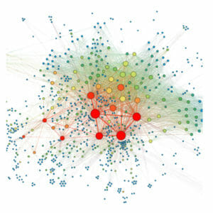
10. Network Diagram
Network diagrams represent connections between a set of entities. Each entity is represented as a node, and the links in the diagram represent relationships between them. These diagrams are a type of data visualization that can be used to show complex relationships clearly and concisely.

Characteristics of Network Diagrams:
- Network diagrams showcase complex network structures, making them suitable for representing social networks, organizational hierarchies, or interconnected components in a system.
- Nodes have additional attributes such as labels, colors, sizes, or metadata, providing further context or information about each node.
- They help to visualize various types of relationships, such as dependencies, collaborations, or interactions, enabling a better understanding of how components within a network are connected.
Gephi is a specialized software for creating and analyzing network graphs, making it ideal for visualizing complex relationships, such as social networks, citation networks, or web structures. The tool provides an intuitive interface to create, customize, and analyze network diagrams, allowing users to explore the structure and dynamics of networks and identify central nodes, communities, and patterns within the data.
Use Cases and Strengths:
- Analyze social networks revealing connections between individuals, groups, or communities. They can be used to identify key influencers, measure network centrality, and understand information diffusion.
- Map complex systems or infrastructures such as computer networks, transportation systems, or supply chains, visually representing the components and their interactions.
- Identify data flow and bottlenecks or critical paths within a networked environment. This is useful for optimizing processes and improving efficiency.
11. Area Chart
An area chart is similar to a line chart, representing data points through line segments. The filled areas from the baseline to the data line segment represent data values and are shaded in different colors to visually present the data.
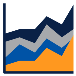
Characteristics of Area Charts:
- Area charts are effective for showing the magnitude of the data, and the way the areas change over the chart can reveal trends, especially over time or in different categories.
- They can be used to showcase how a variable changes within a specific timeframe or compare contributions from different categories.
- Provide strong visual impact, making them effective tools for presentations and reports to convey the overall trends and changes within the data.
As one of the types of data visualization tools, area charts in Highcharts display data as filled areas beneath a line, effectively showcasing both the individual data points and the cumulative trend. For instance, consider an area chart depicting monthly sales data for a product. The x-axis represents the months, the y-axis represents the sales figures, and the shaded area between the line and the x-axis indicates the sales volume for each month. This visualization helps grasp sales patterns and identify peak sales periods throughout the year.
Use Cases and Strengths:
- Analyzing trends and changes in data over a time period. They help users understand how values have evolved over time or across categories, making it easy to spot patterns.
- Comparing proportions or contributions of different categories or subgroups within a dataset. The filled areas make it visually clear how each category contributes to the whole.
- Identifying patterns and variations within the data. Sudden spikes or dips in the filled areas can indicate noteworthy events or shifts.
12. Bubble Chart
Bubble charts display bubbles that are plotted against a two-dimensional plot, and the size of each bubble indicates an additional data value. They are one of the data visualization types that can be useful for revealing patterns and relationships between three variables.

Characteristics of Bubble Charts:
- Each data point is represented by a bubble placed at specific coordinates on the chart.
- The bubble’s position on the x and y axes signifies the values of two variables, while the size of the bubble represents a third data value.
- They help to analyze multiple variables simultaneously. In addition to the x and y coordinates, the bubble size introduces another dimension, providing a comprehensive view of the data.
Bubble charts in Plotly combine three variables into a single point on a two-dimensional plane. For example, you can create a bubble chart in Plotly to showcase the relationship between countries, their GDP, and their population. Each country would be a bubble placed according to its GDP and population, with the size of the bubble reflecting its economic output.
Use Cases and Strengths:
- Compare data points to observe relationships between three data variables and identify trends by showing the movement or distribution of data points across the chart. This makes them valuable for spotting trends or deviations.
- Visualize the relative magnitude of a specific metric based on the bubble size.
- Offer insights into complex relationships between multiple variables. They help in identifying correlations, patterns, or clusters within the data.
13. Waterfall Chart
A Waterfall Chart is a specialized type of data visualization that consists of a series of bars and illustrates how the initial value increases or decreases due to a series of changes in the data set to reach a final value.

Characteristics of Waterfall Charts:
- Help to visualize incremental changes from an initial value and depict both positive and negative values above and below a baseline, emphasizing the cumulative total value as the data points are added or subtracted.
- Valuable for analyzing financial statements, understanding profit/loss, visualizing budget components and the drivers of change, and tracking project progress and the impact of individual tasks.
Waterfall charts in Microsoft Excel are used to visualize the cumulative effect of sequentially introduced positive and negative values. For instance, you could use a waterfall chart to illustrate the company’s net profit changes over a year. The initial bar represents the starting value; subsequent bars show additions like revenue, and negative bars illustrate deductions like expenses. The final bar then displays the net profit, helping you comprehend the factors influencing the overall outcome. These types of data visualization will help you understand the factors influencing the overall outcome and visualize the cumulative effect of changes in your data.
Use Cases and Strengths:
- Visualize budget components to understand how different factors contribute to the overall budget variance and explain the effects of various changes, whether in financial metrics, project plans, or other scenarios.
- Track project progress, showing the impact of individual tasks or milestones on the overall project’s status.
- Valuable in data storytelling, helping to highlight the sequence of changes and the net impact on a value, making it easier to convey a clear and concise narrative.
14. Choropleth Map
Choropleth Map is one of the types of data visualization tool thematic maps that use colors or patterns to represent data across different regions, such as countries, states, or administrative boundaries. They help allocate resources effectively, targeting areas with the highest or lowest values of the represented data, whether for business expansion, disaster relief, or public services.
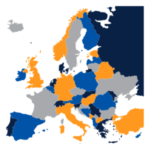
Characteristics of Choropleth Maps:
- Useful for depicting how a measurement varies across a region and shows variations, patterns, and disparities in data across different areas.
- Classify data into ranges or categories, making them valuable for analyzing regional differences, visualizing socioeconomic indicators, and aiding policy decisions and resource allocation.
A choropleth map in Mapbox can be used to illustrate population density across different states in a country. In this case, darker colors could represent higher population densities, allowing viewers to discern areas with higher concentrations of people quickly.
Use Cases and Strengths:
- Analyze data variations across regions to help users understand how data values change from one area to another, making them valuable for demographic studies, economic analysis, and more.
- Visualize socioeconomic indicators, such as income levels, unemployment rates, educational attainment, and healthcare access. These maps reveal disparities between different geographic areas.
- Inform policy decisions by providing a clear visual representation of where resources or interventions are needed most. They help policymakers identify areas with specific needs.
- Used for communicating complex data to a wide audience. They enable stakeholders to grasp the spatial distribution of a specific variable quickly.
15. Radar Chart
Radar Chart helps to compare multiple quantitative variables on a circular grid. They enable comparative analysis of data patterns by depicting data points as vertices connected by lines, forming a shape.

Characteristics of Radar Charts:
- The representation of data in the radar chart facilitates comparative analysis of data patterns and helps identify the variables with similar values and outliers among each variable.
- The shape and area of the pattern help in interpreting data, assessing performance, comparing strengths and weaknesses, analyzing team or individual capabilities, and identifying trends and areas for improvement.
In data visualization types, radar charts in FusionCharts can be used to compare the performance of different athletes across multiple attributes like speed, strength, agility, and endurance. The resulting radar chart would display each athlete’s performance profile, helping viewers assess their strengths and weaknesses across the various attributes.
Use Cases and Strengths:
- Effective for assessing the performance of individuals, teams, products, or processes across multiple criteria to identify areas of strength and weakness quickly.
- Useful for comparing the capabilities or characteristics of different entities.
- Help to identify trends within datasets. By examining how the shape changes over time or across categories, you can spot patterns and areas for improvement.
- Valuable to Visualize trade-offs between various attributes and determine the variables to be prioritized and the ones that need improvement.
16. Word Cloud
Word Clouds are text-based types of data visualization that visually represent words based on their frequency or importance in a given dataset, such as a text document or set of keywords. They help to visualize keyword usage in the context of SEO (Search Engine Optimization) or content analysis and enable users to understand the focus of a document or web page.

Characteristics of Word Clouds:
- The words are displayed in varying sizes, with more prominent words appearing larger, creating a visual hierarchy that highlights the most significant terms.
- Word clouds retain the context of the words, ensuring that viewers can quickly understand the main themes or topics without reading the entire text.
Tagxedo is a word cloud generator that allows users to customize the appearance of the word cloud by applying different shapes, fonts, colors, and layouts. The word cloud can be shaped according to a selected image or theme, creating a visually engaging representation of the text data. It’s commonly used for summarizing text, identifying key terms, and adding visual appeal to presentations, websites, or data visualizations.
Use Cases and Strengths:
- Effective tool for analyzing and summarizing large amounts of text and identifying the most frequent or important terms, making it easier to understand the main ideas within the content.
- Identify patterns or trends within a dataset. Users can gain insights into the prevalent themes or topics by visualizing the most prominent words.
- Explore datasets to provide a quick overview of the main terms, allowing users to dive deeper into specific topics.
- Engage audiences with their visual appeal. They are eye-catching and can be used in presentations, reports, or websites to make the content more engaging and visually appealing.
17. Sankey Diagram
Sankey diagrams are types of data visualization tools that are used to depict the flow of data, energy, or resources from one set of values to another within a system.
Characteristics of Sankey Diagrams:
- Nodes in a Sankey diagram represent specific categories, stages, or entities within the system being analyzed.
- The links between nodes illustrate how these entities are connected and interact.
- Sankey diagrams provide a clear and intuitive way to represent complex flows, making understanding the distribution or movement of data or resources within a system easier.
Google Charts allows users to create Sankey diagrams that clarify the relationships and distribution of data, making them ideal for visualizing data flows, illustrating process steps, identifying significant contributors or bottlenecks, and presenting complex data patterns. The customizable features in Google Charts enable users to fine-tune the appearance of the Sankey diagram to communicate insights from the data effectively.
Use Cases and Strengths:
- Analyze energy flows in various systems, such as power generation, energy consumption, or industrial processes. They help identify areas where energy is being used efficiently or where there might be losses.
- Map processes and workflows, allowing users to visualize the steps and the flow of materials or data throughout the process. This is useful for identifying bottlenecks or areas for optimization.
- Support decision-making by providing a clear overview of how data or resources are distributed or utilized and help stakeholders make informed choices and allocate resources effectively.
- Effective for presenting complex flow-related data to a broader audience, allowing viewers to grasp the distribution and connections between entities quickly.
18. Gantt Chart
Gantt chart is a powerful type of data visualization tool for visualizing project schedules, timelines, and task dependencies. Tasks are plotted on a timeline, helping project managers and team members see the sequence of work.

Characteristics of Gantt Charts:
- Each task is represented as a horizontal bar on the Gantt chart. The position of the bar along the timeline indicates when the task started and ended, and the length represents the duration of the task.
- It illustrates task dependencies, showing which tasks must be completed before others can start. This helps in identifying critical paths and potential delays.
- The chart also displays task relationships and progress, making it valuable for efficient project planning, scheduling, monitoring, and providing a clear visual timeline for stakeholders.
TeamGantt allows users to create and manage Gantt charts online, making it easy for teams to collaborate, plan, and track progress in real time. The platform facilitates team coordination by showing task assignments, dependencies, milestones, and progress, helping teams stay organized, meet deadlines, and communicate effectively.
Use Cases and Strengths:
- Provide efficient project planning and scheduling to enable project managers to allocate resources, set deadlines, and establish a clear timeline for project completion.
- Provide stakeholders with a clear visual timeline of the project’s progress. This transparency helps clients, team members, and executives understand project milestones.
- Facilitate communication and collaboration among project team members by providing a shared visual representation of the project, ensuring everyone is on the same page.
- Assist in resource allocation by showing when tasks require specific resources and help in avoiding over-commitment or underutilization.
- Identify potential bottlenecks and critical paths in a project, allowing for proactive management of these areas to prevent delays.
19. Polar Chart
Polar charts, also known as radar charts or spider charts, represent multivariate data on circular grids. Each variable is represented by a radial axis, and the data points are connected to create a shape, illustrating the values of each variable.

Characteristics of Polar Charts:
The primary strength of these types of data visualization tools lies in their ability to emphasize relative comparisons between variables, making them useful for comparing performance across different aspects, identifying patterns or trends, and creating visually appealing presentations.
Polar charts in Highcharts can be used to compare the performance of different car models across attributes like speed and fuel efficiency. Each car’s data points would be plotted at appropriate distances and angles, allowing for a quick assessment of how they fare regarding these attributes.
Use Cases and Strengths:
- Track performance across different variables or categories and help to understand which variables contribute more or less to the overall performance.
- Identify patterns or trends in data. Observing the shape formed by the data points helps to understand the relationships or deviations in the data.
- Provide visually appealing and provide unique ways to present multivariate data. They can capture the audience’s attention and effectively convey insights.
- In scenarios such as portfolio management or product analysis, polar charts can be used to compare the performance of different assets or products across various criteria.
20. Tree Diagram
Tree diagrams illustrate hierarchical structures using nodes (or elements) and connecting lines.

Characteristics of Tree Diagrams:
- Each node represents a specific entity, category, or element, and the lines depict the relationships or connections between these nodes.
- These types of data visualization charts are useful for organizing and categorizing data and visualizing organizational structures.
In Lucidchart, tree diagrams could be used to outline a company’s organizational structure. The top node could represent the CEO, branching into departments, teams, and individual employees, providing a clear and hierarchical visualization of the organization’s hierarchy.
Use Cases and Strengths:
- Organize and categorize data, making understanding the structure and relationships within a dataset easier.
- Visualize organizational structures, showing a company or institution’s hierarchy of positions, departments, or teams.
- By representing hierarchy and relationships, tree diagrams assist in decision-making processes where understanding the organizational or hierarchical context is crucial.
21. Streamgraph
These types of data visualization illustrate the changing composition of variables over time. They are created using stacked area graphs with smooth, flowing curves, which highlight the relative proportions and trends within the data

Characteristics of Streamgraphs:
Steamgraphs are useful for showing how the contributions of different components shift over time, providing both a dynamic and visually engaging representation.
Steamgraphs in Flourish can help to depict the distribution of music genre popularity over several decades. Each area segment would represent a genre’s relative prominence in a given year, offering a visually engaging way to observe how musical preferences evolved over time.
Use Cases and Strengths:
- Show relative proportions and trends of various components within a dataset. This makes them valuable for understanding how different factors contribute to a whole over time.
- Are visually pleasing and engaging, making them suitable for presentations, reports, and data communication to capture the audience’s attention.
- Depict changes over time, making them a powerful tool for visualizing temporal patterns, fluctuations, and trends.
22. Bullet Chart
Bullet charts use a compact horizontal bar to compare performance against targets.

Characteristics of Bullet Charts:
- Bullet charts are effective tools for assessing performance, evaluating progress toward goals, and comparing categories.
- Bullet charts are designed to use space while providing valuable insights into performance metrics efficiently.
Bullet charts in Google Looker Studio are types of data visualization that can be used to showcase the sales performance of products against their sales targets. The chart would present each product’s sales, with reference lines indicating the target and warning thresholds, enabling quick performance evaluation at a glance.
Use Cases and Strengths:
- Assess performance by providing a concise view of how actual performance compares to the desired target.
- They are valuable for tracking progress toward goals over time and offer a quick way to see if the performance is improving or falling short of expectations.
- Compare across different categories or groups, making them suitable for benchmarking and identifying areas of success or improvement.
- Efficient use of space while conveying important performance information, making them suitable for dashboards and reports where space is limited.
23. Parallel Coordinates
These types of data visualization are used to visualize multiple variable data by employing parallel axes and intersecting lines.

Characteristics of Parallel Coordinates:
Each axis represents a different variable, and the data points are connected by lines that intersect the axes, revealing how each data point relates to the variables.
Parallel Coordinates in Orange can be used to analyze a dataset with attributes like age, income, and education level. By plotting individuals’ data points and connecting them through parallel lines, you can discern correlations and identify clusters based on how variables relate to each other.
Use Cases and Strengths:
- Analyze correlations, patterns, and outliers across variables simultaneously.
- Compare data points based on axis values helping to identify trends, relationships, or anomalies.
- Reduce dimensionality, facilitate data exploration of complex datasets, and provide a comprehensive view of the interplay between variables.
24. Word Tree
Word Trees help visualize hierarchical word relationships and the flow of text in a structured manner. They help to showcase the hierarchical relationships between words, often starting from a root word and branching out into related words or subtopics.
Characteristics of Word Trees:
- Each branch represents a hierarchy level, allowing users to see how words are connected.
- Word trees often incorporate word frequency information, where the size of a word or its position along the branches reflects its frequency or importance in the text.
Word Tree in RAWGraphs can be considered as a type of data visualization tool that is used for analyzing a collection of news articles about different topics. This helps to visualize how various keywords are interconnected and hierarchical in relation to the main topics and reveals the underlying structure and context of the textual data.
Use Cases and Strengths:
- Analyze the structure of a given text to help understand how words are organized within the context of the text and identify key terms or concepts.
- Explore topics and subtopics within a text and assist users in identifying main themes and related concepts by visualizing the hierarchical relationships of words.
- Highlight word frequency, allowing users to quickly identify which words are more prevalent or important within the text.
- Help summarize a text’s content by emphasizing the most frequently mentioned or significant words, providing a condensed overview.
- When dealing with large amounts of text data, word trees offer a way to perform semantic analysis, identifying connections between words and uncovering underlying patterns
25. Force-directed Graph
A force-directed graph represents entity relationships using nodes (vertices) and edges (lines connecting nodes). Each node represents an entity, and the edges depict relationships or interactions between these entities.
Characteristics of Force-directed Graph:
- It employs a dynamic layout algorithm based on attractive and repulsive forces among the nodes, resulting in a visually appealing arrangement.
- Force-directed graphs are valuable for revealing clusters, groupings, and patterns within the network of related entities.
Force-directed graphs in Cytoscape are types of data visualization whose layout style visually represents entity relationships. This layout relies on the simulation of forces (attraction and repulsion) between nodes, resulting in a visually pleasing arrangement where related nodes are drawn closer together. For example, imagine using a force-directed graph in Cytoscape to analyze social network connections. Nodes could represent individuals, and edges could represent connections between them. The force-directed layout would naturally group closely connected individuals, making identifying clusters and relationships within the network easy.
Use Cases and Strengths:
- Analyze complex networks and structures, such as social networks, biological interactions, or interconnected systems.
- Represent relationships and connections among entities and reveal patterns, clusters, and groupings within the network, making them suitable for identifying communities or subgroups of related entities.
- Enable interactive exploration, allowing users to navigate the graph, zoom in on specific areas, and reveal details about individual nodes or edges.
26. Polar Area Chart
A polar area chart is a circular data visualization that uses sectors to represent data values. Circular layouts and sectors of varying sizes create an engaging visual impact, which can help capture the audience’s attention.

Characteristics of Polar Area Chart:
- Each sector’s size corresponds to the magnitude or frequency of the data it represents, and the radial axis measures this magnitude.
- Polar area charts are effective tools for comparing proportions or distributions within a dataset.
Polar area charts in Highcharts are types of data visualization that can help to depict the distribution of tasks completed by team members over different project phases. Each team member’s contribution could be represented by a sector, where the size indicates the number of tasks completed, giving a clear overview of their participation throughout the project lifecycle.
Use Cases and Strengths:
- Compare proportions within a dataset to visually represent how different categories contribute to the whole.
- Identify data distribution across various categories, enabling viewers to understand the spread of values.
- Identify patterns and trends within the data, making them useful for uncovering relationships or fluctuations.
27. Radar Polar Chart
A radar polar chart uses a circular grid with radial axes to represent multiple variable data. This chart is highly effective for comparative analysis, allowing users to identify patterns, strengths, weaknesses, and overall profiles or attributes across multiple variables.

Characteristics of Radar Polar Chart:
- Each variable is represented by a separate radial axis and the axes radiate outward from a central point.
- Data points for each variable are plotted along the corresponding radial axis, and the shape formed by connecting these data points reveals the distribution and relationships between variables.
Radar plot charts in AnyChart are types of data visualization that can be used to analyze the performance of different athletes across various attributes like speed, endurance, and agility. Each athlete’s data points would form a polygon, making it easy to assess their strengths and weaknesses across different attributes visually.
Use Cases and Strengths:
- Effective for comparative analysis and allows for a quick visual assessment of how different data profiles compare to each other.
- Users can observe the overall shape of the chart and identify areas of high or low values across variables and valuable for assessing the strengths and weaknesses of different entities by comparing their performance across various metrics.
28. Sunburst Chart
Sunburst charts are types of data visualization that use a radial layout to represent hierarchical data. It displays data as a series of concentric circles, each representing a level in the hierarchical structure.

Characteristics of Sunburst Chart:
- The innermost circle typically represents the root category, and subsequent circles represent nested subcategories.
- Sunburst charts are effective for hierarchical analysis, enabling the visualization of proportions, sizes, and relationships within the data.
- They provide an interactive and engaging way to explore hierarchical structures.
A sunburst chart in Google Charts can illustrate the product categories and subcategories in an e-commerce store. The outer rings could represent the main categories like electronics, clothing, and accessories, while the inner rings would break down into more specific subcategories like smartphones, dresses, and watches, providing a clear view of the hierarchical structure.
Use Cases and Strengths:
- Effective for hierarchical analysis making it easy to understand the nested relationships between categories and subcategories.
- Visualizes proportions and sizes, helping users compare the contribution of different categories to the whole.
- Enable users to interact with the visualization, allowing them to zoom in on specific segments, reveal details, and explore the hierarchy dynamically.
- Useful to represent data with a hierarchical structure, such as organizational charts, nested categories, or multi-level data.
29. Motion Chart
Motion charts use animation or transitions to display how data changes over time. This dynamic aspect allows users to observe the evolution of the data.

Characteristics of Motion Chart:
- Motion chart is a powerful tool for analyzing trends and patterns, as well as visualizing relationships between variables as they evolve.
- Motion charts are particularly useful for interactive storytelling, engaging audiences with dynamic visuals that showcase data fluctuations and transitions.
Motion charts in Tableau are types of data visualization that can help to visualize the sales performance of different products over months. As time progresses, the data points representing each product move along the axes, revealing how their sales values change month by month, enabling a dynamic understanding of sales trends.
Use Cases and Strengths:
- Analyzing trends and patterns within time-series data. Users can observe how variables change and identify recurring patterns or deviations.
- Visualize how relationships between variables evolve over time, providing insights into correlations, dependencies, or shifts in these relationships.
- The animated transitions capture attention and help in conveying the narrative behind the data.
- Motion charts offer interactive features, enabling users to control playback, select time frames, and focus on specific data points, thus enriching data exploration.
30. Sparkline
A sparkline is a compact, minimalist data visualization that displays trends and patterns in a small space, typically within a single line or very small area.
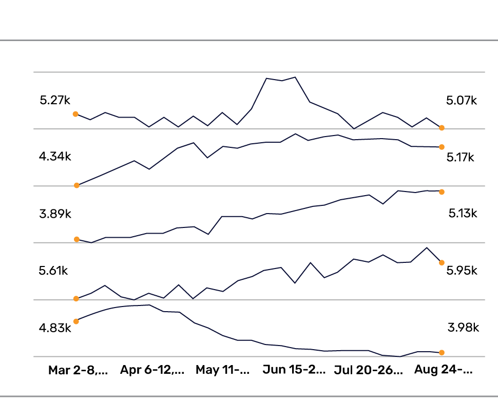
Characteristics of Sparkline:
It is an excellent tool for quickly highlighting changes over time or variations in data without the need for a larger, more detailed chart.
Sparklines in Microsoft Excel are small, condensed types of data visualization that present trends or patterns within a single cell. For example, a sparkline can be used to show the trend of monthly sales for a specific product over the course of a year. Placing the sparkline next to the product’s name allows you to instantly see the sales pattern without needing to refer to a separate chart.
Use Cases and Strengths:
- Analyzing trends and patterns within a dataset to provide a concise visual representation of how data changes over time or across categories.
- Enhancing textual content makes reports, dashboards, or documents more informative and engaging.
- Efficient data summaries allow viewers to quickly grasp the overall direction or variability of a dataset.
- When space is limited or a large number of data points need to be displayed together, sparklines offer a space-efficient way to convey information.
- Sparklines can be placed side by side for easy visual comparison of trends or patterns across multiple categories.
31. Network Graph
A network graph displays the relationships between entities as nodes (vertices) connected by edges (lines or links). They are often employed in community detection, helping to uncover clusters or groups of entities with strong internal connections.

Characteristics of Network Graph:
- It is useful for analyzing complex relationships, representing social networks, and visualizing the flow of information or connections between different entities.
- Allow you to identify central nodes or key entities that play a crucial role in the network, such as influencers in a social network or critical components in a system.
Network graphs in Gephi are types of data visualization that represent entities and their relationships. Nodes depict entities, while edges illustrate connections between them. For instance, consider a social network graph where nodes are individuals, and edges represent friendships. By importing and visualizing this data in Gephi, you can identify clusters of closely connected friends and explore the structure of the social network, revealing important insights about its organization.
Use Cases and Strengths:
- Analyzing complex relationships, making them valuable for understanding intricate systems, dependencies, or interactions.
- Representing social networks showing how individuals or groups are connected in online or offline communities.
- Visualizing information flow such as data transmission, communication patterns, or influence propagation.
32. 3D Surface Plot
A 3D surface plot illustrates three-dimensional surfaces, revealing how a variable alters concerning two dimensions (x and y), with the third dimension (z) indicating the variable’s value. 3D surface plots are commonly used in scientific and engineering fields, including geology, physics, and environmental studies, where understanding three-dimensional data relationships is essential.

Characteristics of 3D Surface Plot:
These plots present data as a surface within a three-dimensional space, where the elevation or depth of the surface corresponds to the analyzed variable’s value (z-axis).
3D surface plots in MATLAB are types of data visualization that can be used to visualize a mathematical function like a saddle-shaped hyperbolic paraboloid, where the x and y values determine the position on the surface, and the z value indicates the height. This type of plot enables you to gain insights into the behavior and relationships of complex functions in three-dimensional space.
Use Cases and Strengths:
- Useful for visualizing terrains, such as mountains, valleys, or other geographical landscapes.
- Analyzing complex relationships between variables that involve three dimensions, reveals how changes in two input variables affect the output.
- Identifying spatial patterns such as identifying peaks, valleys, or clusters within the data.
33. Word Network
A word network represents relationships between words, typically by showing how words are connected or related within a given context.
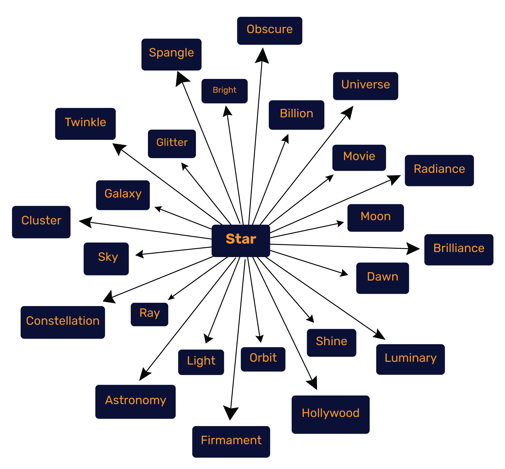
Characteristics of Word Network:
- It is a powerful tool for various text analysis tasks, including exploring similarity, topics, and sentiment, and visualizing the connections between keywords.
- Word networks facilitate concept mapping, aiding in understanding the relationships and semantics of words within textual data.
In AntConc, word networks are types of data visualization that can help to visualize which words frequently occur together in the same articles. This helps uncover patterns and associations within the text data, revealing important thematic connections and contextual relationships between words.
Use Cases and Strengths:
- Invaluable for text analysis tasks, such as analyzing the similarity between documents, identifying topics within a large corpus, or evaluating sentiment based on word associations.
- Visually representing connections between keywords, enabling users to create concept maps that display the relationships between important terms.
- Explore the semantic relationships between words, helping in understanding the meaning and context of individual terms.
- Assist in content summarization by highlighting the most frequently occurring or relevant terms in a body of text.
- Generate insights by revealing word clusters, showing which words are closely related, and identifying central or influential terms within the context.
34. Calendar Heatmap
Calendar heatmaps are types of data visualization that showcase data or events on a grid resembling a calendar. They are valuable for analyzing seasonal trends, and identifying peak seasons or off-peak periods based on data frequency.
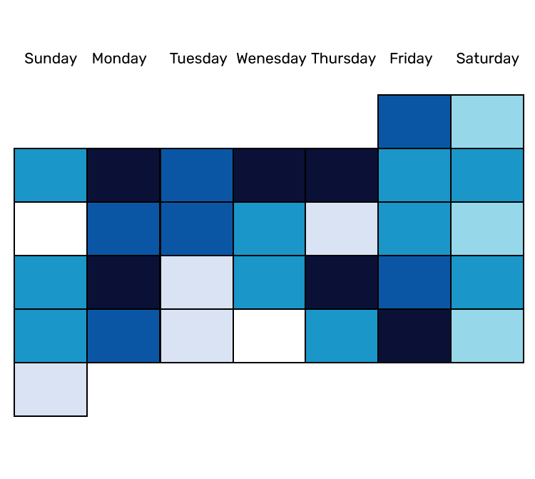
Characteristics of Calendar Heatmap:
Each cell within the grid corresponds to a particular date, and the color of the cell signifies the value or frequency of the associated data or events for that specific date.
A calendar heatmap in Bitbucket in a software development context, could display the days when code commits were made. Darker colors might represent days with more commits, while lighter colors indicate fewer commits, allowing teams to quickly grasp patterns of activity and identify periods of intense development or relative inactivity.
Use Cases and Strengths:
- Identifying temporal patterns, trends, or cycles within the data. This is particularly useful for time-dependent datasets, such as sales, user activity, or weather data.
- Tracking event occurrences of specific events over time makes it easy to observe periods of high or low activity.
- Providing data summaries within a date-based context, allows users to grasp the overall distribution or trends quickly.
- Aid in event scheduling, helping to identify available dates or periods of high demand.
35. Parallel Sets
Parallel sets, also known as parallel coordinate sets, represent multivariate data using parallel axes and facilitate the exploration of data distributions. This helps to reveal how variables or categories relate to each other and provides a comprehensive view of the data.

Characteristics of Parallel Sets:
- It involves creating parallel lines for each data point, where each axis corresponds to a specific variable or category.
- The interactions between these parallel lines provide insights into the relationships and patterns within the data.
For example, imagine analyzing a dataset of survey responses with variables like gender, age group, and favorite color. Parallel sets in Polymaps are data visualization types that display how these variables intersect, illustrating how many respondents belong to different combinations of these categories and enabling insights into the relationships between them.
Use Cases and Strengths:
- Exploring and understanding relationships between multiple variables simultaneously. They allow users to detect patterns, correlations, and trends within complex datasets.
- The parallel lines provide a visual representation of how different categories interact across various dimensions.
- Detect outliers as unusual data points may deviate significantly from the general patterns observed in the parallel coordinates.
Looking to Achieve Business Success by Overcoming Data Extraction Hurdles?

Tapping into Mindbowser’s Data Visualization Expertise
Data visualization serves as a powerful tool for transforming complex data into comprehensible insights and helps to uncover patterns, trends, and relationships within data. Whether through charts, graphs, maps, or interactive tools, effective data visualization enhances decision-making, storytelling, and exploration, driving better understanding and communication of information.
Mindbowser stands as a trusted partner for clients seeking data visualization expertise. With our skilled experts leading the way, optimal visualization techniques are selected to suit unique requirements. Mindbowser’s Data Visualization Services provide custom visualization techniques that cater precisely to these needs, ensuring that data-driven decisions are empowered with clear insights. Through this collaborative partnership, impactful visualizations are forged, ultimately fostering effective communication of insights. Looking to translate data into actionable wisdom, tap Mindbowser for the gateway to effective insights communication.
Frequently Asked Questions
Data visualization should be used for presenting complex information, patterns, and insights in a clear, accessible, and visually engaging manner. It’s especially valuable for large datasets, time trends, comparisons, and variable relationships. It simplifies concepts, aids decision-making, and communicates findings effectively across various fields, enhancing comprehension, insight discovery, and information communication. There are various types of data visualization covered in our blog.
Choosing the right types of data visualization depends upon the data type, goal, complexity, and audience. Consider whether your data is categorical, numerical, or time-based, and define your objectives such as comparison, trend display, or relationship analysis. Bar charts are suitable for comparisons, line charts show trends, scatter plots reveal correlations, and maps visualize geography. Align the data visualization technique based on your audience’s familiarity, experiment, and iterate to find which method is effective for telling your data’s story.
Effectively combining various types of data visualization in a single dashboard requires careful design and alignment with its purpose. Understand the insights and audience needs, selecting complementary visualizations like bar charts, line charts, and scatter plots. Maintain consistent color coding, labeling, and layout to aid interpretation. Utilize interactive features for deeper exploration. Regularly review and refine to ensure ongoing effectiveness and user-friendliness.
Numerous tools and software cater to advanced types of data visualization needs. Examples include Tableau for user-friendly and interactive visuals, Python’s Matplotlib and Seaborn for flexibility, R programming and ggplot2 for code-based visualization, D3.js and Plotly for web-based interactivity, and options like QlikView, Looker, and Power BI for comprehensive analytics. The choice depends on your requirements, expertise, and visualization complexity.
The top 5 types of data visualization are: –
- Bar Charts
- Line Charts
- Scatterplots
- Pie Charts
- Histograms