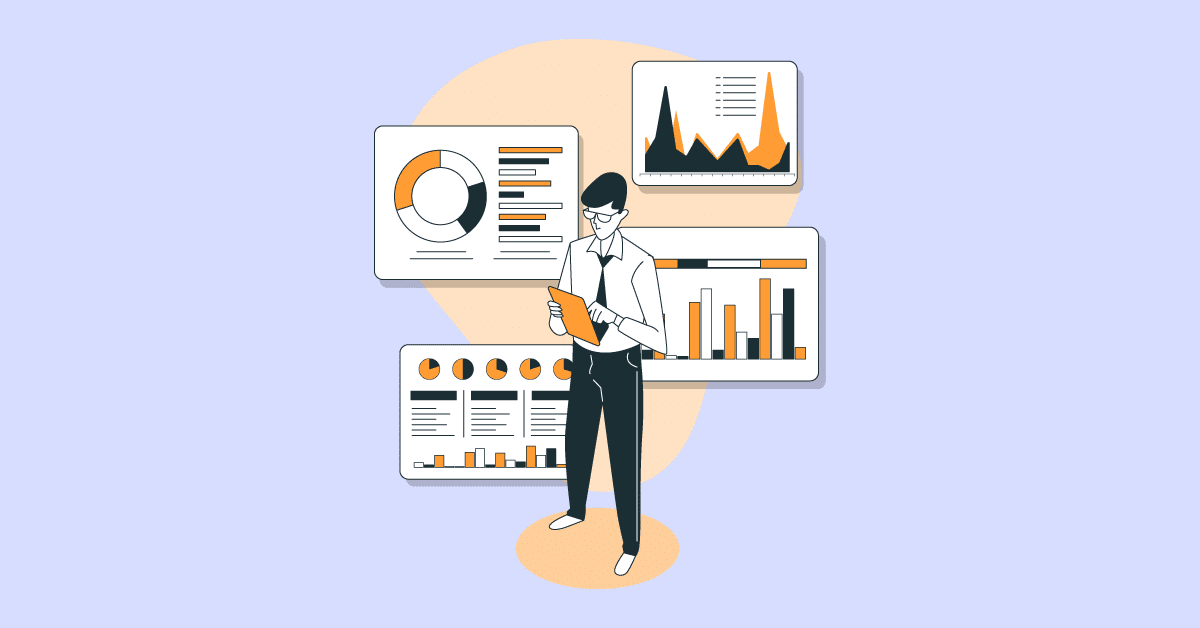
In the healthcare setting, professionals turn to data visualization to communicate patient information and other vital resources. This enables healthcare professionals to display critical information in graphs, charts, pictorials, and other visuals. This system passes all the data and is processed quickly and efficiently.
This article will cover data visualization trends in the healthcare industry.
Keep reading if you want to understand some data visualization trends to look out for in the coming years.
Cloud computing as one of the data visualization trends provides two-fold benefits to the healthcare industry. It has proved to be helpful for both healthcare providers and patients alike. Cloud computing has proven to be effective in the corporate sector in reducing operating costs while enabling providers to deliver high-quality, personalized treatment.
Patients increasingly used to the instant delivery of services can now take advantage of the same promptness from the health sector. By allowing them to manage their health records, Cloud amplifies patient interaction with their health plans, resulting in better patient results.
It further breaks down location barriers and provides remote accessibility for improved performance and experience. During the prevention, treatment, and recovery processes, cloud-based telehealth systems and applications facilitate easy sharing of health data, enhance accessibility, and provide patients with healthcare coverage.
Having the patient’s data in the cloud also facilitates interoperability between the pharmaceuticals, insurance, and payments of the different segments of the healthcare industry.
This facilitates the smooth transfer of data between the various stakeholders, thus speeding up the delivery of healthcare and introducing quality in the process.
Cloud computing enhances efficiencies with rapidly emerging technologies such as Big Data analytics, artificial intelligence, and the medical internet. It opens up multiple opportunities to streamline the delivery of healthcare. It improves the availability of services, enhances interoperability, and lowers costs.
To make predictions or the unknown, predictive analytics is the method of learning from historical data. Predictive analytics would allow the right choices for health care, enabling care to be customized to each person.
Predictive analytics approximates the likelihood of a prediction based on observations in historical data rather than only providing information from past events to an end-user, a significant step forward for many personalized health organizations.
This helps physicians, financial analysts, and administrative staff get a “head up” on future situations before they happen and make decisions on how to proceed forward-thinking.
In emergency treatment, surgery, and intensive care, the importance of predictive modeling in healthcare can easily be observed. A patient’s outcome is directly linked to the care provider’s rapid response and acute decision-making when or if the condition takes an unexpected turn.
In data visualization trends, strategy, and integration compare various types of data and create and deliver comprehensive, patient-specific care plans simpler for the care providers. A provider may, for example, display a patient’s medical history and compare it with other patients with similar conditions against the projected patterns and trajectories.
The reviews of the data visualization effectively check and verify various data points and apply information gained to improve patient care decisions.
With the growing social media trend in the past decade, data researchers have shifted to making data visualization more social, presentable, visually appealing, and easily understandable.
This trend is becoming increasingly popular, and researchers are adopting it pretty quickly, using instances like 3D animations, GIFs, and Youtube Stories.
With the introduction of new data analysis platforms, the data that was once considered difficult to understand and required input from scientists and technical teams have completely changed with the introduction of no-code analysis platforms.
One of the data visualization trends is to use these platforms not only to process the data but also show it in an easy-to-understand manner. This trend will not only help teams make data-driven decisions without any technical inputs but also increase data usage in decision-making.
Storytelling with data is among the most important and integral parts of the business process. It makes the customer feel connected and helps build a relationship with them.
The idea of visualizers becoming storytellers was out a few years ago, but in the past year, it has gained much traction. These are some of the data visualization trends that enable storytelling nowadays and are widely adopted by many organizations.
It can’t be argued that data in charts, diagrams, and dashboards are easy to showcase and explain compared to long paragraphs and reports.
From all the data visualization trends over the years, this trend has taken over the top media organizations, and more and more of them are using this summarized data to show it to their viewers as it takes less space and is easy to explain and understand. It is already very popular in the mainstream media and will gain more popularity in the coming years.
These data visualization trends cannot compare to the introduction of AI in the data visualization industry! Not only has there been a transformation in how we look at data, but also the ease with which data can be consumed.
Big companies have massive data that can be overwhelming, and AI solves this problem by helping them discover what data they should be looking at. Over the coming years, more and more data will be available, and AI will make it easy to get a sense of the data.
Mobile devices need no introduction, as we have used them for almost all our tasks. Since mobile experiences matter most for businesses and their customers, engaging in providing mobile-friendly data will be among the key trends in the coming years.
Many data visualization enterprises have used these data visualization trends and have already incorporated features in their tools that can be used on mobile devices, and more and more organizations are adopting this trend rapidly.
Engaging viewers with movement and control. Interactive visualizations let users drill down, filter, and explore data in real time, fostering deeper understanding and engagement. Animations can bring complex concepts to life, making them easier to grasp.
For example, exploring customer demographics with interactive filters, and discovering hidden buying patterns.
This kind of data visualization trends democratizes data analysis, empowers informed decisions, and transforms cold statistics into captivating experiences. Buckle up, the future of data exploration is interactive and animated!
One of the better data visualization trends is to form the data visually in the form of a “dashboard”, which can be understood as a series of interactive reports that enable decision-makers to analyze metrics easily or scan patterns.
Several types of dashboards can be used in healthcare organizations. Some of these are briefly explained below:
Just as the name suggests, an operational dashboard is designed to display the everyday, routine operations of the hospital. It is a monitoring tool used to track the hospital’s constantly evolving processes and monitor the current performance of key metrics.
The data is updated regularly, sometimes minute-by-minute, making the work very quick and efficient.
These are some of the data visualization trends that give out real-time information about whatever is happening in the hospital at the current moment. All this information and data regarding routine operations can be seen and reviewed. From base-level information to hospital administration, all the data and information can be checked and reviewed throughout the day.
A strategic dashboard is a monitoring tool commonly used by executives to track the status of main performance indicators. The data of the strategic dashboard is also updated regularly but at less regular intervals than an organizational dashboard.
Just as operational dashboards are used for routine activities, strategic dashboards are created to see and review trends and changes in the key indicators.
It also provides collective information for quick and easy viewing and reviewing. For instance, a strategic dashboard enables healthcare professionals to review various changes over the months. This can be viewed through different strategies and events.
An analytical dashboard is a reporting tool that analyzes large volumes of information to enable users to examine trends, predict results, and discover insights. Within business intelligence tools, analytical dashboards are more common because they are typically developed and designed by data analysts. The analytical dashboards work for analysis and bringing similar information together and are a great product of all these data visualization trends that are released.
It includes various data visualization tools for extrapolating or concluding the findings from a large dataset. The analytical dashboard is a mix of various tools and helps further review and gather information. This dashboard is efficient enough to comprehend and understand relevant patterns from a wide set of patient medical records This makes things quick and easy and reduces efforts.
Our team of engineers, data scientists, and mobile app developers are experienced and agile, able to accelerate the innovation and implementation of customizable ML and AI products.
Our experts have vast cross-industry expertise and are supported by scientific rigor and in-depth knowledge of advanced techniques. This allows us to design, develop, and deploy bespoke data solutions that meet the specific needs of our clients.
Curious about how data visualization trends are influencing tools like Power BI? Discover more about the impact of these trends on practical data visualization in our article on Data Visualization with Power BI.
Ready models that result in time and cost-saving

We help you identify & validate viable use cases across your business, guide your model through to deploying your models into production

A strong team led by ph.D. holders in data science
and AI

We cover the full spectrum of ML and AI that is required to get the right ROI for your business

Our solutions are independent of the framework. You can continue to explore proprietary tools as well as choose among open source options


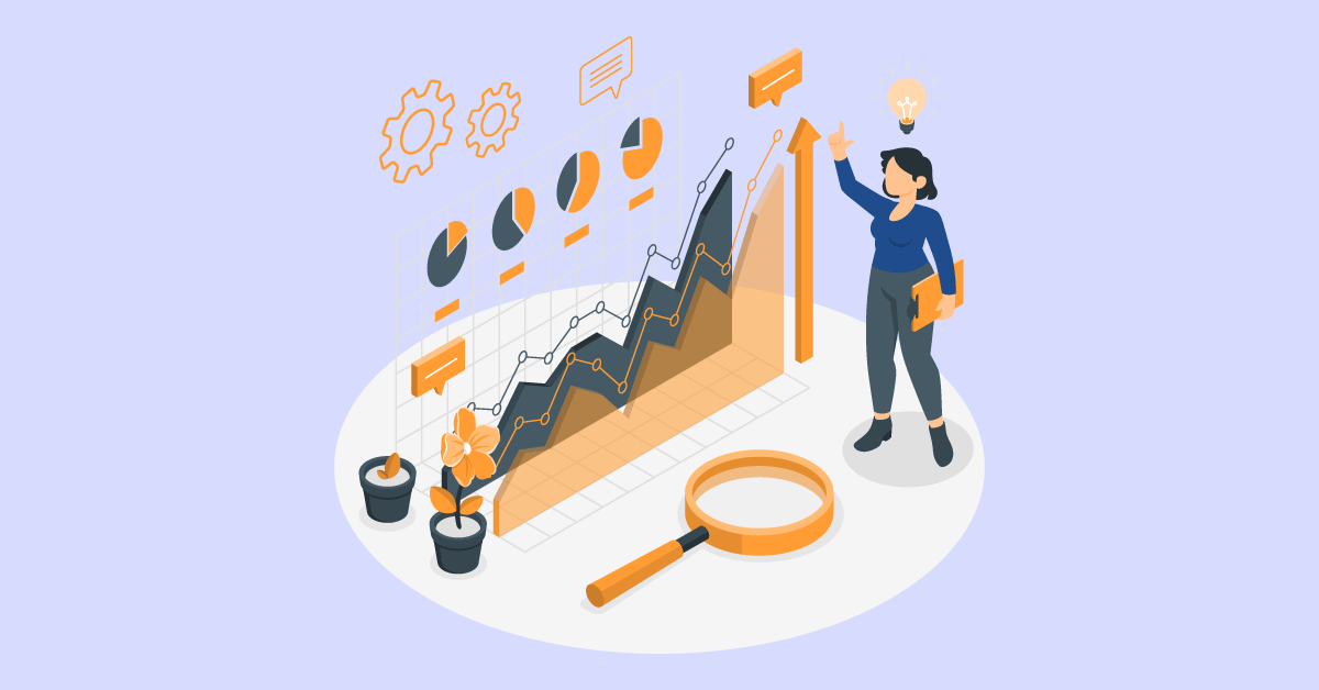
In this sophisticated digital age, data visualizations have become a critical part of the business world and an ever-increasing part of managing our everyday lives!
In addition, data visualization trends and data analysis will also assist in preventing fraud, excessive expenses, waste, and misuse of funds. Seeing that the healthcare sector is a big aspect of life, those who commit fraud in terms of their benefits, bills, etc., are likely to be, and there is always the risk of wasting too much on a single field or event. Data analysis helps prevent certain circumstances so that the industry can work properly and have sufficient facilities.
Also, it’s important to remember that it’s a tedious job to record and interpret all medical data, even with advanced technologies. Due to the various data types available, there will still be mistakes or inadequacies.
The top 5 data visualization trends are: –
Data science provides the foundation for AI by using algorithms and statistical models to analyze and learn from data. One of the data visualization trends is called machine learning, a subset of AI, that relies heavily on data science techniques for training models.
Cloud computing in healthcare enhances accessibility, interoperability, and efficiency. It allows for the quick sharing of health data, facilitates remote accessibility, and contributes to streamlined healthcare delivery by leveraging technologies like Big Data analytics and AI.
Predictive analysis in healthcare allows for making informed decisions based on historical data. It helps in anticipating outcomes, enabling personalized care and rapid response in emergencies.
The ideal tool for visualizing healthcare data varies depending on the objectives and needs. Nonetheless, GIS, interactive dashboards, and heatmaps are well-liked and practical tools.
These tools support trend analysis, geographic disparity visualization, and patient data analysis.
Solutions for complicated requirements can be customized with specialized software like Tableau, Power BI, and QlikView.
Choose the best visualization based on your target audience, desired insights, and data type (numerical, temporal, or categorical).
For example, scatter plots and heatmaps illustrate correlations, pie/bar charts show proportions, and line graphs track trends.
Remember that simplicity is often more effective in communicating ideas than complexity. Try out different kinds of visualization, but keep readability and clarity as a top priority.
Numerous options are available to match your data and goals with tools like Tableau, Power BI, and Matplotlib in Python.

We worked with Mindbowser on a design sprint, and their team did an awesome job. They really helped us shape the look and feel of our web app and gave us a clean, thoughtful design that our build team could...

The team at Mindbowser was highly professional, patient, and collaborative throughout our engagement. They struck the right balance between offering guidance and taking direction, which made the development process smooth. Although our project wasn’t related to healthcare, we clearly benefited...

Founder, Texas Ranch Security
Mindbowser played a crucial role in helping us bring everything together into a unified, cohesive product. Their commitment to industry-standard coding practices made an enormous difference, allowing developers to seamlessly transition in and out of the project without any confusion....

CEO, MarketsAI
I'm thrilled to be partnering with Mindbowser on our journey with TravelRite. The collaboration has been exceptional, and I’m truly grateful for the dedication and expertise the team has brought to the development process. Their commitment to our mission is...

Founder & CEO, TravelRite
The Mindbowser team's professionalism consistently impressed me. Their commitment to quality shone through in every aspect of the project. They truly went the extra mile, ensuring they understood our needs perfectly and were always willing to invest the time to...

CTO, New Day Therapeutics
I collaborated with Mindbowser for several years on a complex SaaS platform project. They took over a partially completed project and successfully transformed it into a fully functional and robust platform. Throughout the entire process, the quality of their work...

President, E.B. Carlson
Mindbowser and team are professional, talented and very responsive. They got us through a challenging situation with our IOT product successfully. They will be our go to dev team going forward.

Founder, Cascada
Amazing team to work with. Very responsive and very skilled in both front and backend engineering. Looking forward to our next project together.

Co-Founder, Emerge
The team is great to work with. Very professional, on task, and efficient.

Founder, PeriopMD
I can not express enough how pleased we are with the whole team. From the first call and meeting, they took our vision and ran with it. Communication was easy and everyone was flexible to our schedule. I’m excited to...

Founder, Seeke
We had very close go live timeline and Mindbowser team got us live a month before.

CEO, BuyNow WorldWide
If you want a team of great developers, I recommend them for the next project.

Founder, Teach Reach
Mindbowser built both iOS and Android apps for Mindworks, that have stood the test of time. 5 years later they still function quite beautifully. Their team always met their objectives and I'm very happy with the end result. Thank you!

Founder, Mindworks
Mindbowser has delivered a much better quality product than our previous tech vendors. Our product is stable and passed Well Architected Framework Review from AWS.

CEO, PurpleAnt
I am happy to share that we got USD 10k in cloud credits courtesy of our friends at Mindbowser. Thank you Pravin and Ayush, this means a lot to us.

CTO, Shortlist
Mindbowser is one of the reasons that our app is successful. These guys have been a great team.

Founder & CEO, MangoMirror
Kudos for all your hard work and diligence on the Telehealth platform project. You made it possible.

CEO, ThriveHealth
Mindbowser helped us build an awesome iOS app to bring balance to people’s lives.

CEO, SMILINGMIND
They were a very responsive team! Extremely easy to communicate and work with!

Founder & CEO, TotTech
We’ve had very little-to-no hiccups at all—it’s been a really pleasurable experience.

Co-Founder, TEAM8s
Mindbowser was very helpful with explaining the development process and started quickly on the project.

Executive Director of Product Development, Innovation Lab
The greatest benefit we got from Mindbowser is the expertise. Their team has developed apps in all different industries with all types of social proofs.

Co-Founder, Vesica
Mindbowser is professional, efficient and thorough.

Consultant, XPRIZE
Very committed, they create beautiful apps and are very benevolent. They have brilliant Ideas.

Founder, S.T.A.R.S of Wellness
Mindbowser was great; they listened to us a lot and helped us hone in on the actual idea of the app. They had put together fantastic wireframes for us.

Co-Founder, Flat Earth
Ayush was responsive and paired me with the best team member possible, to complete my complex vision and project. Could not be happier.

Founder, Child Life On Call
The team from Mindbowser stayed on task, asked the right questions, and completed the required tasks in a timely fashion! Strong work team!

CEO, SDOH2Health LLC
Mindbowser was easy to work with and hit the ground running, immediately feeling like part of our team.

CEO, Stealth Startup
Mindbowser was an excellent partner in developing my fitness app. They were patient, attentive, & understood my business needs. The end product exceeded my expectations. Thrilled to share it globally.

Owner, Phalanx
Mindbowser's expertise in tech, process & mobile development made them our choice for our app. The team was dedicated to the process & delivered high-quality features on time. They also gave valuable industry advice. Highly recommend them for app development...

Co-Founder, Fox&Fork