
Convert your unstructured data into polished insights, ready to fuel intelligent decisions and drive business value with our data visualization services.

Unlock the power of your BI dashboards, ensuring actionable insights render flawlessly, maximizing engagement and decision-making agility.

Transform raw data into actionable insights, empowering every user to make informed decisions in a cost-effective solution with our data visualization services.

Our advanced solutions seamlessly integrate with modernization efforts, driving advanced data-driven decisions in your daily workflow.

Uncover key insights from diverse sources with our data processing services. Analyze, for example, quarterly marketing ROI across channels, pinpointing underperforming ones for strategic optimization.

Custom reports and dashboards cater to diverse user roles across organizations. From CXO-level KPIs to department-specific metrics, we deliver actionable insights for informed decision-making.

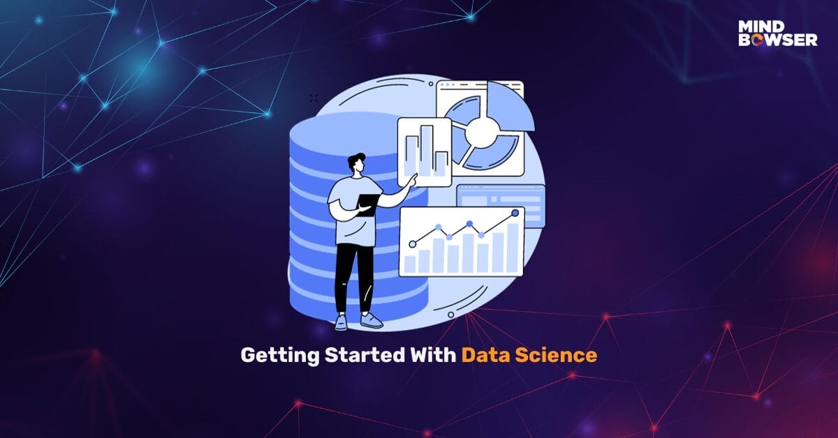
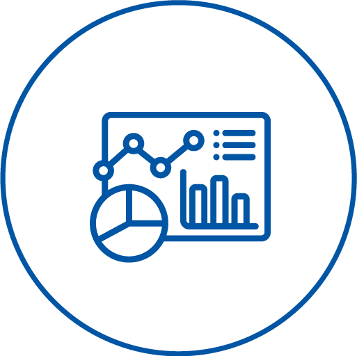
Our data visualization services transform complex datasets into easily interpretable insights. Informative graphs, charts, maps, and tables aid users in extracting meaning from large volumes of data.

Our self-service reporting empowers all decision-makers with instant access to crucial data and insights, fostering a data-centric approach independent of external assistance.
The customer is a machine learning service provider that allows non-technical business professionals to select, train, and apply machine learning to their business. Based in Bellevue, Washington, the company was looking for a reliable partner who could deliver an end-to-end data analytics solution for them.
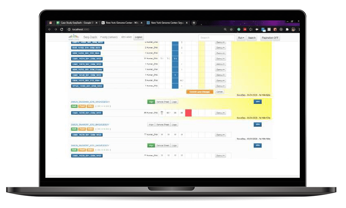
The platform is part of the work done by Mindbowser for The New York Genome Center (NYGC). NYGC is an independent nonprofit academic research institution in New York. The client approached Mindbowser to convert the old application into a new stack. The old application had quality and performance issues. We differentiated all tasks in Jira stories and created sprints to boost the development speed and give proper and on-time delivery.
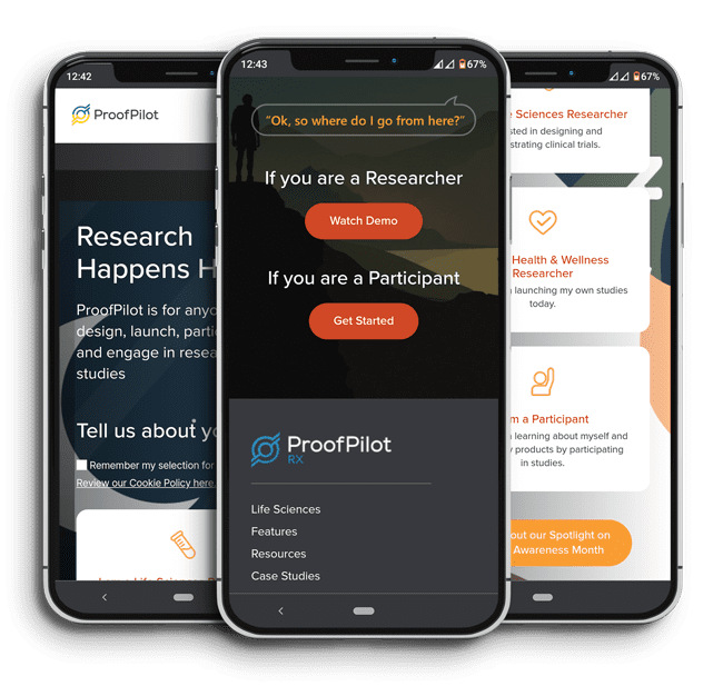
ProofPilot is a healthcare tech platform that allows individuals to
design, manage, launch, and participate in research studies. ProofPilot keeps the data on the platform secure while providing tools to the user to conduct their research studies.
ProofPilot has raised 2Mn in Venture Capital to date
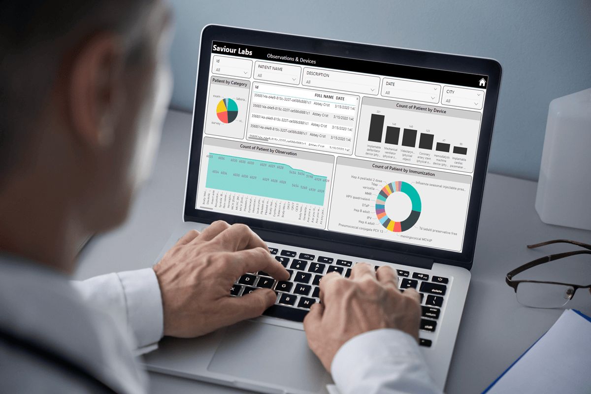
Our high-quality equipment enhances diagnostics and patient care, aiming to revolutionize the industry. The platform delivers devices with user-friendly dashboards, streamlining management for hospitals and providers.


Sandeep is a certified, highly accurate, and experienced Data Scientist adept at collecting, analyzing, and interpreting large datasets, developing new forecasting models, and performing data management tasks. Sandeep possesses extensive analytical skills, strong attention to detail, and a significant ability to work in team environments. Sandeep has 12+ years of experience in building software products and juggling with data.
He has been known for translating complex datasets into meaningful insights, and his passion lies in interpreting the data and providing valuable predictions with a good eye for detail. He is highly optimistic and an avid reader.
Our comprehensive data visualization services rely on the most popular data modeling and mapping techniques. We apply these techniques to capture data and prepare and distribute them across devices and platforms.

Our data visualization services in the BI and data analytics space are quite effective. We’re a strategic business partner for top companies and have worked with many visualization tools.

These reports go beyond desktop compatibility. Reports with smart visualizations can be easily accessible across all mobile devices.

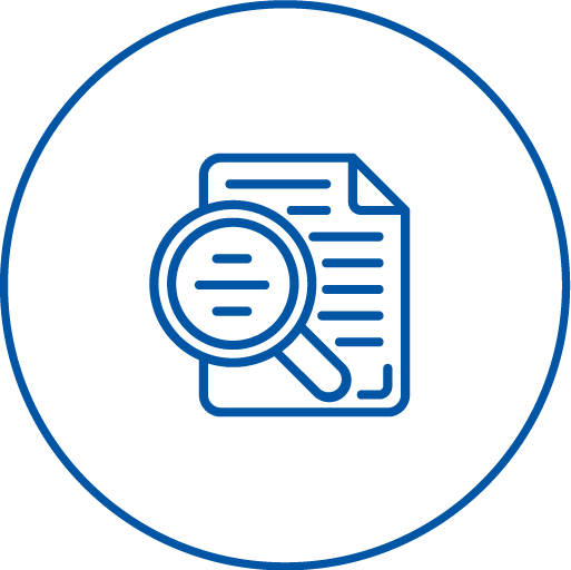
Our data visualization services consultants review all existing data and help you to get your unorganized data in an organized and visually appealing manner.

Maintenance and support offering helps you with continuous improvement and optimization in your data strategy for long-term benefits.
We are led by a team of adept data scientists who have an excellent track record of generating a return on investment for our clients. As a data visualization services company, we help you throughout your data journey to implement an in-depth research and development plan to finalize the best approach for solving your questions and accomplish your vision at the highest level. We work closely with you to analyze each data source, facts, figures, and engineering solution to deliver predictive insights to you. Our step-by-step Data Visualization approach is as follows.

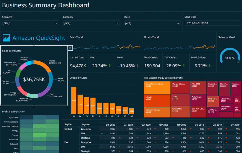
Data Visualization with Amazon QuickSight
With QuickInsight, enterprises can develop interactive visualizations, ad-hoc business analysis, and obtain effective market insights. Amazon QuickSight offers a pay-as-you-go pricing model for obtaining insights at scale.
Offerings of AWS Data Visualization:
Data Visualization with Azure
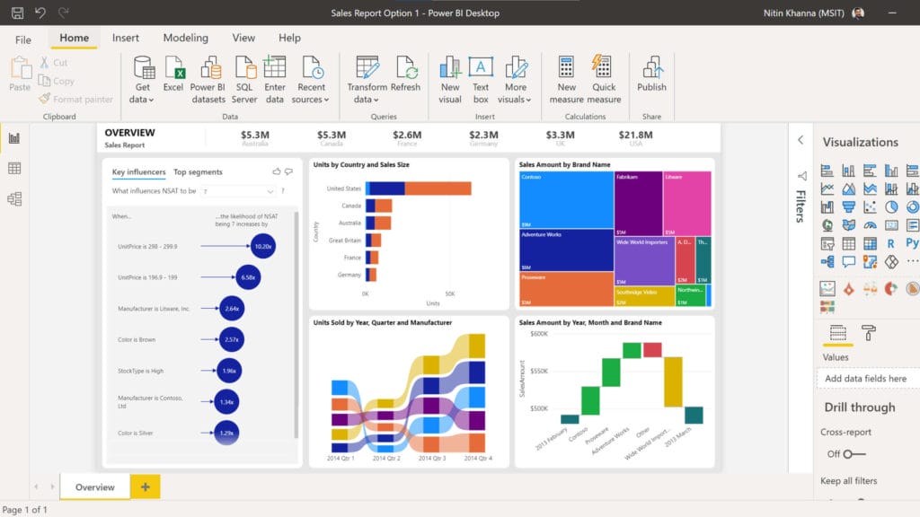
Microsoft Power BI Visualization allows companies to build robust business-centric dashboards, consolidate data from different sources, and facilitate self-service analytics.
Offerings of Azure Data Visualization
Our experts in data visualization services use statistical and mathematical methods and tools to invent solutions that help companies automate processes, optimize entire operation processes, and extract business value with data.
We work with all-size businesses— from startups to Fortune 500— in industries from engineering and tech to pharmaceuticals, retail, and energy.
Our multidisciplinary team of engineers, data scientists, and mobile app developers accelerates innovation and implementation of custom AI/ML products. Backed by in-depth knowledge of advanced techniques, our experts bring vast cross-industry expertise to design, develop, and deploy data solutions enriched with powerful data visualization services.
We help you identify & validate viable use cases across your business, guide your model through to deploying your models into production

We cover the full spectrum of ML and AI that is required to get the right ROI for your business.
Our solutions are independent of the framework. You can continue to explore proprietary tools as well as choose among open source options
Our Design Thinking Led Approach ensures empathetic solutions, fostering a deeper understanding of your mental health.
We boost quality through Automation, streamlining processes for enhanced mental health services.
We offer Clear and Open Pricing Structures, ensuring transparency and affordability for your mental health support.
Check out our blog on trending topics on Data Visualization services.
Our comprehensive data visualization services empower businesses to achieve a sustainable competitive advantage.
We help you make pixel-perfect reports and dashboards, transforming raw data into insightful, interactive visualizations that illuminate key patterns and trends.
Gain a deeper understanding of your information, empowering informed decision-making and driving business success.
With the support of advanced technologies, we help you get the most out of data.

Data science solutions can work with your proprietary data and integrate it into your workflow. Additionally, all data is worked under secure access and stringent NDAs.
Read More
Scraping services combine technology and domain knowledge to analyze and scrape data to convert it into significant information that builds business intelligence for our customers.
Read More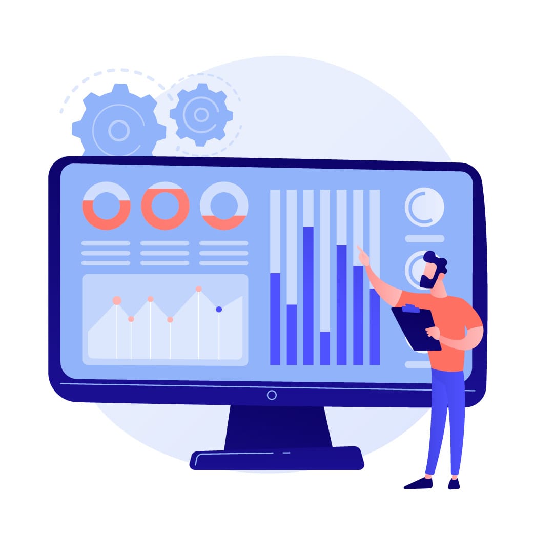
Data analytics consulting solutions help customers identify and obtain the most valuable and meaningful insights from the data, and turn them all into competitive advantages.
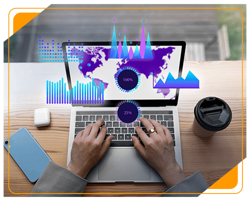
Read MoreData visualization serves as a fundamental technique for your organization to transform large data sets into a flexible and accessible business intelligence practice. By evaluating and presenting information through interactive visualizations, such as dashboards, charts, and graphs, you can accurately measure critical industry metrics and uncover promising new opportunities.
It serves as a potent tool for gleaning profound insights from complex data, informing impactful decisions, and fostering engagement across diverse audiences.
Why is it crucial in data visualization services?
Data visualization services help individuals and organizations transform their raw data into engaging and informative visuals. They go beyond the limitations of spreadsheets and tables, translating complex information into easily understandable charts, graphs, maps, and other visual elements
The best data visualization tools are Tableau, Microsoft Power BI, Looker, Qlik Sense, Sisense, Google Data Studio, Grafana, Chartist.js, FusionCharts, Datawrapper, Infogram, ChartBlocks, and D3.js.
In our data visualization services, we use Tableau, Looker, Zoho Analytics, Qlik Q, Sisense, and Power BI for our data visualization services.

We worked with Mindbowser on a design sprint, and their team did an awesome job. They really helped us shape the look and feel of our web app and gave us a clean, thoughtful design that our build team could...

The team at Mindbowser was highly professional, patient, and collaborative throughout our engagement. They struck the right balance between offering guidance and taking direction, which made the development process smooth. Although our project wasn’t related to healthcare, we clearly benefited...

Founder, Texas Ranch Security
Mindbowser played a crucial role in helping us bring everything together into a unified, cohesive product. Their commitment to industry-standard coding practices made an enormous difference, allowing developers to seamlessly transition in and out of the project without any confusion....

CEO, MarketsAI
I'm thrilled to be partnering with Mindbowser on our journey with TravelRite. The collaboration has been exceptional, and I’m truly grateful for the dedication and expertise the team has brought to the development process. Their commitment to our mission is...

Founder & CEO, TravelRite
The Mindbowser team's professionalism consistently impressed me. Their commitment to quality shone through in every aspect of the project. They truly went the extra mile, ensuring they understood our needs perfectly and were always willing to invest the time to...

CTO, New Day Therapeutics
I collaborated with Mindbowser for several years on a complex SaaS platform project. They took over a partially completed project and successfully transformed it into a fully functional and robust platform. Throughout the entire process, the quality of their work...

President, E.B. Carlson
Mindbowser and team are professional, talented and very responsive. They got us through a challenging situation with our IOT product successfully. They will be our go to dev team going forward.

Founder, Cascada
Amazing team to work with. Very responsive and very skilled in both front and backend engineering. Looking forward to our next project together.

Co-Founder, Emerge
The team is great to work with. Very professional, on task, and efficient.

Founder, PeriopMD
I can not express enough how pleased we are with the whole team. From the first call and meeting, they took our vision and ran with it. Communication was easy and everyone was flexible to our schedule. I’m excited to...

Founder, Seeke
We had very close go live timeline and Mindbowser team got us live a month before.

CEO, BuyNow WorldWide
If you want a team of great developers, I recommend them for the next project.

Founder, Teach Reach
Mindbowser built both iOS and Android apps for Mindworks, that have stood the test of time. 5 years later they still function quite beautifully. Their team always met their objectives and I'm very happy with the end result. Thank you!

Founder, Mindworks
Mindbowser has delivered a much better quality product than our previous tech vendors. Our product is stable and passed Well Architected Framework Review from AWS.

CEO, PurpleAnt
I am happy to share that we got USD 10k in cloud credits courtesy of our friends at Mindbowser. Thank you Pravin and Ayush, this means a lot to us.

CTO, Shortlist
Mindbowser is one of the reasons that our app is successful. These guys have been a great team.

Founder & CEO, MangoMirror
Kudos for all your hard work and diligence on the Telehealth platform project. You made it possible.

CEO, ThriveHealth
Mindbowser helped us build an awesome iOS app to bring balance to people’s lives.

CEO, SMILINGMIND
They were a very responsive team! Extremely easy to communicate and work with!

Founder & CEO, TotTech
We’ve had very little-to-no hiccups at all—it’s been a really pleasurable experience.

Co-Founder, TEAM8s
Mindbowser was very helpful with explaining the development process and started quickly on the project.

Executive Director of Product Development, Innovation Lab
The greatest benefit we got from Mindbowser is the expertise. Their team has developed apps in all different industries with all types of social proofs.

Co-Founder, Vesica
Mindbowser is professional, efficient and thorough.

Consultant, XPRIZE
Very committed, they create beautiful apps and are very benevolent. They have brilliant Ideas.

Founder, S.T.A.R.S of Wellness
Mindbowser was great; they listened to us a lot and helped us hone in on the actual idea of the app. They had put together fantastic wireframes for us.

Co-Founder, Flat Earth
Ayush was responsive and paired me with the best team member possible, to complete my complex vision and project. Could not be happier.

Founder, Child Life On Call
The team from Mindbowser stayed on task, asked the right questions, and completed the required tasks in a timely fashion! Strong work team!

CEO, SDOH2Health LLC
Mindbowser was easy to work with and hit the ground running, immediately feeling like part of our team.

CEO, Stealth Startup
Mindbowser was an excellent partner in developing my fitness app. They were patient, attentive, & understood my business needs. The end product exceeded my expectations. Thrilled to share it globally.

Owner, Phalanx
Mindbowser's expertise in tech, process & mobile development made them our choice for our app. The team was dedicated to the process & delivered high-quality features on time. They also gave valuable industry advice. Highly recommend them for app development...

Co-Founder, Fox&Fork