Healthcare leadership: Turning strategy into compliant, market-ready healthcare solutions.
Read More
Empowering payors with intelligent, compliant solutions for seamless healthcare operations.
Read More
Transforming healthcare delivery through AI-powered automation & regulatory expertise.
Explore Solutions
Accelerating healthcare interoperability with secure, HL7 & FHIR-driven integrations.
Explore Solutions
Accelerating SMART on FHIR app development with secure, compliant healthcare data access.
Explore Solutions
Epic EHR Explained: How It Transforms Healthcare Operations and Patient Care
Read More →
A Complete Breakdown of the 13 Steps of Revenue Cycle Management
Read More →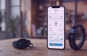
Wearable App Development Solutions: A Complete Guide For 2025
Read More →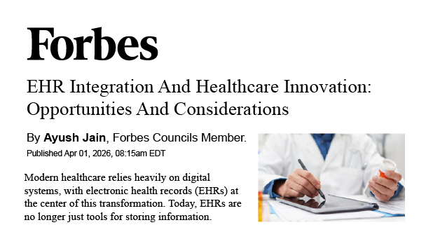
Driving Healthcare Innovation with EHR Integration Opportunities and Critical Considerations
Read More →
Mindbowser’s ConnectHealth Selected for NVIDIA Inception Program to Accelerate AI in Healthcare
Read More →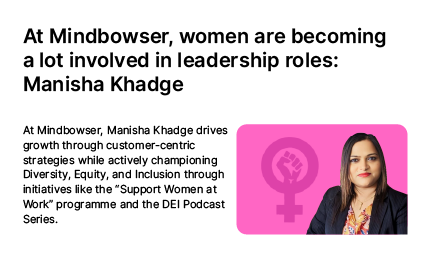
Our CMO Manisha Khadge on Women’s Growing Leadership Impact and DEI in Tech
Read More →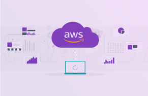
Healthcare Platform Cuts Cloud Costs by 40% with Strategic AWS Migration
Read More →
Improved Predictive Accuracy in Childbirth with Advanced EHR Integration
Read More →
Changing the Health Management with Integration of Wearable Data and Medical Expertise
Read More →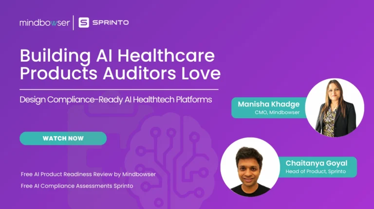
Building AI Healthcare Products That Auditors Love
Watch Now →
Beyond Design: Why Compliance First Discovery is Your Competitive Edge
Watch Now →
Simplifying Healthcare Integration on AWS with EHRConnect
Watch Now →
Tune into expert-led healthcare podcasts on innovation, compliance, & digital transformation.
Watch Now →
The RISE AI in Healthcare Summit Orlando, US January 21 – 23, 2026
Read More →
AI in Healthcare Summit 2026 Las Vegas, US January 15 – 16, 2026
Read More →
44th Annual J.P. Morgan Healthcare Conference San Francisco, US January 12 – 15, 2026
Read More →