
A lot of time we need to add different types of graphs to represent the data. There are multiple libraries used to represent the graph. The most commonly used libraries are:
1. Chart.js
2. Victory
3.Plotly.js
4. Highcharts
5. nvd3.
6. C3.js
7. Chartist
In this article, I will explain how to integrate plotly.js and generate graphs for our website using Reactjs.
Built on top of d3.js and stack.gl, plotly.js is a high-level, declarative charting library. plotly.js ships with over 40 chart types, including scientific charts, 3D graphs, statistical charts, SVG maps, financial charts, and more.
Plotly is an open-source Javascript library used to draw charts. For react we use the react-plotly.js library with plotly.js.
The data for the Plotly.js graph is a JSON object. Every attribute like color, grids, data has a respective JSON object.
Plotly supports different traces types like scatter, bar, pie, line charts, etc. Every trace has some common keys and additional extra keys depending on the type of the trace.
For example,
data={[
          {
            x: [1, 2, 3],
            y: [2, 6, 3],
            type: "scatter",
            mode: "lines+markers",
            marker: { color: "red" },
          },
          { type: "bar", x: [1, 2, 3], y: [2, 5, 3] },
        ]}
Type – The type key is the type of graph we want to represent. Here in the above example, we used bar and scatter type.
Name – It is the trace name. This name shows on hover and to the legend item.
Visible – It decides the trace is visible or not. It has 3 values true, false, “legendonly“.The default value is true. If “legendonly” then it does not appear on the graph but when we click on legend then it showed.
Showlegend – It determines the legends are shown or not. By default its value is true.
Opacity – It sets the opacity of the trace. It lies between or equal to the 0 and 1.
Mode– It shows the drawing mode for the traces of type scatter. It is a combination of strings “lines”,”markers”,”text” that joined with + or “none”.
On the Branch.io dashboard create your account,use link https://dashboard.branch.io/login. After the account was created, set up an account for android.
Title – It represents the title of the graph.we can use it as an object with one or more keys. The keys are text, font, pad, etc.
Legend – It is used to decorate the legends.This object containing keys like bgcolor, bordercolor, borderwidth, font, etc.
Margin – This attribute is used to set the margin to the graph. It has keys like t(top),b(bottom),l(left),r(right), pad, autoexpand, etc.
There more attributes of layout like size, fonts, colors, etc To know more about it you can refer https://plotly.com/javascript/reference/#layout-title
First, we install Plot.ly in our project using npm,
npm install react-plotly.js plotly.js --save
After that, we will import the Plot component and pass the attributes as per our graph requirement.
import React from "react";

import Plot from "react-plotly.js";

class Graph extends React.Component {

  render() {

    return (

      <Plot

        data={[

          {

            x: [1, 2, 3],

            y: [2, 6, 3],

            type: "scatter",

            mode: "lines+markers",

            marker: { color: "red" },

          },

          { type: "bar", x: [1, 2, 3], y: [2, 5, 3] },

        ]}

        layout={{ width: 320, height: 240, title: "Graph Example" }}

      />

    );

  }

}

export default Graph;
In plotly everything passed to an attribute is in JSON object format. In the above example, we created a simple bar chart with scatter.
In data, we added two objects which result in a combination of two graphs i.e bar and scatter. This is a simple example where we directly pass the props to the component.
import React from "react";
import Plot from "react-plotly.js";
class Graph extends React.Component {
  constructor(props) {
    super(props);
    this.state = {
      data: [{
        values: [19, 26, 55],
        labels: ['Residential', 'Non-Residential', 'Utility'],
        type: 'pie'
      }],
      layout: {
        height: 400,
        width: 500,
        title: "Pie chart"
      }
    };
  }
  render() {
    return (
      <div style={{ width: "100%", height: "100%" }}>
        <Plot
          data={this.state.data}
          layout={this.state.layout}
          onInitialized={(figure) => this.setState(figure)}
          onUpdate={(figure) => this.setState(figure)}
        />
      </div>
    );
  }
}
export default Graph;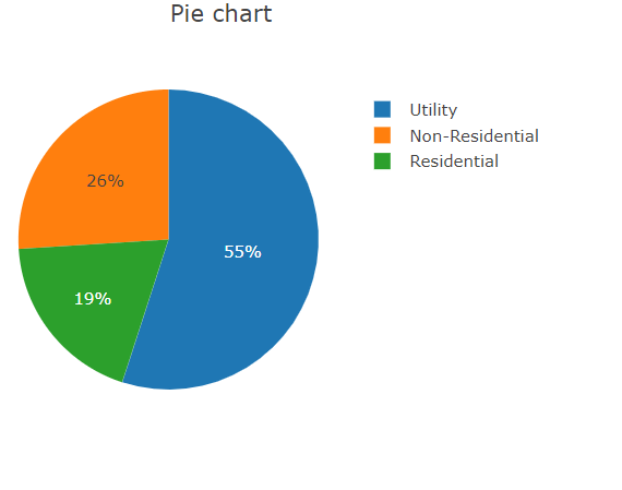
import React from "react";
import Plot from "react-plotly.js";
class Graph extends React.Component {
  constructor(props) {
    super(props);
    this.state = {
      data: [
        {
          x: [1, 2, 3, 4],
          y: [0, 2, 3, 5],
          fill: 'tozeroy',
          type: 'scatter',
          name: 'Vendor'
        },
        {
          x: [1, 2, 3, 4],
          y: [3, 5, 1, 7],
          fill: 'tonexty',
          type: 'scatter',
          name: 'Provider'
        }],
      layout: {
        height: 400,
        width: 600,
        title: "Area chart"
      }
    };
  }
  render() {
    return (
      <div style={{ width: "100%", height: "100%" }}>
        <Plot
          data={this.state.data}
          layout={this.state.layout}
          onInitialized={(figure) => this.setState(figure)}
          onUpdate={(figure) => this.setState(figure)}
        />
      </div>
    );
  }
}
export default Graph;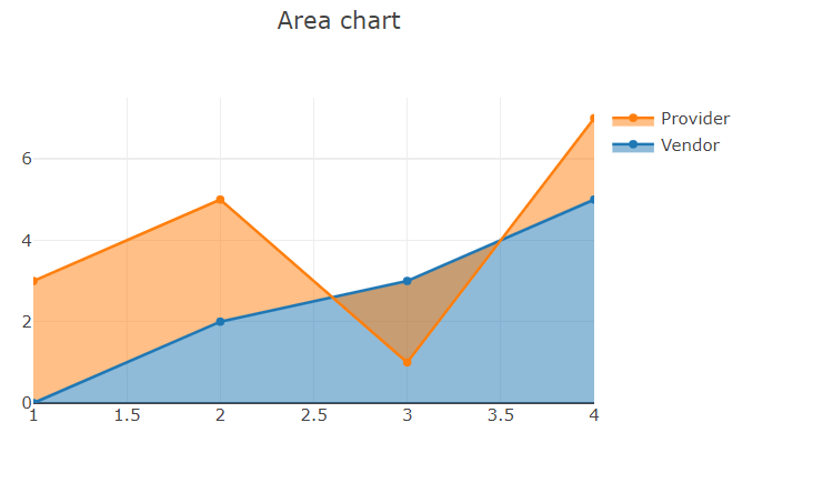
This component does not merge its internal state with any updates. When a user interacts with the plot by zoom or other actions and after that if the component re-renders then it loses this information. So using the onUpdate callback prop we capture and upstream that information.
In ReactJS we can use state and props to get better results. So we can change the data dynamically by updating the state of the parent component.
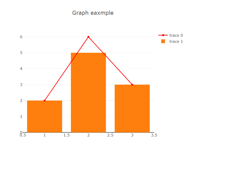
import React from "react";
import Plot from "react-plotly.js";
class Graph extends React.Component {
  constructor(props) {
    super(props);
    this.state = {
      data: [
        {
          x: [1, 2, 3],
          y: [2, 6, 3],
          type: "scatter",
          name: "scatter",
          //   visible: "legendonly",
          mode: "lines+markers",
          opacity: 0.1,
          marker: { color: "red" },
        },
        { type: "bar", name: "bar", x: [1, 2, 3], y: [2, 5, 3] },
      ],
      layout: { width: 600, height: 500, title: "Graph eaxmple" },
    };
  }
  render() {
    return (
      <div style={{ width: "100%", height: "100%" }}>
        <Plot
          data={this.state.data}
          layout={this.state.layout}
          onInitialized={(figure) => this.setState(figure)}
          onUpdate={(figure) => this.setState(figure)}
        />
      </div>
    );
  }
}
export default Graph;
We can create different types of graphs using plotly.js and also customize the graph as per our requirement.

In this article, we learn that we can create different types of graphs using plotly.js and also customize the graph as per our requirement. If you more suggestions on these please comment us.

We worked with Mindbowser on a design sprint, and their team did an awesome job. They really helped us shape the look and feel of our web app and gave us a clean, thoughtful design that our build team could...

The team at Mindbowser was highly professional, patient, and collaborative throughout our engagement. They struck the right balance between offering guidance and taking direction, which made the development process smooth. Although our project wasn’t related to healthcare, we clearly benefited...

Founder, Texas Ranch Security
Mindbowser played a crucial role in helping us bring everything together into a unified, cohesive product. Their commitment to industry-standard coding practices made an enormous difference, allowing developers to seamlessly transition in and out of the project without any confusion....

CEO, MarketsAI
I'm thrilled to be partnering with Mindbowser on our journey with TravelRite. The collaboration has been exceptional, and I’m truly grateful for the dedication and expertise the team has brought to the development process. Their commitment to our mission is...

Founder & CEO, TravelRite
The Mindbowser team's professionalism consistently impressed me. Their commitment to quality shone through in every aspect of the project. They truly went the extra mile, ensuring they understood our needs perfectly and were always willing to invest the time to...

CTO, New Day Therapeutics
I collaborated with Mindbowser for several years on a complex SaaS platform project. They took over a partially completed project and successfully transformed it into a fully functional and robust platform. Throughout the entire process, the quality of their work...

President, E.B. Carlson
Mindbowser and team are professional, talented and very responsive. They got us through a challenging situation with our IOT product successfully. They will be our go to dev team going forward.

Founder, Cascada
Amazing team to work with. Very responsive and very skilled in both front and backend engineering. Looking forward to our next project together.

Co-Founder, Emerge
The team is great to work with. Very professional, on task, and efficient.

Founder, PeriopMD
I can not express enough how pleased we are with the whole team. From the first call and meeting, they took our vision and ran with it. Communication was easy and everyone was flexible to our schedule. I’m excited to...

Founder, Seeke
We had very close go live timeline and Mindbowser team got us live a month before.

CEO, BuyNow WorldWide
If you want a team of great developers, I recommend them for the next project.

Founder, Teach Reach
Mindbowser built both iOS and Android apps for Mindworks, that have stood the test of time. 5 years later they still function quite beautifully. Their team always met their objectives and I'm very happy with the end result. Thank you!

Founder, Mindworks
Mindbowser has delivered a much better quality product than our previous tech vendors. Our product is stable and passed Well Architected Framework Review from AWS.

CEO, PurpleAnt
I am happy to share that we got USD 10k in cloud credits courtesy of our friends at Mindbowser. Thank you Pravin and Ayush, this means a lot to us.

CTO, Shortlist
Mindbowser is one of the reasons that our app is successful. These guys have been a great team.

Founder & CEO, MangoMirror
Kudos for all your hard work and diligence on the Telehealth platform project. You made it possible.

CEO, ThriveHealth
Mindbowser helped us build an awesome iOS app to bring balance to people’s lives.

CEO, SMILINGMIND
They were a very responsive team! Extremely easy to communicate and work with!

Founder & CEO, TotTech
We’ve had very little-to-no hiccups at all—it’s been a really pleasurable experience.

Co-Founder, TEAM8s
Mindbowser was very helpful with explaining the development process and started quickly on the project.

Executive Director of Product Development, Innovation Lab
The greatest benefit we got from Mindbowser is the expertise. Their team has developed apps in all different industries with all types of social proofs.

Co-Founder, Vesica
Mindbowser is professional, efficient and thorough.

Consultant, XPRIZE
Very committed, they create beautiful apps and are very benevolent. They have brilliant Ideas.

Founder, S.T.A.R.S of Wellness
Mindbowser was great; they listened to us a lot and helped us hone in on the actual idea of the app. They had put together fantastic wireframes for us.

Co-Founder, Flat Earth
Ayush was responsive and paired me with the best team member possible, to complete my complex vision and project. Could not be happier.

Founder, Child Life On Call
The team from Mindbowser stayed on task, asked the right questions, and completed the required tasks in a timely fashion! Strong work team!

CEO, SDOH2Health LLC
Mindbowser was easy to work with and hit the ground running, immediately feeling like part of our team.

CEO, Stealth Startup
Mindbowser was an excellent partner in developing my fitness app. They were patient, attentive, & understood my business needs. The end product exceeded my expectations. Thrilled to share it globally.

Owner, Phalanx
Mindbowser's expertise in tech, process & mobile development made them our choice for our app. The team was dedicated to the process & delivered high-quality features on time. They also gave valuable industry advice. Highly recommend them for app development...

Co-Founder, Fox&Fork


